1 Introduction
Financial Econometrics can be broadly defined as the area of statistics and econometrics devoted to the analysis of financial data. The goal of this book is to introduce you to the quantitative analysis of financial data in a learning by doing approach. Instrumental to achieve this is the use of the R programming language which is widely used in academia and the industry for data analysis. R is gaining popularity in economics and finance for its many advantages over alternative sofware packages. It is open source, available in all platforms, and it is supported by a wide community of users that contribute packages, discussions, and blogs. In addition, it represents one of the most popular software for data analytics which is becoming an increasingly important field in business as well as in finance.
Before we get started with the statistical methods and models, let’s quickly consider a few examples of financial data. Financial markets around the world produce everyday billions of observations on, e.g., asset prices, shares transacted, and quotes. Every quarter thousands of companies in the U.S. and abroad provide accounting information that are used by investors to assess the profitability and the prospects of their investments. Exchange rates and commodities are also transacted in financial markets and their behavior determine the price of thousand of products that we consume every day. Let’s consider a few example of financial data that we will use througout the book and start asking questions that we want the data to answer.
1.1 Financial Data
Figure 1.1 shows a popular U.S. stock market index, the S&P 500 Index, divided by the smoothed earnings and dividends from 1871 until 2016. The annual data start in 1871 and it is provided by Professor Robert Shiller from Yale University. The Price-to-Earnings (PE) and Price-to-Dividends (PD) ratios are considered by investors as valuation ratios since they reflect the dollar amount that you pay for the asset for each dollar of earnings or dividends that the asset provides. A plot that shows a variable (e.g., PE or PD ratio) over time is called a time series graph and our goal is to understand the fluctuations over time of the variable.
The valuation ratios for the S&P 500 Index are considered measures of the valuation of the whole US equity market and are used to assess the opportunity to invest in the U.S market. The time series graphs show that the PE has historically fluctuated between 5 and 25 with the exception of the late 1990s when the Index skyrocketed to over 40 times smoothed earnings. The range of variation for the PD ratio up to 1990 has been between 11.5 and 30, but at the end of the 1990s it reached a record valuation of 87, only to subsequently fall back around 40 in the last part of the sample. The PE and PD ratios fluctuate a lot and there are several questions that we would like to find answers to:
- Why are market valuations fluctuating so much?
- Since these are ratios, is it the price in the numerator to make the ratio adjust to its historical values or earnings/dividends (denominator)?
- Are these fluctuations driven by the tendency of economies to have cycles of expansions and recessions?
- Why smart investors did not learn from such a long history to sell at (or close to) the valuation peak and buy at the bottom?
- What explains the extreme valuations in the late 1990s?
- The most recent valuations are still high relative to historical standards. Is that an indication that it should decline further?
These questions are not only relevant for financial institutions managing large portfolios, but also for small investors that are saving for retirement or for college.
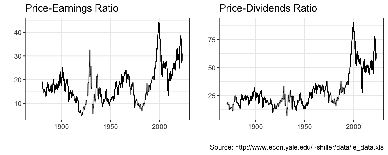
Figure 1.1: Annual Cyclically Adjusted Price-to-Earnings (CAPE) and Price-to-Dividends ratio for the Standard and Poors 500 Index starting in 1871.
The previous discussion considered the annual S&P 500 valuation ratios for over 100 years by sampling only the last price of the year. However, financial markets trade approximately 250 days a year and for every day we observe a closing price. The flow of news about the economy and company events contributes to the daily fluctuations of asset prices. Figure 1.2 shows the daily price of the S&P 500 Index from January 02, 1985 to January 16, 2024 on the left panel, while the right panel shows the daily return of the Index. The return represents the percentage change of the price in a day relative to the price of the previous day. The value of the Index at the beginning of 1985 was 165 and grew to 4766 in January 2024. There have been two severe downturns that are apparent in this graph: the correction in 2000 after the rapid growth of the 1990s and a second one that occured in 2008 during the great recession of 2008-2009. The graph on the right-hand side shows that the daily returns experience sometimes large changes, such as the one-day drop in October 19, 1987 of 22.9% and several instances of changes as large as positive/negative 10% in one day. In addition, it seems that there are periods in which markets are relatively calm and fluctuate within a small range, while in other turbulent times the Index has large variation.
At the daily frequency, rather than actual dividends and earnings that are released at the quarterly frequency, it is news about these variables that make prices fluctuate. Several questions that we can try to answer using data at the daily frequency:
- What forces determine the boom-bust dynamics of asset prices?
- Why do we have these clusters of calm and turbulent times rather than having “normal” times with returns fluctuating on a constant range?
- What is the most likely value of the S&P 500 in 10 years from now?
- Are returns predictable?
- Is volatility, defined as the dispersion of returns around their mean, predictable?
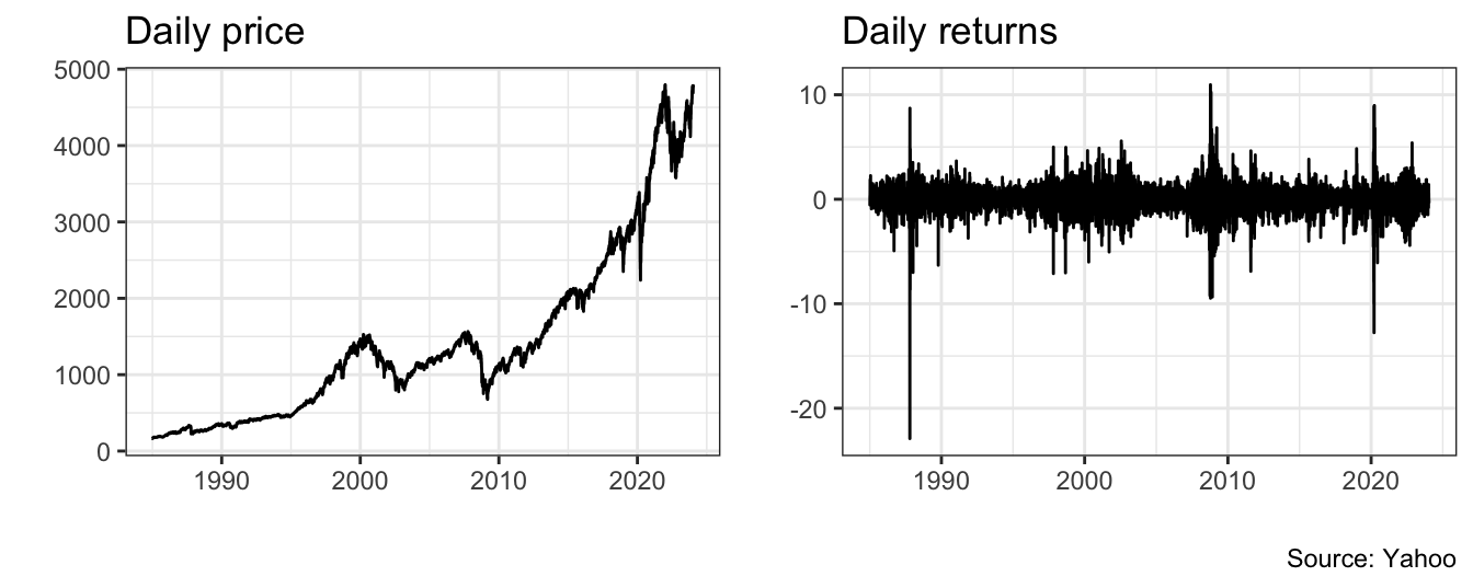
Figure 1.2: Daily prices and returns for the Standard and Poor 500 Index.
Financial markets not only produce one closing price a day, but they produce also thousands of quotes and trades for each asset every day. Figure 1.3 shows the midpoint between the bid and ask price of the US Dollar (USD) and Japanese Yen (JPY) exchange rate in the last trading day of 2016. The picture shows the exchange rate at the 1 minute interval, but within each interval there are several quotes that are produced depending on the time of the day. Armed with these type of data, we can answer different type of questions:
- What factors determine the difference between the price at which you can buy or sell an asset, typically called the bid-ask spread?
- Is the spread constant over time or subject to fluctuations due to market events?
- Is it possible to use intra-day information to construct measures of volatility?
- Does the size of a trade have an impact on the price?
- Can we predict the direction of the next trade and the price change?
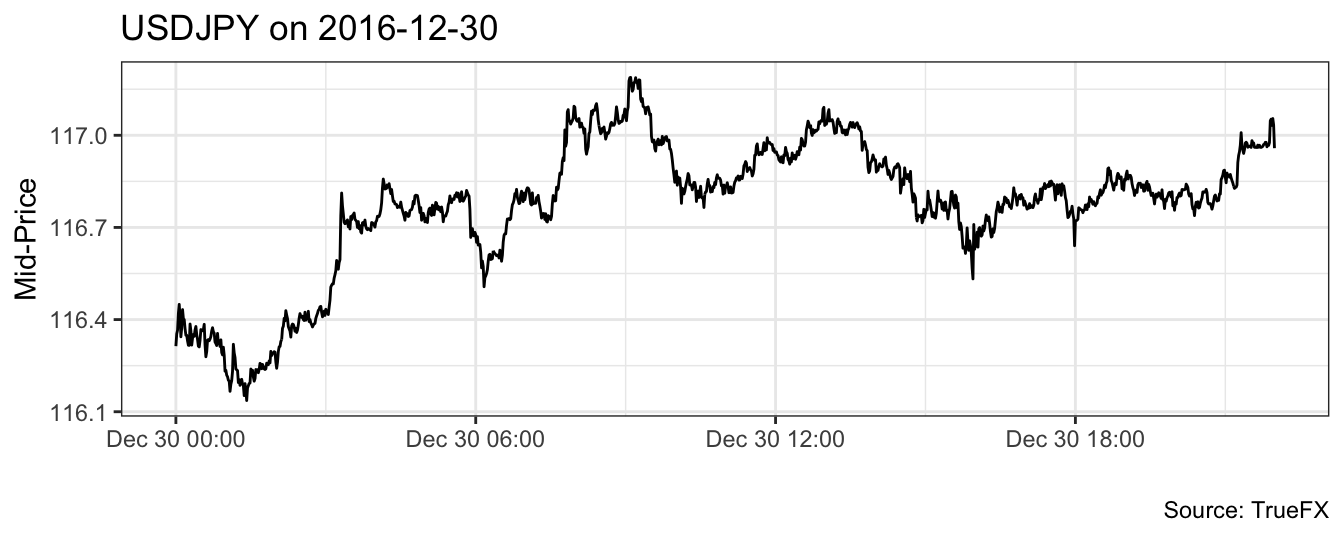
Figure 1.3: Intra-day mid-point between bid and ask price for the USD to JPY exchange rate sampled at the 1 minute frequency.
Working with high-frequency data is challenging due to large amount of quotes and transactions that are produced every day for thousands of assets. For example, the time series in Figure 1.3 represents a subsample of 1,320 1-minute quotes from the 31,076 available for the month of December 2016. The 1-minute quotes are obtained by taking the last quote in each 1 minute interval of weekdays of the month from a total sample of 14,237,744 quotes. The large number of observations makes tools like spreadsheets hardly useful to analyze high-frequency data. First, Microsoft Excel has a limit of rows of slighly more than one million. This means that we would not be able to load even one-month of quotes for the USDJPY exchange rate. Second, simple manipulations such as subsampling and aggregating the dataset to a lower frequency in a spreadsheet can be challenging. Thus, R offers a very interesting proposition by offering a flexible and powerful tool that is not afraid of (moderately) large dataset and allows to perform simple operation in few lines of code. In addition, for almost any task there is a dedicated package that provides ad-hoc functions.
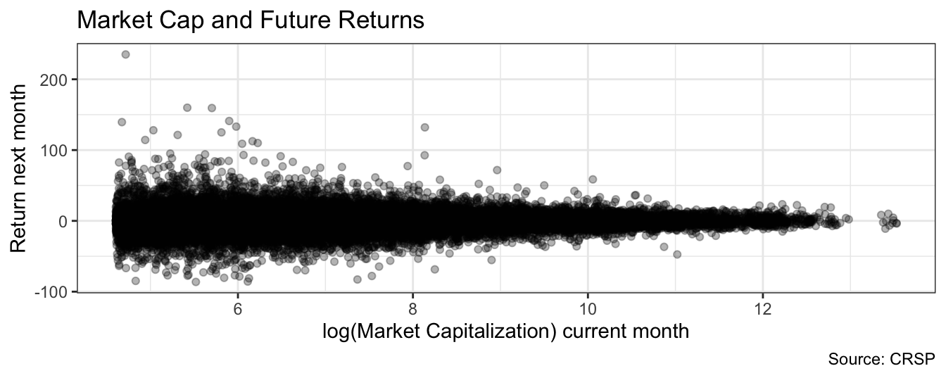
Figure 1.4: Scatter plot of the logarithm of the market capitalization for a stock listed in the NYSE, AMEX, or NASDAQ against the percentage return in the following month. Each point represents a stock-month pair in 2015. Stocks with market cap below 100 million dollars are dropped from the sample.
These examples refer to time series that consists of the observations for a variable (e.g., the S&P 500 Index) over time. In the previous cases the time frequencies are one year, one day, and one minute and with each frequency we discussed different issues and different questions we want to find answers. When dealing with time series the objective of the analysis is to explain the factors driving the variation over time of the variable. Instead, there are other settings in which the goal of the analysis is to understand the relationship between different variables across different units (e.g., stocks) rather than over time. An example is provided in Figure 1.4 that shows the scatter plot of the logarithm of the market capitalization of all the stocks listed in the NYSE, AMEX, and NASDAQ in the months of 2015 against the monthly return in the following month. Many questions arise here:
- Do stocks of large (small) capitalization companies outperform in the following month stocks of small (large) caps? Is size a predictor of future returns?
- In addition to size, what other company characteristics can be used to predict future stock performance?
- Are small caps “riskier” relative to large caps?
- Small caps stocks provide (on average) higher returns relative to large cap stocks: what are the factors explaining it? why?
In this example the data is called cross-sectional or longitudinal in the sense that the goal is to understand the connection between two (or more) variables (e.g., size and future returns) for the same stock.
1.2 Data sources
There are several sources of financial data that, in some cases, are publicly available, while in others are subscription-based. In this book we will use publicly available data when possible, and commercial datasets otherwise. A short-list of data providers is:
- http://finance.yahoo.com/:
- The Yahoo Finance website allows to download daily/weekly/monthly data for individual stocks, indices, mutual funds, and ETFs. The data provided is the opening and closing daily price, the highest and lowest intra-day price, and the volume. In addition, the website provides also the adjusted closing price that is adjusted for dividend payments and stock splits. The data for Figure 1.2 above was obtained from this website.
- The data can be downloaded as a
csvfile under the historical prices tab - There are several packages in
RandPythonthat allow to download the data directly without having to save the file. It requires to know the ticker of the asset.
- http://www.truefx.com:
- TrueFX is a fintech startup that provides financial data and services to traders. Upon registration to their website, it is possible to download intra-day quotes data for many currency pairs in monthly files for the last two years.
- https://fred.stlouisfed.org/:
- the Federal Reserve Economic Database (FRED) is a very extensive database of economic and financial data for both the United States and other countries.
- Similarly to Yahoo Finance, data can be downloaded in
csvformat or can be downloaded directly usingR.
- http://www.quandl.com:
- QUANDL is an aggregator of economic and financial datasets (from the Chicago Mercantile Exchange to FRED to many others)
The ones listed above are the most popular sources of economic and financial data that are publicly available. In addition, there are several subscription-based data providers that offer datasets in other These databases are typically available through the library:
- CRSP: the Center for Research in Security Prices (CRSP) at the University of Chicago provide stock prices starting from 1926
- Compustat: provides accounting information for stocks listed in the United States
- TAQ: Trade And Quote provides tick-by-tick data for all stocks listed in the NYSE, NASDAQ, and AMEX.
1.3 The plan
This book has two main objectives. The first is to introduce the reader to the most important methods and models that are used to analyze financial data. In particular, the discussion focuses on three main areas:
- Regression Model: the regression model has found extensive application in finance, in particular in investment analysis; we will review the basic aspects and assumptions of the model and we will apply it to measure the risk of asset portfolios.
- Time Series Models: the characteristic of time series models is that they exclusively rely on the past values of a variable to predict its future; they are very convenient tools when dealing with higher-frequency data since predictor variables might not be observable, hard to measure, or simply too noisy to be useful.
- Volatility Models: volatility models are time series models that are used to forecast the variance or the standard deviation of asset returns. The assumption underlying these models is that risk varies over time (see Figure 1.2) and this should be accounted for by measures of risk such as the standard deviation of returns. Since risk is an essential component of financial decisions, these models have found widespread application, in particular with the advent of risk management practice in financial institutions.
The goal of the book is to give you a hands-on understanding of these models and their relevance in the analysis of financial data. However, lots of things can go wrong when statistical tools are used ``mechanically’’. Put it very simply, our goal is to extract useful information from a large amount of data and there are many issues that might distort our analysis. Analyzing data is not only concerned with producing numbers (a more elegant term would be estimate) but, more importantly, being aware of the potential pitfalls and possible remedies to make our analysis trustworthy.
The second objective of the book is to introduce the reader to the R and Python programming language. R is becoming an increasingly useful tool for data analysis in many different fields and a fierce competitor of commercial statistical and econometric packages. The discussion of the techniques and models is closely integrated with the implementation in R so that all tables and graphs in the book can be reproduced by the reader. It is probably uncontroversial to say that in the era of “big data” R is a top-contender to replace the long-serving “spreadsheets” that is nearing the end of their usable life. R puts your capabilities to analyze data in a different level relative to what you can achieve using a spreadsheet or menu-driven software. Also, mastering R is a skill that can be useful if you decide that your destiny is to do marketing analytics rather than analyzing financial data. Python has also established itself as an important tool for data scientists, in particular for its reach and powerful machine learning libraries and its popularity among engineers that deploy the algorithms. While R is a statistical program for the statistical and data science community, Python is becoming a statistical package and being fluent in these languages can provide great benefits.
Readings
Some readings that you might be interested if you want to find out more about the discussion in this chapter:
Exercises
The goal of the empirical exercises in this Chapter is to review the important concepts from probability, statistics, finance, and economics and all involve data analysis. For this exercises you are allowed to use a spreadsheet, while from the next chapter we of R.
Go to Yahoo Finance and download historical data for tickers
SPY(SPDR S&P 500 ETF) from January 1995 until the most recent at the daily frequency.- Sort the data by having the date from oldest to newest
- Plot the time series of the price (x-axis is time and y-axis the price in $)
- Plot the time series of the logarithm of the price. What are the advantages/disadvantages of plotting the logarithm of the price rather than the price?
- Calculate the return as the percentage change of the price in day \(t\) relative to day \(t-1\)
- Plot the return time series and discuss the evidence of clusters of high and low volatility
- Calculate the average, standard deviation, skewness and kurtosis of the asset return and discuss the results
- Calculate the fraction of observations in the sample that are smaller than -5% and larger than 5%
- Assume that the daily returns are normally distributed with mean equal to the sample average and variance set at the sample variance; calculate the probability that the returns is smaller than -5% or larger than 5% and compare these values with the fractions calculated in the previous point
- Calculate the sample quantile at 1% and 99% of the asset returns
- Assuming normality, calculate the quantiles of the normal distribution with mean and variance equal to their sample estimates. Compare the values to the one obtained in the previous question
Download from Yahoo Finance historical data for
SPY(S&P 500 Index),WMT(Walmart), andAAPL(Apple) at the daily frequency from January 1995 until the most recent available day.- Sort the data from the oldest date to the newest date; make sure that in each row the price of the three assets refers to the same date
- Calculate the daily returns as the percentage change of the price in day \(t\) relative to the previous day \(t-1\) for the three assets
- Estimate a linear regression model in which the return of
WMTandAAPLare the dependent variable and the return ofSPYis the independent variable; provide an interpretation of the estimated coefficients - Test the null hypothesis that the intercept and the coefficient of the market are equal to zero at 5% significance level
- Comparing the two stocks, which one is “riskier”?
Visit the page of Robert Shiller at Yale and download the file chapt26.xlsx
- Do a time series plot of the nominal S&P 500 Index (column
P) - Calculate the average annual growth rate of the Index
- Plot the real price (column
RealP) over time, where the real value is obtained by dividing the nominal by the CPI Index - Calculate the average annual real growth rate of the Index
- The equity premium is defined as the difference between the average real return of investing in the equity market (we use the S&P 500 to proxy for this) and the real interest rate (column
RealR). How large is the equity premium in this sample? Calculate the equity premium including and excluding data from 1990: is the magnitude of the premium significantly different? What explanation can be offered in case they are different? - Calculate the annual percentage change of the Index (
R), the dividends (D), and earnings (E). Which of the three variables in more volatile? - The columns
P*,P*randP*Care measures of the fundamental value of the real S&P 500 Index that are obtained by discounting future cash flows. Plot the three measures of fundamental value and the real Index (RealP). Are the fundamental values tracking closely the real price? If not, what could explain the deviations of the Index price from its fundamental value?
- Do a time series plot of the nominal S&P 500 Index (column
Create a free account at TrueFX.com and go to the download area. TrueFX gives you access to tick-by-tick quote prices for a wide range of currencies and the data are organized by years (starting in 2009) and pairs. Choose a month, year and currency pair and download the file. Unzip it to a location in your hard drive and answer the following questions:
- Open the
csvfile in a spreadsheet; your options are:- Microsoft Excel has a limit of 1,048,576 rows which is most likely not enough for the file at hand; you will get an alert from Excel that the file was not loaded completely but still will load the first 1,048,576 rows
- OpenOffice Calc has a limit of approx 65,000 rows
- Google Docs spreadsheet has a limit of 200,000 cells; since the TrueFx files have 4 columns, you can only load up to 50,000 rows
- The file contains 4 columns: the currency pair, date and time, bid price, ask price. Assign headers to the columns (you might have to drop one row to do that).
- What is the first and last date in your sample (that has been truncated due to ``row limitations’’)?
- Create a mid-point column that is calculated as the average of the bid and ask price
- Plot the time series of the mid-price (x-axis is the date and y-axis the mid-price)
- Calculate the bid-ask spread which is defined as the difference between the bid and ask prices.
- Calculate the mean, min, and max of the bid-ask spread. Plot the spread over time and evaluate whether it is varying over time.
- Open the