3 Linear Regression Model
Are financial returns predictable? This question has received considerable attention in academic research and in the finance profession. The mainstream theory in financial economics is that markets are efficient and that prices reflect all available information. If this theory is correct, current values of economic and financial variables should not be useful in predicting future returns. The theory can thus be empirically tested by evaluating if the data show evidence of a relationship between future returns and current value of predictive variables, e.g. the dividend-price ratio. In practice, the fact that many fund managers follow an “active” strategy of “outperforming the market” seems at odd with the theory that prices are unpredictable and that investors should only follow a “passive” strategy.
There is an extensive literature in financial economics trying to answer this question. A recent article by Welch and Goyal (2008) is a comprehensive evaluation of the many variables that were found to predict financial returns. The conclusion of the article is that there is some evidence, although not very strong, that returns are predictable. However, the predictability is hardly useful when trying to forecast returns in real-time19. The authors provide the data used in their paper and also an updated version to 2015 at this link. The dataset is provided at the monthly, quarterly, and annual frequency and contains several variables described in detail in the article. For now, we are only interested in using D12 (the dividend), the Rfree (riskfree rate proxied by the 3-month T-bill rate), and the CRSP_SPvw that represents the return of the CRSP value-weighted Index. The code below downloads and reads the Excel file and then creates new variables using the dplyr package. The new variables created are DP (the percentage dividend-price ratio) and ep_crsp that is the equity premium defined as the difference between next year’s percentage return on the CRSP value-weighted Index and the riskfree rate. Finally, a scatter plot of the equity premium against the dividend-price ratio at the annual frequency is produced in Figure 3.1. You should be able to reproduce the graph with the code below.
library(downloader)    # package to download files
library(readxl)          # package to read xlsx files
library(dplyr)
library(lubridate)

# link to the page of Amit Goyal with the data up to 2015; the file is an Excel xlsx file
url       <- "http://www.hec.unil.ch/agoyal/docs/PredictorData2015.xlsx"
file      <- download(url, destfile="goyal_welch.xlsx")
data      <- read_excel("goyal_welch.xlsx", sheet="Annual", na = "NaN")

data <- data %>% mutate(date    = ymd(paste(yyyy,"-01-01",sep="")),
                        DP      = 100 * D12 / Index,
                        ep_crsp = 100 * (lead(CRSP_SPvw - Rfree, 1, order_by=yyyy))) %>%
                dplyr::filter(yyyy >= 1926, yyyy < 2015)

library(ggplot2)
ep.plot <- ggplot(data, aes(DP,ep_crsp)) + geom_point() + theme_bw() + labs(caption=url)
ep.plot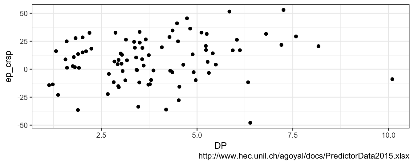
Figure 3.1: Annual observations of the dividend-price (DP) ratio and the equity premium for the CRSP value weighted Index (calculated as the difference between the next year return on the CRSP Value Weighted Index and the riskfree rate).
So: are returns predictable? It seems that years when the DP ratio was high (e.g., higher than 5%) were followed by years with large positive returns. However, also low values of the DP ratio were followed by years with moderately positive returns, but also some negative returns. It seems that, on average, future returns are higher following years with higher DP ratio. The economic logic supporting this relationship is that a high value of the DP makes the asset attractive to investors that will buy more and put upward pressure on the price that is in denominator of the ratio. Sometimes, scatter plots are difficult to interpret and to extract a clear answer about the relationship between two variables. In these cases, it is useful to draw a regression line through the points. The regression line represents the average equity premium that is expected for a certain value of the dividend-price ratio and can be added to the previous graph with the geom_smooth() function as shown below:
ep.plot + geom_smooth(method="lm", se=FALSE, color="orange")
Figure 3.2: Scatter plot of the Dividend-to-Price ratio and the equity premium with the regression line added to the plot.
The regression line is upward sloping which means that increasing values of the dividend-price ratio predict higher returns in the following years. The regression line is equal to -0.04 + 2.16 * DP so that if the DP ratio is equal to 2.5% the model predicts that next year the equity premium will be 5.37% and if the ratio is equal to 5% then the premium is expected to be equal to 10.78%20. The fact that the data points are quite distant from the regression line indicates that the DP has some explanatory power for the equity premium, but we do not expect the predictions to be very precise. For example, if you consider the years in which the DP ratio was close to 5%, there have been years in which the premium has been -10% and others as high as 38% despite the regression line predicted 10.78%. Hence, the regression line seems to account for some dependence between the dividend-price ratio and the equity premium, although there is still large uncertainty. Also, it seems a bit puzzling the behavior of the DP below 2.5%. In the years in which the DP was extremely low the equity premium was actually mostly positive between 0 and 25% while there are only a few years with a negative premium.
A scatter plot is a very useful way to visually investigate the relationship between two variables. However, it eliminates the time series characteristics of these variables that could reveal important features in the data. Figure 3.3 shows the dividend-price ratio and the equity premium over time (starting in 1926).
plot1 <- ggplot(data, aes(yyyy, DP)) + geom_line() + theme_bw() + labs(x="", y="DP") +
         geom_hline(yintercept = 5, color="violet") + geom_hline(yintercept = 2.5, color="violet")
plot2 <- ggplot(data, aes(yyyy, ep_crsp)) + geom_line() + theme_bw() +
         geom_hline(yintercept = 0, color="tomato3") + labs(x="", y="Equity Premium")
grid.arrange(plot1, plot2)
Figure 3.3: Time series of the DP ratio (top) and the equity premium (bottom) from 1926 to 2015.
Let’s consider first the DP ratio. The ratio was larger than 5% mostly between the mid-1930s and the mid-1950s, fluctuated in the range 2.5-5% until approximately 1995, and since then it has been below 2.5% except for 2008. Notice how values of the ratio below 2.5% never occured before 1995 and were associated, in most cases, with positive premiums and larger than expected based on the regression line. While we see a clear decline in the DP ratio in the latest part of the sample, such a trend is not observable in the equity premium that oscillated approximately between plus/minus 25% throughout the sample. This raises several questions about the relationship between the DP ratio and future returns:
- will the
DPratio ever go back to 5% or more? - is the historical relationship between the
DPratio and the equity premium a good and reliable guidance for the future? - in other words, did the relationship change over time?
The goal of this Chapter is to review the Linear Regression Model (LRM) as the basic framework to investigate the relationship between variables. The goal is not to provide a comprehesive review, but rather to discuss the important concepts and discuss several applications to financial data. The most important task in data analysis is to be aware of the many problems that can arise in empirical work that can distort the analysis, such as the effect of outliers and of omitted variables. This Chapter is meant to provide an intentionally light review which will necessarily require that the reader consults more detailed and precise treatments of the LRM as in Stock and Watson (2010) and Wooldridge (2015).
3.1 LRM with one independent variable
The LRM assumes that there is a relationship between a variable \(Y\) observed at time \(t\), denoted \(Y_t\), and another variable \(X\) observed in the same time period, denoted \(X_t\), and that the relationship is linear, that is, \[Y_t = \beta_0 + \beta_1 * X_t + \epsilon_t\] where \(Y_t\) is called the dependent variable, \(X_t\) is the independent variable, \(\beta_0\) and \(\beta_1\) are parameters, and \(\epsilon_t\) is the error term. Typically, we use subscript \(t\) when the variables are observed over time (time series data) and subscript \(i\) when they vary across different individuals, firms, or countries at one point in time (cross-sectional or longitudinal data). The aim of the LRM is to explain the variation over time or across units of the dependent variable \(Y\) based on the variation of the independent variable \(X\): high values of \(Y\) are explained by high (or low) values of \(X\), depending on the parameter \(\beta_1\). For example, in the case of the equity premium our goal is to understand why in some years the equity premium is positive and large while in other years it is small positive or negative. Another example is the cross-section of stocks in a certain period (month or quarter) and the aim in this case is to understand the characteristics of stocks that drive their future performance. We estimate the LRM by Ordinary Least Squares (OLS) which is an estimation method that determines the parameter values such that they minimize the sum of squared residuals. For the LRM we have analytical formulas for the OLS coefficient estimates. The estimate of the slope coefficient, \(\hat\beta_1\), is given by \[\hat\beta_1 = \frac{\hat\sigma_{X,Y}}{\hat\sigma^2_{X}} = \hat\rho_{X,Y} \frac{\hat\sigma_{Y}}{\hat\sigma_{X}}\] where \(\hat\sigma^2_{X}\) and \(\hat\sigma^2_{Y}\) represent the sample variances of the two variables, and \(\hat\sigma_{X,Y}\) and \(\hat\rho_{X,Y}\) are the sample covariance and the correlation of \(X\) and \(Y\), respectively. The sample intercept, \(\hat\beta_0\), is given by \[\hat\beta_0 = \bar{Y} - \hat\beta_1 * \bar{X}\] where \(\bar{X}\) and \(\bar{Y}\) represent the sample mean of \(X_t\) and \(Y_t\). Let’s make the formulas operative using the dataset discussed in the introduction to this chapter. The dependent variable is actually \(Y_{t+1}\) in this application and represents the annual equity premium (ep_crsp) in the following year, while the independent variable \(X_t\) is the DP, the dividend-price ratio for the current year. To calculate the estimate of the slope coefficient \(\beta_1\) we need to estimate the covariance of the premium and the ratio as well as the variance of PD. We discussed already how to estimate these statistical quantities in R in the previous chapter using the cov() and var() commands:
cov(data$ep_crsp, data$DP) / var(data$DP)[1] 2.1637The interpretation of the slope estimate is that if the DP changes by 1% then we expect the equity premium in the following year to change by 2.164%. The alternative way to calculate \(\hat{\beta}_1\) is using the correlation coefficient and the ratio of the standard deviations of the two assets:
cor(data$ep_crsp, data$DP) * sd(data$ep_crsp) / sd(data$DP)[1] 2.1637This formula shows the relationship between the correlation and the slope coefficients when the LRM has only one independent variables. The correlation between ep_crsp and DP in the sample is 0.184 and it is scaled up by 11.76 that represents the ratio of the standard deviations of the dependent and independent variables. Notice that if we had standardized both \(X\) and \(Y\) to have standard deviation equal to 1 then the correlation coefficient would be equal to the slope coefficient. Once the slope parameter is estimated, we can then calculate the sample intercept as follows:
mean(data$ep_crsp) - beta1 * mean(data$DP)[1] -0.035942The OLS formulas for the estimators of the intercept and slope coefficients and their calculation are programmed in all statistical and econometric software, and even Microsoft Excel can provide you with the calculations. Still, it is important to understand what these numbers represent and how to relate to other quantities that we routinely use to measure dependence. The R function lm() (for linear model) estimates the LRM automatically and provides all accessory information that is needed to conduct inference and evaluate the goodness of the model. The following example estimates the LRM with the equity premium as the dependent variable and the DP ratio as the independent:
# two equivalent ways of estimating a linear model
fit <- lm(data$ep_crsp ~ data$DP)
fit <- lm(ep_crsp ~ DP, data=data)
Call:
lm(formula = ep_crsp ~ DP, data = data)

Coefficients:
(Intercept)           DP
    -0.0359       2.1637
The fit object produces only the coefficient estimates and a more detailed report of the relevant statistics can be obtained using the function summary(fit) as shown below:
summary(fit)
Call:
lm(formula = ep_crsp ~ DP, data = data)

Residuals:
   Min     1Q Median     3Q    Max
-61.72 -13.26   2.53  13.34  38.89

Coefficients:
            Estimate Std. Error t value Pr(>|t|)
(Intercept)  -0.0359     5.2297   -0.01    0.995
DP            2.1637     1.2393    1.75    0.084 .
---
Signif. codes:  0 '***' 0.001 '**' 0.01 '*' 0.05 '.' 0.1 ' ' 1

Residual standard error: 20 on 87 degrees of freedom
Multiple R-squared:  0.0339,    Adjusted R-squared:  0.0227
F-statistic: 3.05 on 1 and 87 DF,  p-value: 0.0844
The summary() of the lm object provides the statistical quantities that are used in testing hypothesis and understand the relevance of the model in explaining the data. The information provided is21:
- Estimate: the OLS estimates of the coefficients in the LRM
- Std. Error: the standard errors represent the standard deviations of the estimates and measure the uncertainty in the sample about the coefficient estimates
- t value: the ratio of the estimate and the standard error of a coefficient; it represents the t-statistic for the null hypothesis that the coefficient is equal to zero, that is, \(H_0: \beta_i = 0\) (i=0,1). In large samples the t-statistic has a standard normal distribution and the two-sided critical values at 10, 5, and 1% are 1.64, 1.96, and 2.58, respectively. The null hypothesis that a coefficient is equal to zero against the alternative that is different from zero is rejected when the absolute value of the t-statistic is larger than critical values.
- Pr(>|t|): the p-value represents the probability that the standard normal distribution takes a value larger (in absolute value) than the t-statistic. The null \(H_0: \beta_i = 0\) is rejected in favor of \(H_1: \beta_i \not= 0\) when the p-value is smaller than the significance level (1, 5, 10%) .
- Residual standard error: the variance of the residuals \(\hat{\epsilon_t} = Y_t - \hat\beta_0 - \hat\beta_1 * X_t\).
- R\(^2\): a measure of goodness-of-fit that represents the percentage of the variance of the dependent variable that is explained by the model, while \(100- R^2\)% remains unexplained. The measure ranges from 0 to 1 with 0 meaning that the model is totally irrelevant to explain the dependent variable and 1 meaning that it completely explain it without errors.
- Adjusted R2: this quantity penalizes the \(R^2\) measure for the number of parameters that are included in the regression. This is because \(R^2\) does not decrease when additional independent variables are included in the model. Models with highest adjusted \(R^2\) are preferred.
- F-statistic: tests the null hypothesis that all slope parameters are equal to zero against the alternative that at least one is different from zero. The critical value of the F-statistic depends on the number of observations and the number of variables included in the regression.
The regression results show that an increase of the DP ratio by 1% (% is the unit of the DP variable) leads to an increase of future returns by 2.16% and confirms that higher dividend-price ratio predict higher future returns. The coefficient of the DP ratio has a t-statistic of 1.75 and a p-value of 0.08 which means that it is statistically significant at 10% but not at 5%. Hence, we do find evidence indicating that the dividend-price ratio is a significant predictor of future returns, although only at 10% significance level. The goodness-of-fit measure \(R^2\) is equal to 0.034 or 3.4% which is quite close to its lower bound of zero and indicates that the DP ratio has small predictive power for the equity premium. We thus find that returns are predictable, although the predictive content of the variable we used (the dividend-price ratio) is small. Maybe there could be other more powerful predictors of the equity premium, and the search continues.
Based on the coefficient estimates, we can then calculate the fitted values and the residuals of the regression model. The fitted values are calculated as \(\hat\beta_0 + \hat\beta_1 * DP_t\) and represent the prediction of the equity premium in year \(t+1\) based on the DP ratio of year \(t\). We can denote the fitted values (or expected or predicted) as \(E(EP_{t+1})\) where \(E(\cdot)\) is the expectation and \(EP_{t+1}\) represents the equity premium in the following year. The residuals are the estimated errors and are obtained by subtracting the predicted equity premium to the value that actually realized, that is, \(\hat\epsilon_{t+1} = EP_{t+1} - E(EP_{t+1})\). Figure 3.4 shows the time series of the equity premium (orange line) and the forecast from the model (red line), while the bottom graph shows the residuals that represent the distance between the realized and fitted equity premium in the top graph.
plot1 <- ggplot(data) + geom_line(aes(yyyy, ep_crsp), color="orange") +
                        geom_line(aes(yyyy, fit$fitted.values), color="red") +
                        theme_bw() + labs(x="", y="Premium & Fitted")
plot2 <- ggplot(data) + geom_line(aes(yyyy, fit$residuals), color="royalblue2") +
                        theme_bw() + labs(x="",y="Residuals") +
                        geom_hline(yintercept=0, color="slategray4")
grid.arrange(plot1, plot2)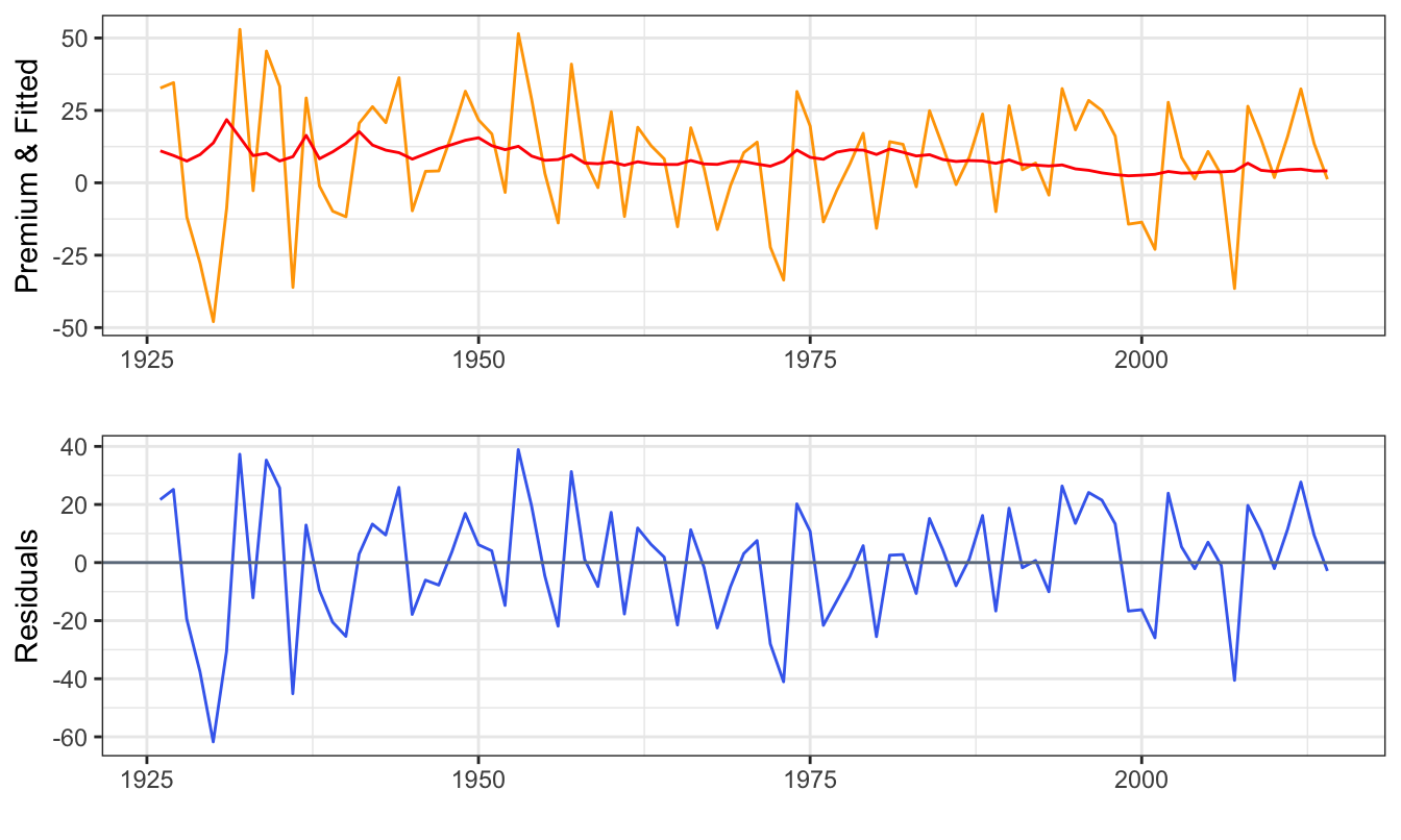
Figure 3.4: Time series of the realized and predicted equity premium (top) and the residuals obtained as the difference between the realized and predicted equity premium (bottom).
Let’s first look at the top graph. The red line (predicted equity premium) seems quite flat relative to the orange line (realized equity premium). The goal of the model is to produce predictions that are as close as possible to the realized values. Unfortunately, in this case it seems that the predictions of the model are not very informative about the following year equity premium. This makes visually clear the implications of a low \(R^2\). If the \(R^2\) was equal to zero the red line would have been flat and, at the other extreme, if \(R^2\) was equal to one then the red line would overlap with the orange line22. In this case, the predicted equity premium varies over time in response to changes in the DP ratio, but hardly enough to keep track of the changes of the realized equity premium in any useful way.
3.2 Robust standard errors
The standard errors calculated by the lm() function are based on the assumption that the errors \(\epsilon_t\) have constant variance and, for time series data, that they are independent over time. In practice, both assumptions might fail. The variance or standard deviation of the errors might vary over time or across individuals and errors might be dependent and correlated over time. For example, an indication of dependence in the error is when positive errors are more (less) likely to be followed by positive (negative) errors as opposed to be equally likely. Calculating the standard errors assuming homogeneity and independence when in fact the errors are heteroskedastic and/or dependent is that, typically, the standard errors are smaller than they should be to make correct inference. The solution is to correct the standard errors using Heteroskeasticity Corrected (HC) standard errors in cross-sectional regressions and using Heteroskedasticity and Autocorrelation Corrected (HAC) standard errors when dealing with time series data as proposed by Newey and West (1987). A practical rule is use corrected standard errors by default and in case the residuals are homoskedastic and independent over time there is only a small loss of precision in small samples. The code below shows how to calculate Newey-West HAC standard errors for a lm object.
library(sandwich)  # function NeweyWest() to calculates HAC standard errors
library(lmtest)    # function coeftest() produces a table of results with HAC s.e.
fit <- lm(ep_crsp ~ DP, data=data)
summary(fit)$coefficients
coeftest(fit, df = Inf, vcov = NeweyWest(fit, prewhite = FALSE))
Estimate Std. Error t value Pr(>|t|)
(Intercept) -0.036 5.2 -0.0069 0.995
DP 2.164 1.2 1.7459 0.084
z test of coefficients:
Estimate Std. Error z value Pr(>|z|)
(Intercept) -0.0359 4.9993 -0.01 0.99
DP 2.1637 1.3173 1.64 0.10Notice that:
- The coefficient estimates are the same since they are not biased by the presence of heteroskedasticity and auto-correlation in the errors
- The standard error for
DPand the intercept increase slightly. This implies that the t-statistic forDPdecreases from 1.75 to 1.64 and the p-value increases from 0.08 to 0.1. TheDPis still significant at 10% level but it becomes a even more marginal case.
As mentioned earlier, when dealing with time series data it is good practice to estimate HAC standard errors by default which is what we will do in the rest of this book.
3.3 Functional forms
In the example above we considered the case of a linear relationship between the independent variable \(X\) and the dependent variable \(Y\). However, there are situations in which the relationship between \(X\) and \(Y\) might not be well-explained by a linear model. This can happen, e.g., when the effect of changes of \(X\) on the dependent variable \(Y\) depends on the level of \(X\). In this Section, we discuss two functional forms that are relevant in financial applications.
One functional form that can be used to account for nonlinearities in the relationship between X and Y is the quadratic model, which simply consists of adding the square of the independent variable as an additional regressor. The Quadratic Regression Model is given by \[ Y_t = \beta_0 + \beta_1 * X_t + \beta_2 * X_t^2 + \epsilon_t\] that, relative to the linear model, adds some curvature to the relationship through the quadratic term. The model can still be estimated by OLS and the expected effect of a one unit increase in \(X\) is now given by \(\beta_1 + 2 \beta_2 X_t\). Hence, the effect on \(Y\) of changes in \(X\) is a function of the level of the independent variable X, while in the linear model the effect is \(\beta_1\) no matter the value of \(X\). Polynomials of higher order can also be used, but care needs to be taken since the additional powers of \(X_t\) are strongly correlated with \(X_t\) and \(X_t^2\). The cubic regression model is thus given by: \[ Y_t = \beta_0 + \beta_1 * X_t + \beta_2 * X_t^2 + + \beta_3 * X_t^3 + \epsilon_t\]
The second type of nonlinearity that can be easily introduced in the LRM assumes that the slope coefficient of \(X\) is different below or above a certain threshold value of \(X\). For example, if \(X_t\) represents the market return we might want to evaluate if there is a different (linear) relationship between the stock and the market return when the market return is, e.g., below or above the mean/median. We can define two new variables as \(X_t * I(X_t \geq m)\) and $ X_t * I(X_t < m)$, where \(I(A)\) is the indicator function which takes value 1 if the event \(A\) is true and zero otherwise, and \(m\) is a threshold value to define the variable above and below. The model is given by: \[Y_t = \beta_0 + \beta_1 X_t * I(X_t \geq m) + \beta_2 X_t * I(X_t < m) + \epsilon_t\] where the coefficients \(\beta_1\) and \(\beta_2\) represent the effect on the dependent variable of a unit change in \(X_t\) when \(X_t\) is larger or smaller than the value \(m\). Another way of specifying this model is by including the regressor \(X_t\) and only one of the two interaction effects: \[Y_t = \gamma_0 + \gamma_1 X_t + \gamma_2 X_t * I(X_t \geq m) + \epsilon_t\] In this case the coefficient \(\gamma_2\) represents the differential effect of the variable \(X\) when it is below or above the value \(m\). Testing the null hypothesis that \(\gamma_2 = 0\) represents a way to evaluate whether there is a nonlinear relationship between the two variables.
3.3.1 Application: Are hedge fund returns nonlinear?
An interesting application of nonlinear functional forms is to model hedge fund returns. As opposed to mutual funds that mostly hold long positions and make limited use of financial derivatives and leverage, hedge funds make extensive use of these instruments to hedge downside risk and boost their returns. This potentially produces a nonlinear response to changes in market returns which cannot be captured by a linear model. As a simple example, assume that a hedge fund holds a portfolio composed of one call option on a certain stock. The performance/payoff will obviously have a nonlinear relationship to the price of the underlying asset and will be better approximated by either of the functional forms discussed above. We can empirically investigate this issue using the Credit Suisse Hedge Fund Indexes23 that provide the overall and strategy-specific performance of a portfolio of hedge funds. Indexes are available for the following strategies: convertible arbitrage, dedicated short bias, equity market neutral, event driven, global macro and long-short equity among others. Since individual hedge fund returns data are proprietary, we will use these Indexes that could be interpreted as a sort of fund-of-funds of the overall universe or for specific strategies of hedge funds.
The file hedgefunds.csv contains the returns of 14 Credit Suisse Hedge Fund Indexes (the HF index and 13 strategies indexes) starting in January 1993 at the monthly frequency. Figure 3.5 shows the change in NAV for these indexes, with some strategies performing extremely well (e.g., global macro) and other performing rather poorly (e.g., dedicated short bias). All strategies seem to have experienced a decline during the 2008-2009 recession, although some strategies were affected to a lesser extent.
hfret      <- read_csv('hedgefunds.csv')
hfret$date <- as.yearmon(mdy(hfret$date))   # format the date to match the format of factor
sp500      <- dplyr::select(mydata, date, GSPC)  # merge with S&P 500
sp500$GSPC <- 100 * sp500$GSPC / sp500$GSPC[sp500$date == "Dec 1993"] # make Dec 1993 equal to 100
hfret      <- inner_join(hfret, sp500, by="date") # join the hfret and sp500 in one data frame
# reorganize the data in e columns: date, Strategy, NAV (makes it easier to use ggplot2)
hfret      <- arrange(hfret, date) %>% tidyr::gather(Strategy, NAV, -date)

ggplot(hfret, aes(date, NAV, color=Strategy)) +
  geom_line() + theme_bw() + labs(x="", caption="Credit Suisse HF Indexes") +
  theme(legend.text=element_text(size=7)) + guides(col = guide_legend(nrow = 8, byrow = TRUE))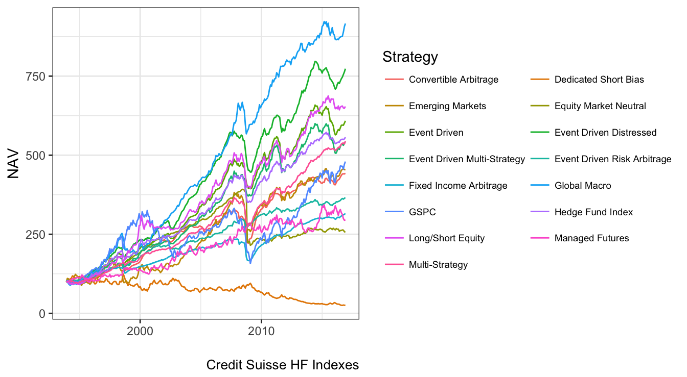
Figure 3.5: Net Asset Value (NAV) of the Credit Suisse HF Indexes starting in December 1993. In this graph the NAV of all strategies is standardized at 100 in December 1993.
Alternatively, we can evaluate and compare the descriptive statistics of the strategies by calculating the mean, standard deviation, skewness, and kurtosis for the monthly returns defined as the percentage change of the NAV. In the code below I use the skewness and kurtosis functions from the e1071 package and format the results as a table using the kable function from the knitr package.
hfret <- hfret %>%
         group_by(Strategy) %>%
         mutate(RET = 100 * log(NAV / lag(NAV))) %>%
         dplyr::filter(!is.na(RET))
strategy.table <-hfret %>%
                 group_by(Strategy) %>%
                 summarize(AV = mean(RET),
                           SD = sd(RET),
                           SKEW = e1071::skewness(RET),
                           KURT = e1071::kurtosis(RET),
                           MIN  = min(RET), MAX = max(RET))
knitr::kable(strategy.table, digits=3, caption="Summary statistics for the HF strategy returns
from the Credit Suisse Hedge Fund Indexes starting in December 1993.")| Strategy | AV | SD | SKEW | KURT | MIN | MAX |
|---|---|---|---|---|---|---|
| Convertible Arbitrage | 0.54 | 1.9 | -3.003 | 20.36 | -13.5 | 5.6 |
| Dedicated Short Bias | -0.49 | 4.6 | 0.521 | 0.81 | -12.0 | 20.5 |
| Emerging Markets | 0.55 | 4.0 | -1.255 | 8.39 | -26.2 | 15.2 |
| Equity Market Neutral | 0.34 | 3.3 | -13.735 | 210.97 | -51.8 | 3.6 |
| Event Driven | 0.65 | 1.8 | -2.216 | 11.16 | -12.5 | 4.1 |
| Event Driven Distressed | 0.74 | 1.8 | -2.281 | 13.15 | -13.3 | 4.1 |
| Event Driven Multi-Strategy | 0.61 | 1.9 | -1.768 | 7.78 | -12.2 | 4.7 |
| Event Driven Risk Arbitrage | 0.47 | 1.1 | -0.990 | 4.87 | -6.4 | 3.7 |
| Fixed Income Arbitrage | 0.42 | 1.6 | -5.057 | 40.80 | -15.1 | 4.2 |
| Global Macro | 0.80 | 2.6 | -0.126 | 4.82 | -12.3 | 10.1 |
| GSPC | 0.57 | 4.3 | -0.840 | 1.66 | -18.6 | 10.2 |
| Hedge Fund Index | 0.62 | 2.0 | -0.263 | 3.15 | -7.8 | 8.2 |
| Long/Short Equity | 0.68 | 2.6 | -0.201 | 3.83 | -12.1 | 12.2 |
| Managed Futures | 0.39 | 3.3 | -0.046 | -0.15 | -9.8 | 9.5 |
| Multi-Strategy | 0.62 | 1.4 | -1.838 | 7.44 | -7.6 | 4.2 |
Some facts that emerge from this table:
- The best performing strategy is
Global Macrowith an average return of 0.8% monthly and the worst performing strategy isDedicated Short Biasthat realized an average return of -0.49%. As a comparison, the S&P 500 Index in the same period had a average return of 0.57% and theHedge Fund Indexof 0.62% - In terms of volatility, the standard deviation of the S&P 500 in this period was 4.28% monthly and the
Hedge Fund Indexof 2. The least volatile HF strategy wasEvent Driven Risk Arbitrage(1.14%) and the most volatile wasDedicated Short Bias(4.65%) - Overall, it seems that most strategies provide a better risk-return ratio relative to investing in the S&P 500 by providing higher returns per unit of volatility.
- Most strategies have negative skewness and positive excess kurtosis that indicate that the distribution of returns are left-skewed and fat tailed. This could be due to large negative returns due to significant declines in NAV. Some values of the kurtosis are quite extreme as in the case of the
Equity Market Neutralstrategy with a value of 210.97. This is an indication that some outliers might have occured in the sample and that further examination is required as discussed later in the Chapter. The columnMINandMAXshow thatEquity Market Neutralexperienced a loss of 51.84% in one month while the largest gain was 3.59%. In analyzing this dataset we will have to consider carefully whether these extreme observations might be considered outliers and have an effect on our analysis.
Are the HF returns sensitive to movements in the U.S. equity market? To evaluate graphically this question we can do a scatter plot of the HF Index return against the S&P 500. Figure 3.6 shows that there seems to be positive correlation between these two variables, although the most striking feature of the plot is the difference in scale between the x- and y-axis: the HF returns range between \(\pm 8\)% while the equity index between \(-20\)% and \(12\)%. The standard deviation of the HF index is 2% compared to 4.28% for the S&P 500 Index which shows that hedge funds provide a hedge against large movements in markets. Notice that the code to make Figure 3.6 keeps the column names to be the strategy names given by Credit Suisse. This is mostly driven by the intent to make the code easier to read and more transparent. In practice, it is more convenient to rename the columns to some shorter and faster to type names (e.g., HFI). Below is the code to produce Figure 3.6.
hfret1 <- hfret %>% dplyr::select(-NAV) %>% tidyr::spread(Strategy, RET)

ggplot(hfret1, aes(GSPC, `Hedge Fund Index`)) + geom_point() +
  geom_vline(xintercept=0, color="mediumorchid3") +
  geom_hline(yintercept=0, color="mediumorchid3") +
  labs(caption = "Credit Suisse, Yahoo")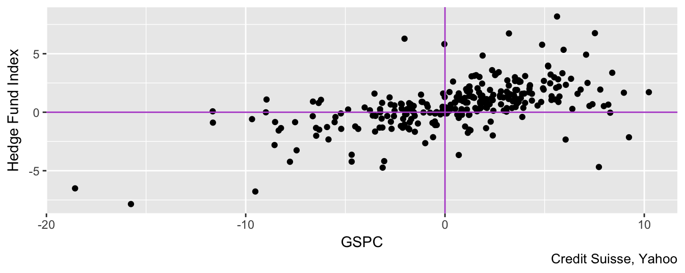
Figure 3.6: Scatter plot of the monthly returns of the SP 500 Index and the CSHedge Fund Index starting in December 1993.
Before introducing non-linearities, let’s estimate a linear model in which the HF index return is explained by the S&P 500 return. The results below show the existence of a statistically significant relationship between the two returns. The exposure of the HF return to S&P 500 fluctuations is 0.27 which means that if the market return changes by \(\pm 1\)% then we expect the fund return to change by \(\pm\) 0.27%. The \(R^2\) of the regression is 0.33, which is not very high for this type of regressions. A (relatively) low \(R^2\) in this case is actually good news for hedge funds since most strategies promise to provide low (if none) exposure to market fluctuation. If this is case then a low goodness-of-fit statistic is good news. We can add the fitted linear relationship given by 0.47 + 0.27\(R_t^{SP500}\) to the previous scatter plot to have a graphical understanding of the LRM:
fitlin     <- lm( `Hedge Fund Index` ~ GSPC, data=hfret1)
coeftest(fitlin, vcov=NeweyWest(fitlin, prewhite = FALSE))
t test of coefficients:

            Estimate Std. Error t value Pr(>|t|)
(Intercept)   0.4695     0.1162    4.04  7.0e-05 ***
GSPC          0.2687     0.0327    8.23  7.9e-15 ***
---
Signif. codes: 0 '***' 0.001 '**' 0.01 '*' 0.05 '.' 0.1 ' ' 1ggplot(hfret1, aes(GSPC, `Hedge Fund Index`)) +
geom_point(color="coral4", alpha=0.4) +
geom_abline(intercept = coef(fitlin)[1], slope = coef(fitlin)[2], color="coral1") +
theme_classic() + labs(caption = "Credit Suisse, Yahoo")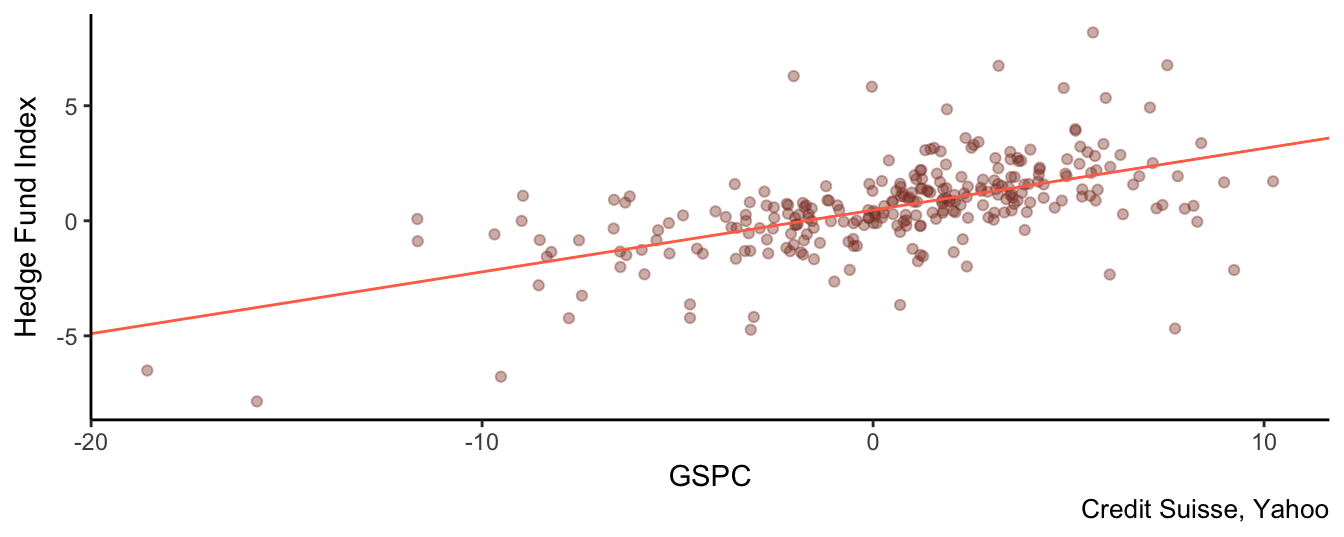
Figure 3.7: Scatter plot of the SP 500 and the HF Index together with the regression line obtained from the fitlin object.
To estimate a quadratic model we need to add the quadratic term to the linear regression. This can be done adding the term I(GSPC^2) where I() is used to add transformations of variables in the formula of the lm() function:
fitquad <- lm(`Hedge Fund Index` ~ GSPC + I(GSPC^2), data=hfret1)
coeftest(fitquad, vcov=NeweyWest(fitquad, prewhite = FALSE))
t test of coefficients:

            Estimate Std. Error t value Pr(>|t|)
(Intercept)  0.61540    0.11323    5.44  1.2e-07 ***
GSPC         0.25064    0.03540    7.08  1.2e-11 ***
I(GSPC^2)   -0.00729    0.00423   -1.73    0.086 .
---
Signif. codes:  0 '***' 0.001 '**' 0.01 '*' 0.05 '.' 0.1 ' ' 1
Since the coefficient of the square term is statistically significant at 10% level we conclude that a nonlinear form is a better model to explain the relationship between the market and fund returns. In this case, we find that the p-value for the null hypothesis that the coefficient of the square market return is equal to zero is 0.09 (or 8.6%) which is smaller than 0.10 (or 10%) and we thus conclude that there is significant evidence of nonlinearity in the relationship between the HF and the market return. The effect of a \(\pm\) 1% change in the S&P 500 is given by 0.25 + (-0.01)\(R_t^{SP500}\).The fact that the coefficient of the quadratic term is negative implies that the parabola 0.62 + 0.25\(R_t^{SP500}\) + -0.01\((R_t^{SP500})^2\) will lay below the line 0.62 + 0.25\((R_t^{SP500})\). So, for large (either positive or negative) returns the parabola implies expectations of returns that are significantly lower relative to the line. Instead, if the coefficient of the quadratic term is positive then the parabola would lay above the line and imply that hedge fund returns become less sensitive (or even profit) from large movements in the market.
In Figure 3.8 we see that the contribution of the quadratic term (dashed line) becomes apparent at the extremes (large absolute market returns), while for small returns it is close or overlaps with the fitted values of the linear model. In terms of goodness-of-fit, the adjusted \(R^2\) of the quadratic regression is 0.34 which is a modest increase relative to 0.33 for the linear model.
ggplot(hfret1, aes(GSPC, `Hedge Fund Index`)) +
  geom_point(color="antiquewhite4", alpha=0.2) +
  stat_function(fun = function(x) coef(fitlin)[1] + coef(fitlin)[2]*x, color="coral1")  +
  stat_function(fun = function(x) coef(fitquad)[1] + coef(fitquad)[2]*x
                + coef(fitquad)[3]*x^2, color="slategrey")  +
theme_bw() + labs(caption = "Credit Suisse, Yahoo") 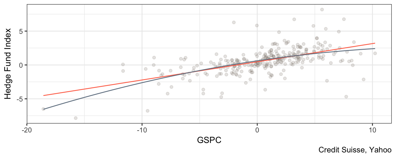
Figure 3.8: Scatter plot of the SP 500 and the HF index returns with linear and quadratic regression line.
The second type of nonlinearity that was discussed earlier assumes that the relationship between dependent and independent variables is linear but with different slopes below and above a certain value of the independent variable. In the example below we consider the median value of the independent variable as the threshold value (in this sample the median value of the S&P 500 is 1.11%). There are two equivalent ways to specify model24 for estimation by including in the regression:
- the
GSPCreturn and the interaction termI(GSPC * (GSPC < m) - the
I(GSPC * (GSPC < m)andI(GSPC * (GSPC >= m)
To avoid perfect multicollinearity we need to avoid to include the variable (e.g., GSPC) and both of its transformations in the regression since the model cannot be estimated. The lm() function in these cases drops one of the regressors and estimates the model on the remaining ones. One advantage of the first specification is that the coefficient of the term I(GSPC * (GSPC < m)) represents the difference in the effect of a change of the independent variable on the dependent. If the null hypothesis that it is equal to zero is not rejected than the data indicate that the nonlinear model is not needed and we can continue the analysis with the linear model.
m             <- median(hfret1$GSPC, na.rm=T)
fit.piecewise <- lm( `Hedge Fund Index` ~ GSPC + I(GSPC * (GSPC < m)), data=hfret1)
coeftest(fit.piecewise, vcov=NeweyWest(fit.piecewise, prewhite = FALSE))
t test of coefficients:

                     Estimate Std. Error t value Pr(>|t|)
(Intercept)            0.6271     0.1380    4.54  8.3e-06 ***
GSPC                   0.2152     0.0624    3.45  0.00066 ***
I(GSPC * (GSPC < m))   0.0967     0.0915    1.06  0.29131
---
Signif. codes:  0 '***' 0.001 '**' 0.01 '*' 0.05 '.' 0.1 ' ' 1
fit.piecewise <- lm( `Hedge Fund Index` ~ I(GSPC *(GSPC < m)) + I(GSPC * (GSPC >= m)), data=hfret1)
coeftest(fit.piecewise, vcov=NeweyWest(fit.piecewise, prewhite = FALSE))
t test of coefficients:

                      Estimate Std. Error t value Pr(>|t|)
(Intercept)             0.6271     0.1405    4.46  1.2e-05 ***
I(GSPC * (GSPC < m))    0.3119     0.0517    6.03  5.3e-09 ***
I(GSPC * (GSPC >= m))   0.2152     0.0635    3.39  0.00081 ***
---
Signif. codes:  0 '***' 0.001 '**' 0.01 '*' 0.05 '.' 0.1 ' ' 1
The two specifications achieve the same result in term of \(R^2\) (equal to 0.34) and the parameters of one model can be mapped into the parameters of the other model. The slope coefficient (or market exposure) of the HF Index below the median is 0.31 and above is 0.22, which suggests that the HF Index is more sensitive to downward movements of the market relative to upward movements. Instead, in the first regression the results show that a 1% change in the S&P 500 causes a 0.22 change, but the index return is below the median, that is I(GSPC < m)=1, then the effect is 0.31 which is obtained by summing 0.22 and 0.1. To evaluate statistically if the nonlinear specification is useful or not we can simply test whether the coefficient of I(GSPC * (GSPC < m)) is equal to zero against the alternative that it is different from zero. The pvalue for this hypothesis is 0.29and even at 10% we do not reject the null hypothesis that it is equal to zero. Hence, this nonlinear specification does not seem to be supported by the data, as opposed to the quadratic model. The shape of the regression line for this model and for the quadratic model are very similar as shown in Figure 3.9, although the quadratic model is marginally superior to the linear model by having a significant coefficient in the square term, and by achieving higher adjusted \(R^2\).
mat <- data.frame(X = (fit.piecewise$model[,2]+fit.piecewise$model[,3]), fitted = fitted(fit.piecewise))
mat <- arrange(mat, fitted)

ggplot(hfret1, aes(GSPC, `Hedge Fund Index`)) +
  geom_point(color="antiquewhite4", alpha=0.3) +
  geom_smooth(method="lm", se=FALSE, color="coral1") +
  geom_line(data=mat, aes(X,fitted),color="purple", size=1) +
  theme_bw() + labs(caption = "Credit Suisse, Yahoo")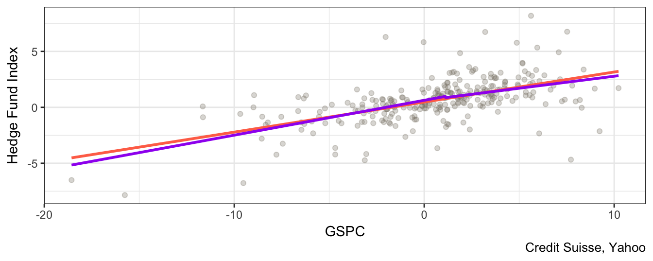
Figure 3.9: Scatter plot of the SP 500 return and the Hedge Fund Index together with the linear regression line and the piece-wise or threshold linear model.
3.4 The role of outliers
One of the strategies provided by Credit Suisse is the equity market neutral strategy that aims at providing positive expected return, with low volatility and no correlation with the equity market. Figure 3.10 represents a scatter plot of the market return (proxied by the S&P 500) and the HF equity market neutral return.
ggplot(hfret1, aes(GSPC, `Equity Market Neutral`)) +
  geom_point(alpha=0.5) + theme_bw() + labs(caption = "Credit Suisse, Yahoo")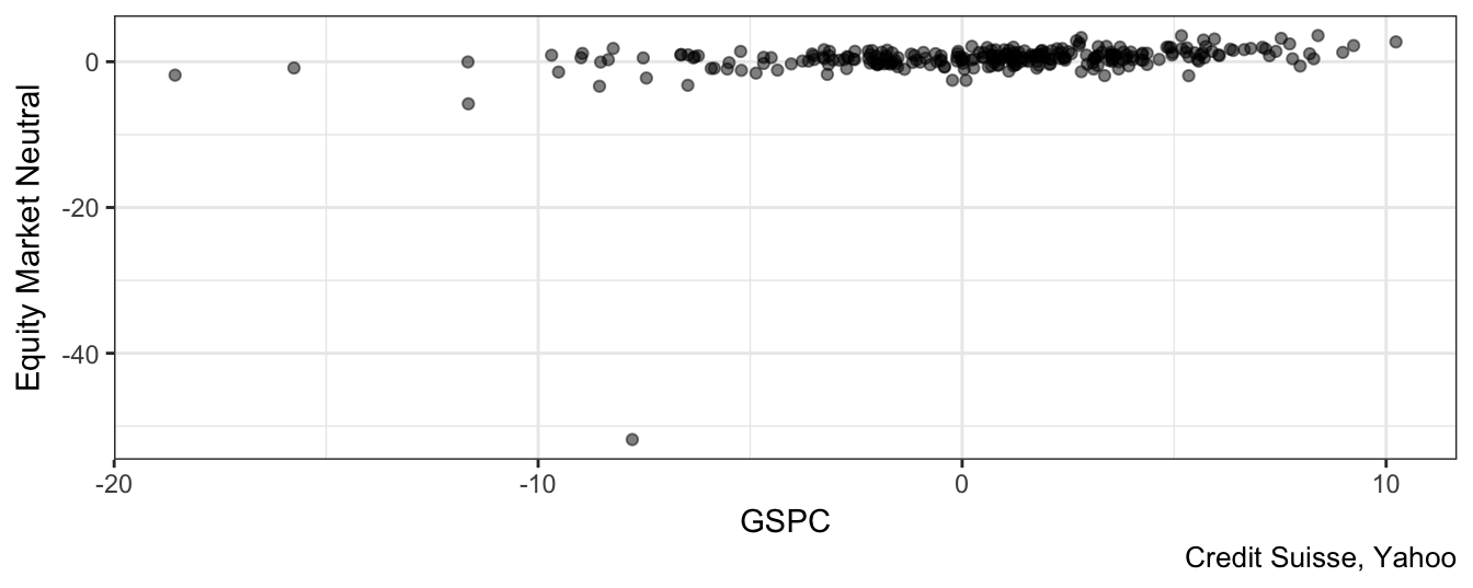
Figure 3.10: Scatter plot of the SP 500 returns and the HF Equity Market Neutral returns.
What is wrong with Figure 3.10? Did we do a mistake in plotting the variables? No, the only issue with the graph is the large negative return of -51.84% for the HF strategy relative to a loss for the S&P 500 of “only” 7.78%. To find out when the extreme observation occurred, we can use the command which.min(hfret1$'Equity Market Neutral') which indicates that it represents the 179th observation. What happened in November 2008 to create a loss of 51.84% to an aggregate index of market neutral strategy hedge funds? In a press release Credit Suisse discusses that they marked down to zero the assets of the Kingate Global Fund, which was a hedge fund based on the British Virgin Islands that acted as a feeder for the Madoff funds and was completely wiped out when the Ponzi scheme operated by Bernard Madoff was discovered. Does this extreme observation or outlier have an effect on our conclusions and our assessment of the equity market neutral strategy? Let’s consider how the descriptive statistics in Table 3.1 would change if the outlier is excluded:
- the mean would increase from 0.34% to 0.53%
- the standard deviation would decline from 3.35% to 1.13%
- the skewness would change from -13.74 to 0.53
- the excess kurtosis would change from 210.97 to 3.97
These results make clear that there is a significant effect of the outlier in distorting the descriptive statistics. Statistically speaking, the estimates might be biased because the outlier has the effect of pushing away the sample estimates from their population values. This is an important issue in practice because we use these quantities to compare the risk-return tradeoff of different assets and also because we wish to predict the expected future return from investing in such a strategy. Should we include or exclude the outlier when calculating quantities that are the basis for investment decisions? This choice depends on our interpretation of the nature of the extreme observation: is it an intrinsic feature of the process to produce outliers occasionally or can it be attributed to a one-time event that is unlikely to happen again? In the current situation we need to assess whether another Ponzi scheme of the magnitude operated by Bernard Madoff can occur in the future and lead to the liquidation of a large equity market neutral hedge fund. It is probably fair to say that the circumstances that led to the 51.84% loss were so exceptional that it is warranted to simply drop that observation from the sample when estimating the model parameters.
In addition to creating bias in the descriptive statistics, outliers have also the potential to bias the coefficient estimates of the LRM. The code below shows the estimation results for the model \(R_t^{EMN} = \beta_0 + \beta_1 R_t^{SP500} + \epsilon_t\), where \(R_t^{EMN}\) and \(R_t^{SP500}\) are the returns of the equity market neutral and S&P 500 returns. The first regression model includes all observations while the second drops the outlier:
fit0 <- lm(`Equity Market Neutral` ~ GSPC, data=hfret1)
coeftest(fit0, vcov=NeweyWest(fit0, prewhite = FALSE))
t test of coefficients:

            Estimate Std. Error t value Pr(>|t|)
(Intercept)   0.2261     0.2376    0.95    0.342
GSPC          0.2034     0.0821    2.48    0.014 *
---
Signif. codes:  0 '***' 0.001 '**' 0.01 '*' 0.05 '.' 0.1 ' ' 1
fit1 <- lm(`Equity Market Neutral` ~ GSPC, data = subset(hfret1, date != "Nov 2008"))
coeftest(fit1, vcov=NeweyWest(fit1, prewhite = FALSE))
t test of coefficients:

            Estimate Std. Error t value Pr(>|t|)
(Intercept)   0.4606     0.0937    4.91  1.5e-06 ***
GSPC          0.1184     0.0252    4.69  4.3e-06 ***
---
Signif. codes:  0 '***' 0.001 '**' 0.01 '*' 0.05 '.' 0.1 ' ' 1
These results indicate that by dropping the November 2008 return the estimate of \(\beta_0\) increases from 0.23 to 0.46 while the market exposure of the fund declines from 0.2 to 0.12. Hence, the effect of the large negative return is to depress the estimate of the interecept (interpreted as the risk-adjusted return) and to increase the slope (the HF exposure to the market return). However, even after removing the outlier the exposure \(\beta_1\) is statistically different from zero at 1%, which indicates that the aggregate index has low but significant exposure to market fluctuations. The outlier has also an effect on the goodness-of-fit statistic since the \(R^2\) increases from 0.07 to 0.2 when the extreme observation is excluded from the sample. Figure 3.11 shows the scatter plot of GSPC and Equity Market Neutral together with the regression lines estimated above. In this graph the observations for November 2008 is dropped and clearly the lightsalmon1 line seems to be closer to the points relative to the firebrick4 line that is estimated including the outlier.
c0 <- coef(fit0)
c1 <- coef(fit1)
dplyr::filter(hfret1, `Equity Market Neutral` > -20) %>%
  ggplot(., aes(GSPC, `Equity Market Neutral`)) + geom_point(alpha=0.4) +
  geom_abline(intercept = c0[1], slope = c0[2], color="lightsalmon1", size = 1) +
  geom_abline(intercept = c1[1], slope = c1[1],color="firebrick4", size = 1)  +
  labs(caption = "Credit Suisse, Yahoo")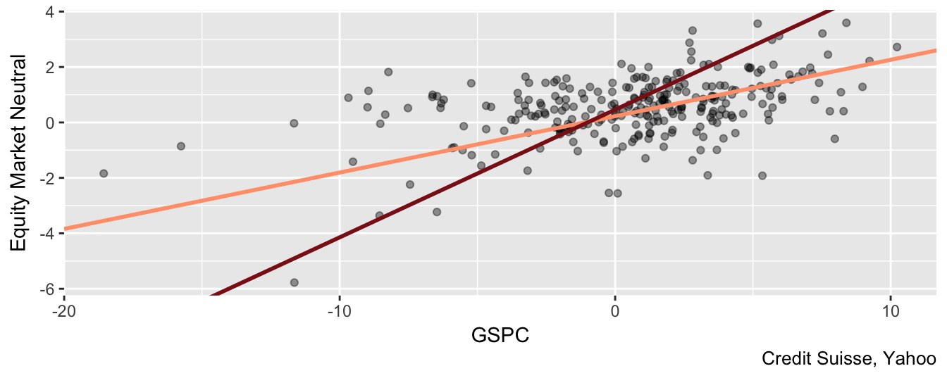
Figure 3.11: Scatter plot of the Equity Market Neutral Index and the SP 500 returns excluding the November 2008 observations. The regression lines are estimated with/without the extreme observation.
3.5 LRM with multiple independent variables
In practice, we might be interested to include more than just one variable to explain the dependent variable \(Y\). Denote the \(K\) independent variables that we are interested to include in the regression by \(X_{k,t}\) for \(k=1,\cdots,K\). The linear regression with multiple regressors is defined as \[ Y_t = \beta_0 + \beta_1 * X_{1,t} + \cdots + \beta_K * X_{K,t} + \epsilon_t \] Also in this case we can use OLS to estimate the parameters \(\beta_k\) (for \(k=1,\cdots, K\)) by choosing the values that minimize the sum of the squared residuals. Care should be given to the correlation among the independent variables to avoid cases of extremely high dependence. The case of correlation among two independent variables equal to 1 is called perfect collinearity and the model cannot be estimated. This is because it is not possible to associate changes in \(Y_t\) with changes in \(X_{1,t}\) or \(X_{2,t}\) since the two independent variables have correlation one and move in the same direction and by a proportional amount. A similar situation arises when an independent variable has correlation 1 with a linear combination of the independent variables25. The solution in this case is to exclude one of the variables from the regression. In practice, it is more likely to happen that the regressors have very high correlation although not equal to 1. In this case the model can be estimated but the coefficient estimates become unreliable. For example, equity markets move together in response to news that affect the economies worldwide. So, there are significant co-movements among these markets and thus high correlation which can become problematic in some situations. Before estimating the LRM, the correlation between the independent variables should be estimated to evaluate whether there are high correlations that might make impossible or unreliable to estimate the model. Correlations are high when they are larger than 0.85 and you should start assessing if these variables are both needed in the regression. A practical way to assess the effect of these correlations is to estimate the LRM with both variables, and then excluding one of them and including the other. By comparing the adjusted \(R^2\) and the stability of the coefficient estimates and the standard errors should give an answer whether it is the case to include both or just one of the variables.
In R the LRM with multiple regressors is estimated using the lm() command discussed before. To illustrate the LRM with multiple regressors I will extend the earlier market model to a 3-factor model in which there are two more independent variables or factors to explain the variation over time of the returns of a portfolio. The factors are called the Fama-French factors after the two economists that first proposed these factors to model risk in portfolios. In addition to the market return (MKT), they construct two additional risk factors:
- Small minus Big (SMB) which is defined as the difference between the return of a portfolio of small capitalization stocks and a portfolio of large capitalization stocks. The aim of this factor is to capture the premium from investing in small cap stocks.
- High minus Low (HML) is obtained as the difference between a portfolio of high Book-to-Market (B-M) ratio stocks and a portfolio of low B-M stocks. The high B-M ratio stocks are also called value stocks while the low B-M ratio ones are referred to as growth stocks. The factor provides a proxy for the premium from investing in value relative to growth stocks.
More details about the construction of these factors are available at Ken French webpage where you can also download the data for the MKT, SMB, and HML factors and the risk-free rate (RF). The dataset starts in July 1926 and ends in January 2017 and Figure 3.1226 shows the time series plot of the 3 factors and the risk-free rate.
plot.zoo(factors)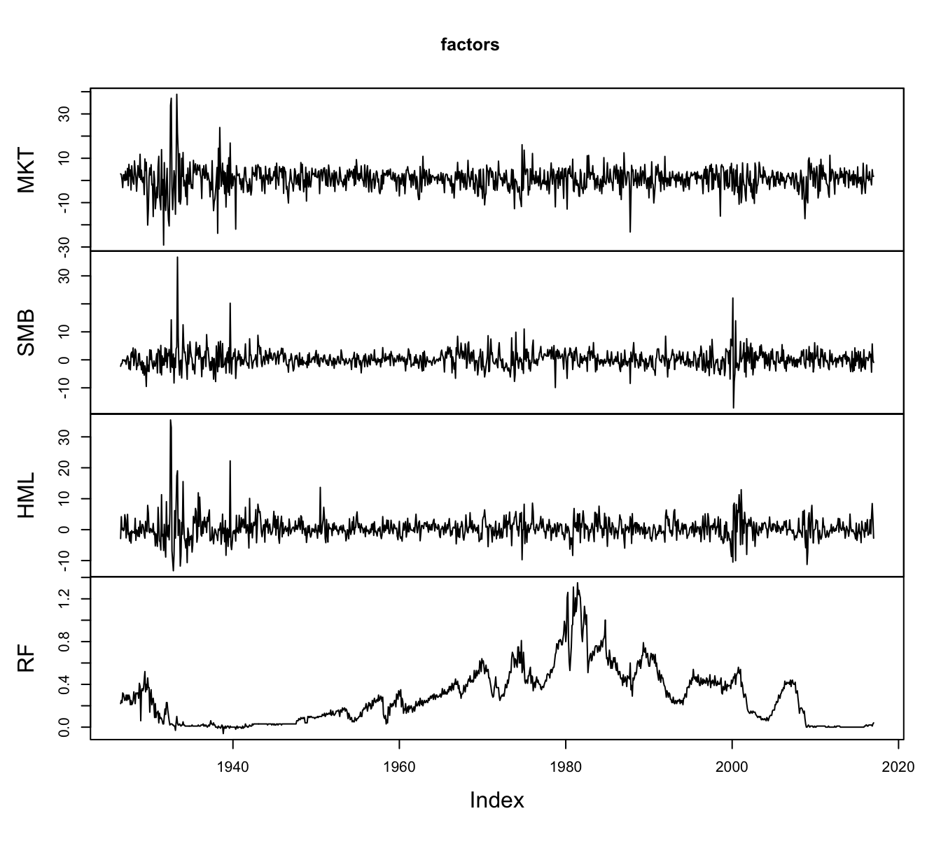
Figure 3.12: The time series of the Fama-French (FF) factors and the riskfree rate starting in 1926 at the monthly frequency. The data is obtained from Ken French website.
The data is in a xts-object called factors that has 1087 rows and 4 columns. To calculate the mean() and sd() of each column of the object we can use the apply() function that applies a function specified by the users to the rows or the columns of a data frame (specifying the argument MARGIN equal to 1 for rows and 2 for columns). The example below shows how to calculate the mean and standard deviation of the variables and combines them in a data frame:
data.frame(AVERAGE = apply(factors, 2, mean), STDEV = apply(factors, 2, sd)) AVERAGE STDEV
MKT 0.65 5.37
SMB 0.21 3.21
HML 0.40 3.50
RF 0.28 0.25The average monthly MKT return from 1926 to 2017 has been 0.65% in excess of the risk-free rate. The average of SMB is 0.21% and represents the monthly premium deriving from investing in small capitalization relative to large capitalization stocks. The sample average of HML is 0.4% which measures the premium from investing in value stocks (high book-to-market ratio) relative to growth stocks (low book-to-market ratio). The standard deviation of MKT, SMB, and HML factors are 5.37%, 3.21%, and 3.5%, respectively. Another statistic that is useful to estimate is the correlation between the factors that allows us to measure their dependence. We can calculate the correlation matrix using the cor() function that was introduced earlier:
cor(factors) MKT SMB HML RF
MKT 1.000 0.319 0.241 -0.065
SMB 0.319 1.000 0.122 -0.052
HML 0.241 0.122 1.000 0.018
RF -0.065 -0.052 0.018 1.000The correlation matrix is a table that shows the pair-wise correlation between the variable in the row and the one in the column. The numbers in the diagonal are all equal to 1 because they represent the correlation of a factor with itself. The correlation estimates show that SMB and HML are weakly correlated to the MKT returns (0.32 and 0.24, respectively) and also among each other (0.12). In this sense, it seems that the factors capture moderately correlated sources of risk which can be valuable from a diversification stand-point.
3.5.1 Size portfolios
Financial economics has devoted lots of energy to understand the factors driving asset prices and their expected returns. On the way, many anomalies have emerged in the sense of empirical facts that did not align with a theory. In this case the theory is the Capital Asset Pricing Model (CAPM) which states that the expected return of an asset should be proportial to the exposure to systematic risk measure by the excess market return relative to the risk-free rate of return. If we denote by \(R_t^{i}\) the excess return of asset \(i\) in period \(t\) and by \(R_t^{MKT}\) the excess market return in the same period, the CAPM predicts that \[ R_t^i = \alpha + \beta R_t^{MKT} + \epsilon_t \] where the intercept \(\alpha\) in the theory should be equal to zero and the slope \(\beta\) measures the exposure of the asset to market risk. Let’s consider an application. The data library in Ken French webpage provides historical data for the returns of portfolio of stocks formed based on their market capitalization. The way these portfolio are constructed is by sorting once a year all the stocks listed in the NYSE, AMEX, and NASDAQ from the largest capitalization to the smallest and then creating portfolios that invest in a fraction of these stocks. The French dataset forms size portfolios as follows:
- 3 portfolios: the 30% of smallest capitalization, the 30% of largest, and the 40% of medium capitalization
- 5 portfolios: lowest 20%, largest 20%, and 20% interval between the smallest and largest (quintiles)
- 10 portfolios: divide the sample at intervals of 10% (deciles)
This process can be interpreted as a mutual fund that once a year (typically in June) forms a portfolio of stocks based on their market capitalization and keeps that allocation for one year. First, let’s consider the 10 decile portfolios and calculate the average return over the period 1926-2017:
port10      <- c("Lo 10", "Dec 2","Dec 3","Dec 4","Dec 5",
                 "Dec 6","Dec 7","Dec 8", "Dec 9", "Hi 10")
size10      <- subset(port.size, select=port10)
table.size10 <- data.frame(`AV RET` = apply(size10, 2, mean),
                           `STD DEV` = apply(size10, 2, sd))
knitr::kable(t(table.size10), digits=3,
             caption = "Average return and standard deviation of the decile
portfolios sorted by size.")| Lo 10 | Dec 2 | Dec 3 | Dec 4 | Dec 5 | Dec 6 | Dec 7 | Dec 8 | Dec 9 | Hi 10 | |
|---|---|---|---|---|---|---|---|---|---|---|
| AV.RET | 1.1 | 0.99 | 0.98 | 0.94 | 0.89 | 0.9 | 0.83 | 0.79 | 0.73 | 0.6 |
| STD.DEV | 10.0 | 8.75 | 7.99 | 7.46 | 7.07 | 6.8 | 6.45 | 6.16 | 5.81 | 5.1 |
The results in Table 3.2 show that, historically, portfolios of small caps have provided significantly higher returns relative to portfolios of large caps. A portfolio that consistently invested in the 10% of smaller caps earned an average monthly return of 1.12% relative to the portfolio of the largest companies that earned 0.6%. Why is the expected return of small caps portfolios higher relative to the larger caps? Is it because they are more risky? This is definitely the case since the standard deviation of the smallest cap portfolio is 9.98% relative to the 5.06% of the largest cap portfolio. Why is the standard deviation higher for small caps? do we want to look for an explanation to both? The CAPM model predicts that stocks or portfolios that are more exposed to systematic risk (high \(\beta\)) are riskier and receive compensation in the form of higher expected returns. Let’s estimate the CAPM model in the previous Equation to the 10 size portfolios and, if the CAPM is correct, we should find that \(\beta\)s decline moving from the 1st decile portfolio to the 10th portfolio and that \(\alpha\)s are close to zero. The code below estimates the CAPM model with the dependent variable being size10 which is a xts object with 10 columns and 1087 rows. The lm() command will automatically estimate the regression on the independent variable MKT for each column of the object size10.
size.capm   <- lm(size10 ~ MKT, data=factors)
knitr::kable(coef(size.capm), digits=3,
             caption="OLS estimates of the intercept and slope coefficients in the CAPM
regression for 10 portfolio sorted by size (market capitalization).")| Lo 10 | Dec 2 | Dec 3 | Dec 4 | Dec 5 | Dec 6 | Dec 7 | Dec 8 | Dec 9 | Hi 10 | |
|---|---|---|---|---|---|---|---|---|---|---|
| (Intercept) | 0.19 | 0.08 | 0.11 | 0.11 | 0.088 | 0.12 | 0.074 | 0.064 | 0.036 | -0.007 |
| MKT | 1.42 | 1.39 | 1.33 | 1.26 | 1.229 | 1.20 | 1.152 | 1.115 | 1.063 | 0.931 |
The estimates of the slope coefficients in Table 3.3 show, as expected, that smaller caps have higher betas relative to portfolios of large cap stocks (1.42 vs 0.93). This explains the fact that portfolios with more exposure to small caps are more volatile and provide higher expected returns relative to portfolios with predominantly larger stocks. What about the intercepts or alpha? The CAPM model predicted that these coefficients should be equal to zero, but a first assessment of the estimates does not seem to confirm this. The first portfolio has an estimate of \(\alpha\) of 0.19 which, from the perspective of monthly returns, is a considerable number. However, a proper assessment of the hypothesis that \(\alpha = 0\) should account for the standard errors of the estimates and perform a statistical test of the hypothesis against the alternative that the intercept is different from zero. The CAPM model also implies that the expected return of the portfolios, \(E(R_t^i)\), is given by the sum of \(\alpha\) and the compensation for exposure to market risk, \(\beta R_t^{MKT}\). We can use the ggplot2 package to do a bar-plot that helps visualizing the contribution of each component of the expected return.
size10.stat <- data.frame(PORT  = factor(names(size10), levels=names(size10)),
                          AVRET = apply(size10, 2, mean),
                          ALPHA = coef(size.capm)['(Intercept)',],
                          BETA  =  coef(size.capm)['MKT',])
ggplot(size10.stat) + geom_bar(aes(x = PORT, y = AVRET), fill="gray90",  stat = "identity") +
  geom_bar(aes(x = PORT, y = ALPHA),fill = "lightsteelblue2",  stat="identity") +
  theme_bw() + labs(x = "", y = "Return", title="Size Portfolios") +
  geom_hline(yintercept = mean(factors$MKT), color="orangered2")
Figure 3.13: Bar plot of the average return of the decile portfolios sorted on size together with the estimated intercept (alpha). The horizontal line represents the average MKT return.
Figure 3.13 shows that the CAPM model explains a significant component of the average return of the portfolios, but there is still between 10-20% of the return that is attributed to alpha. As we said before, it could be that these intercepts are not estimated very precisely so that statistically they are not different from zero. To evaluate this hypothesis we need to obtain the standard errors or the t-statistic from the lm() object. Since the dependent variable size10 in the previous regression is composed of 10 variable, the lm object for summary(size.capm) stores the regression results in a list with 10 elements and each element represents the results for one portfolio. For example:
summary(size.capm)[[1]]
Call:
lm(formula = `Lo 10` ~ MKT, data = factors)

Residuals:
         Lo 10
Min    -18.592
1Q      -2.851
Median  -0.394
3Q       1.982
Max     78.069

Coefficients:
            Estimate Std. Error t value Pr(>|t|)
(Intercept)   0.1919     0.1970    0.97     0.33
MKT           1.4205     0.0365   38.96   <2e-16 ***
---
Signif. codes:  0 '***' 0.001 '**' 0.01 '*' 0.05 '.' 0.1 ' ' 1

Residual standard error: 6.5 on 1085 degrees of freedom
Multiple R-squared:  0.583, Adjusted R-squared:  0.583
F-statistic: 1.52e+03 on 1 and 1085 DF,  p-value: <2e-16
To extract the t-statistic of the intercept for each item in the list in one line we can use the lapply() or the sapply() function that apply a user-specified function to each item of a list. In this simple case, the function sapply() is preferable because it returns a vector rather than a list as the lapply() function does. The code to obtain this is shown below where we extract the value in row 1 and column 3 of coefficients for each item in the list:
capm.tstat <- sapply(summary(size.capm), function(x) tstat = x$coefficients[1,3])Lo 10 Dec 2 Dec 3 Dec 4 Dec 5 Dec 6 Dec 7 Dec 8 Dec 9 Hi 10
0.97 0.57 1.00 1.16 1.13 1.77 1.33 1.43 1.06 -0.26 Since all t-statistics are smaller than 1.96 we do not reject the null hypothesis that the \(\alpha = 0\) for each of these 10 portfolios at 5% significance level, while at 10% significance only the intercept for the 6th decile is significant. Let’s also extract from the regression results the adjusted \(R^2\) of the regression and the standard error of regression. In the code below, I also bind the standard deviation of each portfolio return so that we can access the magnitude of the variables.
size.capm.stats <- sapply(summary(size.capm),
                          function(x) c(SER = x$sigma, AD.RSQ = x$adj.r.squared))
colnames(size.capm.stats) <- colnames(size10)
The first portfolio is twice more volatile relative to the last portfolio and the CAPM model contributes to explain most of its variability (adjusted \(R^2\) of 0.97), but only 0.58 for Lo 1027. This suggests that the small cap portfolios could benefit from adding additional risk factors that might explain some of the unexplained variation of the returns and so improve \(R^2\).
The CAPM model predicts that the portfolio return should be explained by just one factor, the market return. This assumption might work for some portfolios, but it seems that it has some difficulties explaining the return of portfolios in which small cap stocks are predominant. Fama and French (1993) proposed a 3-factor model that add SMB and HML to the MKT factor given by \[ R_t^i = \alpha + \beta_{MKT} R_t^{MKT} + \beta_{SMB} SMB_t + \beta_{HML} HML_{t} + \epsilon_t \] Let’s see how the results would change if we estimate the 3-factor model on the size portfolios:
size.3fac <- lm(size10 ~ MKT + SMB + HML, data=factors)
knitr::kable(coef(size.3fac), digits=3,
             caption="Loadings of 3 Fama-French factors on 10
portfolio sorted by market capitalization.")| Lo 10 | Dec 2 | Dec 3 | Dec 4 | Dec 5 | Dec 6 | Dec 7 | Dec 8 | Dec 9 | Hi 10 | |
|---|---|---|---|---|---|---|---|---|---|---|
| (Intercept) | -0.17 | -0.17 | -0.089 | -0.055 | -0.032 | 0.006 | -0.001 | 0.009 | -0.004 | 0.022 |
| MKT | 1.00 | 1.07 | 1.079 | 1.042 | 1.061 | 1.075 | 1.053 | 1.052 | 1.033 | 0.977 |
| SMB | 1.56 | 1.27 | 1.005 | 0.881 | 0.724 | 0.493 | 0.408 | 0.236 | 0.066 | -0.215 |
| HML | 0.78 | 0.48 | 0.375 | 0.308 | 0.192 | 0.224 | 0.132 | 0.115 | 0.114 | -0.034 |
The results in Table 3.4 show that:
- the estimated alpha are mostly negative
- the exposure to market risk (market beta) is very close to 1 for all portfolios and significantly smaller for the low decile portfolios relative to the CAPM regression (the beta for the first portfolio decreases from 1.42 to 1).
- The loading on the SMB for the low decile portfolios is large and positive and decreases until it becomes negative for the last decile portfolios. This is expected since the low portfolios have a larger exposure to small caps and thus benefit from the risk premium of small caps.
- Although we are not sorting stocks based on the book-to-market ratio but only on size, the loading on the HML factor is positive and large at low quantiles and decreases to approximately zero for the portfolio of largest cap stocks. This indicates the out-performance of the small caps portfolios is partly due also to a book-to-market effect, in the sense that small stocks are more likely to be value stocks and the regression is able to distinguish the component of the return that is due to the size effect and the part that is due to the value effect.
In addition, the comparison in Table 3.5 of the adjusted \(R^2\) for the CAPM and 3-factor model indicates that the largest improvements in goodness-of-fit occur for the lowest decile portfolios, while for the top decile portfolios the improvement is marginal.
size.capm.stats  <- sapply(summary(size.capm), function(x) AD.RSQ = x$adj.r.squared)
size.3fac.stats  <- sapply(summary(size.3fac), function(x) AD.RSQ = x$adj.r.squared)
size.stats       <- rbind(CAPM = size.capm.stats, `3-FACTOR` = size.3fac.stats)
colnames(size.stats) <- colnames(size10)
knitr::kable(size.stats, digits=3, caption="Adjusted R-square for the CAPM
and the 3-factor models estimated on the size portfolios.")| Lo 10 | Dec 2 | Dec 3 | Dec 4 | Dec 5 | Dec 6 | Dec 7 | Dec 8 | Dec 9 | Hi 10 | |
|---|---|---|---|---|---|---|---|---|---|---|
| CAPM | 0.58 | 0.72 | 0.80 | 0.82 | 0.87 | 0.90 | 0.92 | 0.94 | 0.96 | 0.97 |
| 3-FACTOR | 0.89 | 0.96 | 0.98 | 0.97 | 0.98 | 0.96 | 0.96 | 0.96 | 0.97 | 0.99 |
3.5.2 Book-to-Market Ratio Portfolios
Another indicator that is often used to form portfolios is the book-to-market (BM) ratio, i.e., the ratio of the book value of a company to its market capitalization. Portfolios are formed by sorting stocks based on the BM ratio and decile portfolios are formed. Stocks with high BM ratio are called value and those with low BM ratio are called growth. Historically, value stocks have outperformed growth stocks which calls for an explanation similar to our earlier discussion of the outperformance of small relative to large capitalization stocks. Below is the code that calculates the average return and the standard deviation of the BM portfolios.
port10     <- c("Lo 10", "Dec 2","Dec 3","Dec 4","Dec 5",
                 "Dec 6","Dec 7","Dec 8", "Dec 9", "Hi 10")
b2m10      <- subset(port.b2m, select=port10)

table.b2m10 <- data.frame(AVRET = apply(b2m10, 2, mean),
                          STDEV = apply(b2m10, 2, sd))
knitr::kable(t(table.b2m10), digits=3,
             caption = "Average return and standard deviation of the decile
portfolios sorted by Book-to-Market ratio.")| Lo 10 | Dec 2 | Dec 3 | Dec 4 | Dec 5 | Dec 6 | Dec 7 | Dec 8 | Dec 9 | Hi 10 | |
|---|---|---|---|---|---|---|---|---|---|---|
| AVRET | 0.58 | 0.68 | 0.69 | 0.66 | 0.72 | 0.8 | 0.73 | 0.92 | 1.1 | 1.1 |
| STDEV | 5.71 | 5.32 | 5.41 | 5.93 | 5.71 | 6.0 | 6.44 | 6.74 | 7.7 | 9.2 |
Table 3.6 shows that the first BM portfolio (growth stocks), has an average monthly return of 0.58% and a standard deviation of 5.71% as opposed to the last portfolio (value stocks) that has an average return of 1.07% and a standard deviation of 9.23%. Similarly to the size portfolios, there is a significant increase in the average return that comes also with an increase of its uncertainty. Similarly to the previous analysis, we will proceed by estimating the CAPM model and the 3-factor model and evaluate the performance of each model in explaining the expected return of the BM portfolios.
b2m.capm <- lm(b2m10 ~ MKT, data=factors)
knitr::kable(coef(b2m.capm), digits=3,
             caption="Coefficient estimates for the CAPM model on 10 portfolio
sorted by book-to-market ratio.")| Lo 10 | Dec 2 | Dec 3 | Dec 4 | Dec 5 | Dec 6 | Dec 7 | Dec 8 | Dec 9 | Hi 10 | |
|---|---|---|---|---|---|---|---|---|---|---|
| (Intercept) | -0.082 | 0.062 | 0.052 | -0.023 | 0.065 | 0.12 | 0.008 | 0.17 | 0.23 | 0.11 |
| MKT | 1.011 | 0.947 | 0.970 | 1.049 | 1.002 | 1.03 | 1.101 | 1.14 | 1.28 | 1.46 |
As expected the exposure to market risk (beta) reported in Table 3.7 increases from 1.01 for the growth portfolio to 1.46 for the value portfolio. The beta for the BM portfolios is mostly close to 1 and increases significantly only for the top decile portfolios. In terms of the intercept \(\alpha\), the estimates are close to zero except for the top three deciles that are larger than zero and have t-statistics of 1.98, 2.118, 0.772 respectively.
b2m.3fac <- lm(b2m10 ~ MKT + SMB + HML, data=factors)
knitr::kable(coef(b2m.3fac), digits=3,
             caption="Coefficient estimates of the 3-factor model on 10 portfolio
sorted by book-to-market ratio.")| Lo 10 | Dec 2 | Dec 3 | Dec 4 | Dec 5 | Dec 6 | Dec 7 | Dec 8 | Dec 9 | Hi 10 | |
|---|---|---|---|---|---|---|---|---|---|---|
| (Intercept) | 0.024 | 0.118 | 0.070 | -0.064 | -0.008 | -0.001 | -0.156 | -0.039 | -0.047 | -0.26 |
| MKT | 1.077 | 0.978 | 0.985 | 1.033 | 0.975 | 0.978 | 1.011 | 1.015 | 1.103 | 1.19 |
| SMB | -0.072 | -0.003 | -0.044 | -0.037 | -0.079 | -0.058 | 0.021 | 0.119 | 0.223 | 0.55 |
| HML | -0.336 | -0.191 | -0.047 | 0.151 | 0.271 | 0.426 | 0.546 | 0.666 | 0.853 | 1.09 |
Table 3.8 shows the results for the 3-factor model. The MKT beta for the value portfolio (top decile) has declined but it is still significantly larger than one. The SMB beta is mostly close to zero, except for the top three deciles where it is increasingly positive (equals 0.55 for the Hi 10 portfolio). This confirms the findings for the size portfolios that value and small cap stocks intersect to a certain degree. Finally, the HML beta shows negative loadings in the growth portfolios and positive loadings in the value portfolios. In terms of goodness-of-fit, comparing the adjusted \(R^2\) in Table 3.9 the 3-factor model is preferable for all portfolios to the CAPM model with the largest improvements occuring for the top decile portfolios.
b2m.capm.stats  <- sapply(summary(b2m.capm), function(x) AD.RSQ = x$adj.r.squared)
b2m.3fac.stats  <- sapply(summary(b2m.3fac), function(x) AD.RSQ = x$adj.r.squared)
b2m.stats       <- rbind(CAPM = b2m.capm.stats, `3-FACTOR` = b2m.3fac.stats)
colnames(b2m.stats) <- port10
knitr::kable(b2m.stats, digits=3, caption="Adjusted R-square for the CAPM
and the 3-factor models estimate on the Book-to-Market portfolios. ")| Lo 10 | Dec 2 | Dec 3 | Dec 4 | Dec 5 | Dec 6 | Dec 7 | Dec 8 | Dec 9 | Hi 10 | |
|---|---|---|---|---|---|---|---|---|---|---|
| CAPM | 0.90 | 0.92 | 0.93 | 0.90 | 0.89 | 0.85 | 0.84 | 0.83 | 0.80 | 0.72 |
| 3-FACTOR | 0.94 | 0.93 | 0.93 | 0.91 | 0.91 | 0.91 | 0.93 | 0.95 | 0.95 | 0.93 |
3.5.3 CAPM and 3-factor models using dplyr
An alternative approach to estimate the asset pricing models on a set of portfolios or funds is to use the package dplyr. The advantage of using dplyr is that it allows to leverage its syntax and make the code more compact and transparent. In the application below, we estimate the CAPM and 3-factor model to the 10 size portfolios, but the code scales up to many more assets by only changing the input data frame. Some notes on the various steps and the new commands that are used below:
- first, the xts object
size10is converted to a data frame and a columndateis created - the data frame is re-organized from 10 columns representing the returns over time of the strategy to a data frame with three columns representing:
date: the month of the observationPortfolio: the portfolio (Lo.10, …,Hi.10)RET: the value of the monthly return
- The function used to re-organize the data is
gather()from the packagetidyrthat takes three arguments:- a data frame
- the name of the new column to create based on the column names of the data frame
- the name of the new column to create that will be filled wi the values of the returns of each strategy
- The
do()command used to createsize.modelis used because there is nodplyrverb that does the operation we are interested in; in this case thedo()command consists of the estimation of the CAPM and 3-factor model. Thesize.modelwill be a data frame with 10 rows and 3 columns representing the portfolio name, and the two additional columns containing the estimation output. - To extract information from
size.modelwe use the functionstidy()andglance()from packagebroom; the functiontidy()produces a data frame with the portfolio names, the regressor (e.g.,(Intercept),MKT,SMB,HML) and additional columns forestimate,std.error,statistic, andp.value. Instead, the role ofglance()is to extract the additional information about the regression such as the \(R^2\), the adjusted \(R^2\), the standard error of the regression (sigma), the F-statistic, its p-value, and a few more statistics. - We then reorganize the information in a table format (
capm.tabandff3fact.tab) and print the tables usingkable()
size10.df  <- data.frame(date = ymd(time(size10)), coredata(size10))
factors.df <- data.frame(coredata(factors))
size10.df  <- tidyr::gather(size10.df, "Portfolio", "RET", 2:ncol(size10.df), factor_key = TRUE)
size.model <- size10.df %>%
             group_by(Portfolio) %>%
             mutate(MKT = factors.df$MKT, SMB = factors.df$SMB, HML = factors.df$HML) %>%
             do(fit.capm = lm(RET ~ MKT, data=.),
                fit.3f   = lm(RET ~ MKT + SMB + HML, data=.))

capm.tab   <- broom::tidy(size.model, fit.capm) %>% dplyr::select(Portfolio, term, estimate) %>%
             tidyr::spread(term, estimate) %>% rename(alpha =  `(Intercept)`) %>%
             full_join(broom::glance(size.model, fit.capm), by = "Portfolio")

ff3fact.tab  <- broom::tidy(size.model, fit.3f) %>% dplyr::select(Portfolio, term, estimate) %>%
             tidyr::spread(term, estimate)  %>% rename(alpha = `(Intercept)`) %>%
full_join(broom::glance(size.model, fit.capm), by = "Portfolio") | Portfolio | alpha | MKT | r.squared | adj.r.squared | sigma | statistic | p.value |
|---|---|---|---|---|---|---|---|
| Lo.10 | 0.192 | 1.42 | 0.58 | 0.58 | 6.45 | 1518 | 0 |
| Dec.2 | 0.080 | 1.39 | 0.72 | 0.72 | 4.61 | 2825 | 0 |
| Dec.3 | 0.109 | 1.33 | 0.80 | 0.80 | 3.58 | 4308 | 0 |
| Dec.4 | 0.112 | 1.26 | 0.82 | 0.82 | 3.16 | 4956 | 0 |
| Dec.5 | 0.088 | 1.23 | 0.87 | 0.87 | 2.55 | 7271 | 0 |
| Dec.6 | 0.115 | 1.20 | 0.90 | 0.90 | 2.13 | 9959 | 0 |
| Dec.7 | 0.074 | 1.15 | 0.92 | 0.92 | 1.82 | 12523 | 0 |
| Dec.8 | 0.064 | 1.11 | 0.94 | 0.94 | 1.46 | 18182 | 0 |
| Dec.9 | 0.036 | 1.06 | 0.96 | 0.96 | 1.11 | 28901 | 0 |
| Hi.10 | -0.007 | 0.93 | 0.97 | 0.97 | 0.83 | 39357 | 0 |
| Portfolio | alpha | HML | MKT | SMB | r.squared | adj.r.squared | sigma | statistic | p.value |
|---|---|---|---|---|---|---|---|---|---|
| Lo.10 | -0.175 | 0.782 | 1.00 | 1.562 | 0.58 | 0.58 | 6.45 | 1518 | 0 |
| Dec.2 | -0.172 | 0.481 | 1.07 | 1.269 | 0.72 | 0.72 | 4.61 | 2825 | 0 |
| Dec.3 | -0.089 | 0.375 | 1.08 | 1.005 | 0.80 | 0.80 | 3.58 | 4308 | 0 |
| Dec.4 | -0.055 | 0.308 | 1.04 | 0.881 | 0.82 | 0.82 | 3.16 | 4956 | 0 |
| Dec.5 | -0.032 | 0.192 | 1.06 | 0.724 | 0.87 | 0.87 | 2.55 | 7271 | 0 |
| Dec.6 | 0.006 | 0.224 | 1.07 | 0.493 | 0.90 | 0.90 | 2.13 | 9959 | 0 |
| Dec.7 | -0.001 | 0.132 | 1.05 | 0.408 | 0.92 | 0.92 | 1.82 | 12523 | 0 |
| Dec.8 | 0.009 | 0.115 | 1.05 | 0.236 | 0.94 | 0.94 | 1.46 | 18182 | 0 |
| Dec.9 | -0.004 | 0.114 | 1.03 | 0.066 | 0.96 | 0.96 | 1.11 | 28901 | 0 |
| Hi.10 | 0.022 | -0.034 | 0.98 | -0.215 | 0.97 | 0.97 | 0.83 | 39357 | 0 |
Table 3.10 and 3.11 show the regression results for the two asset pricing models estimated on the returns of the 10 size portfolios that includes the coefficient estimates of alpha and the exposures, in addition to the adjusted and unadjusted \(R^2\) of the regression, the standard error of the regression (sigma), the F-statistic (statistic) and its p-value. Instead of presenting the regression results in a table format, we can plot the information in a graph which might be a more intuitive way of communicating the results. In Figure 3.14 the CAPM beta estimates for the 10 size portfolios are shown together with a line that represents the \(R^2\) goodness-of-fit statistics for the portfolios. As we move from Lo.10 to Hi.10 (from small to large caps) the MKT beta decreases, the goodness-of-fit increases, and alpha decreases. These three indicators point in the same direction: the CAPM model is a good at explaining the top decile portfolios, but has some difficulties in pricing the low decile portfolios since \(R^2\) is (relatively) low and alpha is large.
capm.plot  <- broom::tidy(size.model, fit.capm) %>%
              mutate(term = plyr::mapvalues(term, from="(Intercept)", to="alpha"))

ggplot(capm.plot) +
   geom_bar(aes(x=Portfolio, y=estimate, fill=term), stat="identity", position="dodge") +
  geom_line(aes(x=Portfolio, y=r.squared,group=1), data=capm.tab, color="orange", size=1.5) +
  theme_classic() + geom_hline(yintercept = 1, color="black", linetype="dashed")+
  labs(x="Portfolio", y="", title="Size Portfolios", subtitle="CAPM beta and R squared")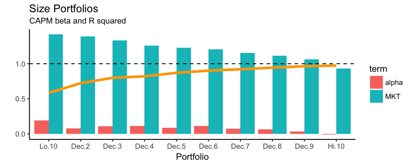
Figure 3.14: The alpha and beta estimates for the CAPM model for 10 portfolio sorted on size. The line represents the \(R^2\) of the regression model.
When extending the analysis to the 3-factor model we find that the MKT exposure is quite similar across portfolios and close to 128. The exposure to SMB risk is high for Lo.10 and reduces as the component of small cap stocks decreases in higher decile portfolios. The contribution of the HML factor to the expected returns of the portfolios follows a similar pattern. Hence, low decile size portfolios benefit from both a small cap and a value perspective. In addition, it turns out that the alpha estimates are negative, in particular for the low quantile portfolios which suggests that the model is actually over-correcting for the small size effect. A visualization of the estimation results is given in Figure 3.15.
ff3fact.plot <- broom::tidy(size.model, fit.3f)  %>%
              mutate(term = plyr::mapvalues(term, from="(Intercept)", to="alpha"))

ggplot(ff3fact.plot) +
   geom_bar(aes(x=Portfolio, y=estimate, fill=term), stat="identity", position="dodge") +
  geom_line(aes(x=Portfolio, y=r.squared, group=1), data=ff3fact.tab, color="orange", size=1.5) +
  theme_classic() + geom_hline(yintercept = 1, color="black", linetype="dashed")+
  labs(x="Portfolio", y="", title="Beta and R square")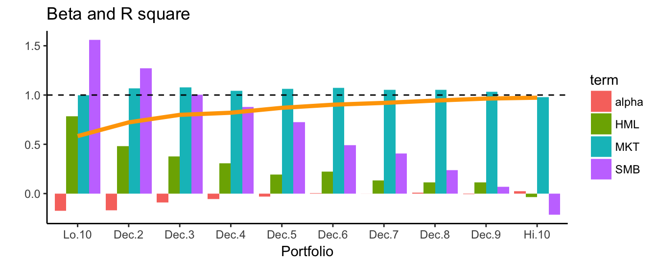
Figure 3.15: The alpha and beta estimates for the 3-factor model for 10 portfolio sorted on size. The line represents the \(R^2\) of the regression model.
Figure 3.16 represents a scatter plot of the alpha of the regression and the MKT beta in the CAPM model. It is interesting to notice that larger alpha are also associated with higher beta. As we saw in Figure 3.14, the combination of large alpha and large beta describes mostly the lowest decile portfolios, while large cap have lower market exposure and no alpha.
ggplot(capm.tab, aes(x=alpha, y=MKT)) + geom_point() +
theme_bw() + geom_smooth(method="lm", se=FALSE, color="darkgreen") 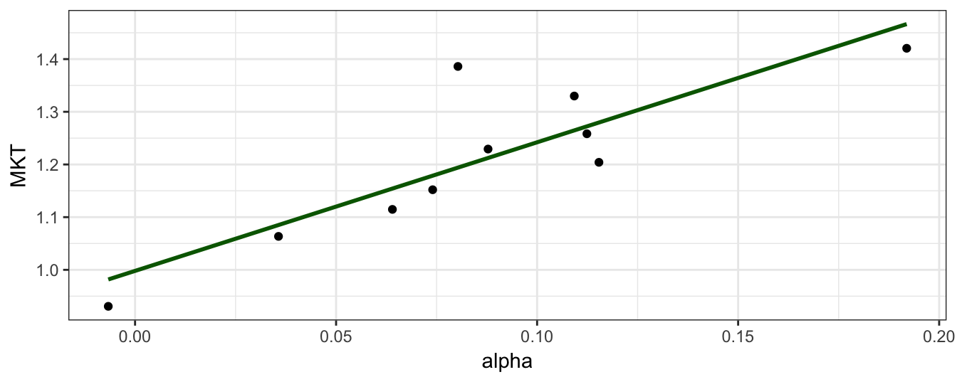
Figure 3.16: Scatter plot of the portfolio alpha and the MKT beta for the 10 portfolios sorted on size.
3.5.4 What a style!
The data on size and BM portfolio returns provided in French’s data library are constructed for academic research and are not actually traded in financial markets. However, there are several products available in the form of mutual funds or ETF for those investors that are interested in getting exposure to these risks. As an example, let’s consider the DFA Small Cap Value mutual fund (ticker: DFSVX) that invests in companies with small capitalization that are considered undervalued according to a valuation ratio (e.g., Book to Market ratio). In this case the name of the fund already provides a clear indication of the type of risks that are involved in investing in such as fund. By regressing the returns of DFSVX on the Fama-French factors we can assess whether the stated investment strategy (small cap value) is indeed followed and whether the fund provides alpha, that is, the expected return that is not due to exposure to market, small cap, and value risks.
DFSVX  <- getSymbols("DFSVX", from = "1993-03-01", auto.assign=FALSE)
DFSVX  <- Ad(to.monthly(DFSVX))
DFSVX  <- 100 * diff(log(DFSVX))
names(DFSVX) <- 'DFSVX'

fit <- lm(DFSVX ~ MKT + SMB + HML, data=merge(factors, DFSVX))
fit.table <- coeftest(fit, vcov=NeweyWest(fit, prewhite = FALSE))
t test of coefficients:

            Estimate Std. Error t value Pr(>|t|)
(Intercept)   0.0112     0.0686    0.16     0.87
MKT           1.0393     0.0204   50.95   <2e-16 ***
SMB           0.7815     0.0651   12.01   <2e-16 ***
HML           0.6688     0.0414   16.14   <2e-16 ***
---
Signif. codes:  0 '***' 0.001 '**' 0.01 '*' 0.05 '.' 0.1 ' ' 1
The results show that DFSVX has statistically significant exposure to all three risk factors, in particular with large positive coefficients both in the SMB and in the HML factors. The \(R^2\) of the regression is 0.96 that is very high and indicates that the factors explain most of the variation in the fund returns. In addition, the alpha is very close to zero and with a t-stat of 0.16 it is not statistically different from zero. The overall picture that emerges is that the DFSVX represents a tradable asset to obtain passive exposure to market, small cap, and value stocks. In addition, keep in mind that we might have ignored the investment strategy followed by the fund, and the simple interpretation of the regression results would have indicated that the manager invests in US small cap value stocks. Although the illustration is for mutual funds that are highly transparent about their investment strategy, the technique can be used also to investigate hedge fund returns or the returns of an investment strategy.
Let’s practice using the Fama-French 3-factor model. Assume that you are assigned the task of classifying the investment style of 7 mistery funds that you are given to analyze. The only information you are provided is that these funds invest in U.S. equity only. This is called style analysis in the sense that you are trying to understand the investment style or philosophy of a mutual or hedge fund. In the code below, I retrieve prices for 7 mistery.ticks from Yahoo Finance and create the monthly returns. Notice some new features in the code below:
- An environment called
mistery.envis defined where the functiongetSymbols()stores the sevenxtsobjects - Function
eapply()is anapplyfunction that is used for environments and applies a function to each element of an environment - The function that is used in
eapply()to each of the seven elements isfunction(x) 100 * ClCl(to.monthly(x))which calculates the percentage return as follows:- takes element
xof the environment - subsamples to monthly frequency using
to.monthly() - calculates the close-to-close return with function
ClCL() - multiplies by 100 to make the return percentage
- takes element
mistery.listis a list with each element representing axtsobject with the return of a mistery fundReduce()merges the elements in the list in axts-object that has seven columns; keep in mind that each fund might have started at different points in time so that merging takes care of aligning the dates appropriately.- The columns/variables of the
mistery.retare namedFUND1toFUND7to keep their anonymity
The last three observations are shown below. Relative to the previous Chapter, we introduced the eapply() function that is not very often used by intermediate R programmers, but it is very useful in this case to extract the information needed in a few lines of code. Also, notice that this code could have been generalized to a larger number of tickers with no additional programming effort.
# mistery.ticks is a vector with 7 "mistery" tickers
mistery.env    <- new.env()
mistery.ticks  <- getSymbols(mistery.ticks, from = "1995-03-01", env = mistery.env)
mistery.list   <- eapply(mistery.env, function(x) 100*ClCl(to.monthly(x)))
mistery.ret    <- Reduce(merge, mistery.list[mistery.ticks])
mistery.names  <-  paste("FUND", 1:length(mistery.ticks), sep="")
colnames(mistery.ret) <- mistery.names
tail(mistery.ret, 3)
FUND1 FUND2 FUND3 FUND4 FUND5 FUND6 FUND7
Mar 2017 -0.38 -0.41 0.048 -1.36 -1.179 0.54 0.30
Apr 2017 1.03 0.88 1.591 0.66 0.461 2.33 1.02
May 2017 0.70 0.12 -0.047 0.41 -0.027 0.23 0.54Once we create the returns for the seven funds, the next step is to estimate the 3-factor model. In this case we can follow the earlier approach of using mistery.ret in the lm() formula that will estimate the regression model on MKT, SMB, and HML for each column/variable. Can you tell the style of these funds based on the results on Table 3.12? Which fund invests in large, large value, large growth, small, small value, and small growth stocks?
mistery.data       <- merge(mistery.ret, factors)
fit                <- lm(mistery.data[,mistery.names] ~ MKT + SMB + HML, data=mistery.data)
mistery.rsq <- sapply(summary(fit), function(x) AD.RSQ = x$adj.r.squared)| FUND1 | FUND2 | FUND3 | FUND4 | FUND5 | FUND6 | FUND7 | |
|---|---|---|---|---|---|---|---|
| (Intercept) | -0.20 | -0.35 | -0.43 | -0.385 | -0.53 | -0.13 | -0.18 |
| MKT | 0.99 | 1.02 | 0.99 | 1.102 | 1.07 | 1.00 | 1.01 |
| SMB | -0.15 | 0.76 | 0.86 | -0.002 | 0.80 | 0.68 | -0.13 |
| HML | -0.02 | 0.28 | 0.34 | 0.321 | 0.51 | 0.08 | -0.12 |
| R squared | 0.98 | 0.92 | 0.88 | 0.919 | 0.90 | 0.95 | 0.96 |
When we apply the lm() function to a data frame as the dependent variable the function estimates the parameters on the same set of observations for all variables, that is, eliminating missing values. This can be an issue in this dataset since these funds started at different point in time29. For example, the earliest fund started in Apr 1995 and the latest in Jan 2013 so that the approach followed above drops many years of data for the longest existing funds. This is not necessarily a bad thing, since there are situation in which you might want to estimate the model parameters for all funds on the same time period. However, there are also cases in which you want to estimate the coefficient on the longest available sample for each fund. If this is the case, then we need to take a different coding strategy relative to the previous one which consists of estimating the 3-factor model having each column of mistery.ret as the dependent variable. This can be done using a loop over the columns of the object or using an apply()-type function that substitutes for the need of the loop. The example below first defines a function myf() that takes a variable x that is a xts object, merges the variables with the factors and then runs a regression of the variable on MKT, SMB, and HML. This function is then passed to sapply() which applies the function to each column of the object mistery.ret. The reason for using sapply() instead of apply() is that it provides a matrix of the results already formatted. Comparing Table 3.13 to 3.12 that are some minor differences on the coefficient estimates, but no major differences relative to the previous case.
myf <- function(x)
{
  data=merge(x,factors)
  fit <- lm(data[,1] ~ MKT + SMB + HML, data=data)
  output <- c(coef(fit), 'R squared' = summary(fit)$r.squared)
  return(output)
}
out <- sapply(mistery.ret,  myf)
knitr::kable(out, digits=3, caption="Estimation results for seven mistery mutual fund
             returns regressed on the Fama-French 3 factors. The estimation is performed
individually on each fund")| FUND1 | FUND2 | FUND3 | FUND4 | FUND5 | FUND6 | FUND7 | |
|---|---|---|---|---|---|---|---|
| (Intercept) | -0.022 | -0.26 | -0.33 | -0.231 | -0.33 | -0.13 | -0.18 |
| MKT | 0.983 | 1.01 | 0.96 | 1.062 | 1.01 | 1.00 | 1.01 |
| SMB | -0.175 | 0.78 | 0.93 | -0.095 | 0.74 | 0.68 | -0.13 |
| HML | 0.035 | 0.29 | 0.20 | 0.562 | 0.62 | 0.08 | -0.12 |
| R squared | 0.988 | 0.90 | 0.81 | 0.844 | 0.85 | 0.95 | 0.96 |
Footnote30 provides the solution to the mistery.
3.6 Omitted variable bias
An important assumption that is introduced when deriving the properties of the OLS estimator is that the regressors included in the model represent all those that are relevant to explain the dependent variable. However, in practice it is difficult to make sure that this assumption is satisfied. In some situations we might not observe a variable that we believe relevant to explain the dependent variable, while in other situations we might not know which variables are actually relevant. What is the effect of omitting relevant variables on the OLS coefficient estimates? The answer depends on the correlation between the omitted variable and the included variable(s). If the omitted and included variables are correlated, then the estimate of the slope coefficients of the regressors will be biased, that is, they will be significantly different from their true value. However, if we omit a relevant variable that is not correlated with any of the included variables, then we do not expect any bias in the coefficient estimate. To illustrate this concept, we will discuss first an example on financial data and then perform a simulation exercise to illustrate the bias.
Assume that we are given to analyze a mutual fund return with the aim to understand the risk factors underlying the performance of the fund. Take this as another mistery fund that we want to classify in terms of investment style. We could start the empirical analysis as we did earlier, by assuming that the relevant factors to include in the regression are the Fama-French factors. The 3-factor model is thus given by \(R^{fund}_t = \beta_0 + \beta_1 * MKT_t + \beta_2 * SMB_t + \beta_3 * HML_t + \epsilon_t\) and its estimation by OLS provides the following results:
t test of coefficients:

            Estimate Std. Error t value Pr(>|t|)
(Intercept)   0.0345     0.3944    0.09    0.930
MKT           1.0381     0.0757   13.72   <2e-16 ***
SMB           0.2768     0.1229    2.25    0.025 *
HML          -0.0187     0.1102   -0.17    0.865
---
Signif. codes:  0 '***' 0.001 '**' 0.01 '*' 0.05 '.' 0.1 ' ' 1
The fund has an exposure of 1.04 against the US equity market that is highly significant. In addition, there seems to be significant (at 10%) exposure to SMB with a coefficient of 0.28 and a t-statistic of 2.25, but not to HML which has a t-statistic of -0.17. In addition, the R\(^2\) of the regression is equal to 0.53, which indicates a reasonable fit, although for this type of regressions we typically expect larger goodness-of-fit statistics (see the previous Section). Based on these results, we would conclude that the exposure to MKT makes the fund sensitive to the fluctuations of the overall US equity market, in addition to some exposure to the small cap premium deriving from increase exposure to small caps. However, it turns out that the fund is the Oppenheimer Developing Markets (ticker: ODMAX) which is a fund that invests exclusively in stocks from emerging markets and does not hold any US stock. How do we make sense of the regression results above and the stated investment strategy of the fund? How is it possible that the exposures to the MKT and SMB are large and significant in the regression above but the fund does not hold any US stock? It is possible because the MKT and SMB might be correlated with an omitted risk factor (e.g., emerging market risk) which causes bias in the estimates for MKT and SMB. The bias is due to the fact that omitting a relevant risk factor makes the MKT and SMB look significant since they co-move, to a certain extent, to that omitted factor although they would not be relevant if the omitted factor was included. The solution in this application is to include other factors that are more appropriate to proxy for the risk exposure of the fund. Given the investment objective of the fund, we could consider including as an additional risk factor the MSCI Emerging Markets (EM) Index. In terms of correlation between the EM factor and the Fama-French factors, the results below indicate that there is a strong positive correlation with the US-equity market and by smaller correlations with SMB (positive) and HML (negative).
  MKT   SMB   HML
 0.69  0.26 -0.14
It seems thus reasonable to include the EM factor as an additional risk factor to explain the performance of ODMAX. The Table below shows the estimation results of a regression of ODMAX excess monthly returns on 4 factors, the EM factor in addition to the FF factors.
t test of coefficients:

            Estimate Std. Error t value Pr(>|t|)
(Intercept)   0.3716     0.2326    1.60    0.112
EEM           0.7234     0.0642   11.26   <2e-16 ***
MKT           0.1938     0.0822    2.36    0.019 *
SMB           0.1554     0.0878    1.77    0.078 .
HML           0.0200     0.0632    0.32    0.751
---
Signif. codes:  0 '***' 0.001 '**' 0.01 '*' 0.05 '.' 0.1 ' ' 1
Not surprisingly, the estimated exposure to EM is 0.72 and highly significant, whilst the exposure to the FF factors has declined significantly. In particular, adding EM to the regression has the effect of reducing the coefficient of the MKT from 1.04 to 0.19. The drop in the MKT beta is due to the fact that in the first regression part of the coefficient of MKT was actually proxing for the effect of EM. The estimate from the first regression of 1.04 is biased because it captures both the effect of MKT on ODMAX, but also represents a good proxy for the omitted source of risk of the EM Index, given the large and positive correlation between MKT and EM. The effect of omitted variables and the resulting bias in the coefficient estimates is not only an econometric issue, but it has important practical implications. If we use the LRM for performance attribution, that is, disentangling the systematic component of the fund return (beta) from the risk-adjusted part (alpha), then omitting some relevant risk factors has the effect of producing bias in the remaining coefficients and thus changes our conclusion about the contribution of each component to the performance of the fund. Typically, for mutual funds we have a clear idea of the investment strategy and the type of risks that the asset returns are exposed to. However, hedge funds are less transparent about their investment strategy and it might be difficult to pick the right factors and the coefficient estimates might be biased.
3.6.1 A simulation exercise
We can perform a simulation to illustrate the effect of omitted variables in producing biased coefficient estimates. The steps of the simulation are as follows:
We will assume that the dependent variable \(Y_t\) (for \(t=1, \cdots, T\)) is generated by the following model: \[ Y_t = 0.5 * X_{1,t} + 0.5 * X_{2,t} + \epsilon_t \] where the factors \(X_{1,t}\) and \(X_{2,t}\) are simulated from the (multivariate) normal distribution with mean 0 and variance 1 for both variables, with their correlation set equal to \(\rho\). The error term \(\epsilon_t\) is also normally distributed with mean 0 and standard deviation 0.5. In the context of this simulation exercise, the model above for \(Y_t\) represents the true model with the population parameter values equal to \(\beta_0 = 0\) and \(\beta_1 = \beta_2 = 0.5\).
We then estimate by OLS the following model: \[ Y_t = \beta_0 + \beta_1 X_{1,t} + \eta_t \] where we intentionally omit the factor \(X_{2,t}\) from the regression. Notice that \(X_{2,t}\) is both a relevant variable to explain \(Y_t\) (since \(\beta_2 = 0.5\)) and it is correlated with \(X_{1,t}\) if we set \(\rho \not= 0\)
We repeat step 1-2 S times and store the estimate of \(\beta_1\)
We can then analyze the properties of \(\hat\beta_1\), the estimate of \(\beta_1\), by, for example, plotting a histogram of the S values obtained in the simulation. If omitting \(X_{2,t}\) does not introduce bias in the estimate of \(\beta_1\), then we expect the histogram to be centered at the true value of the parameter 0.5. Instead, the histogram will be shifted away from the true value of the parameter if the omission introduces bias. The code below starts by setting the values of the parameters, such as the number of simulations, length of the time series, and the parameters of the distributions. Then the for loop iterates S times step 1 and 2 described above, while the bottom part of the program plots the histogram.
library(MASS) # this package is needed for function `mvrnorm()` to simulate from the
              # multivariate normal distribution

S     <- 1000                         # set the number of simulations
T     <- 300                          # set the number of periods
mu    <- c(0,0)                       # mean of variables X1 and X2
cor   <- 0.7                          # correlation coefficient between X1 & X2
Sigma <- matrix(c(1,cor,cor,1), 2, 2) # covariance matrix of X = [X1, X2]
beta  <- c(0.5, 0.5)                  # slope coefficient of X = [X1, X2]
eps   <- rnorm(T, 0, 0.5)             # errors

betahat <- matrix(NA, S, 1)           # vector to store the estimates of beta1

for (i in 1:S)                        # loop starts here
{                                             # simulate the indep. variable X = [X1, X2]
  X   <- mvrnorm(T, mu, Sigma)                # `mvnorm` from package MASS simulate the
                                              # multivariate normal distribution (dim: Nx2)
  Y   <- beta[1]*X[,1] + beta[2] * X[,2] + eps# simulate the dep. variable Y (dim: Nx1)
  fit <- lm(Y ~ X[,1])                        # fit the linear model of Y on X1 but not X2
  betahat[i] <- coef(fit)[2]                  # store the estimated coefficient of X1
}                                     # loop ends here

# set the limits of the x-axis
xmin <- min(min(betahat), 0.3)
xmax <- max(betahat)
ymax <- 13

# plot the histogram of betahat together with a vertical line at the true value of beta
ggplot() + geom_histogram(aes(betahat, y = ..density..), bins=50, fill="white", color="black") +
           xlim(c(xmin, xmax)) + ylim(c(0,ymax)) + geom_vline(xintercept = beta[1], col="red", size=1) +
           annotate("text", label = "true value", x = beta[1]+0.1, y =11, size = 5, colour = "red") +
           labs(x="",title="Histogram of estimated beta")
In the simulation exercise we set the correlation between \(X_{1,t}\) and \(X_{2,t}\) equal to 0.7 (line cor = 0.7) and it is clear from the histogram above that the distribution of the OLS estimate is shifted away from the true value of 0.5. This illustrates quite well the problem of omitted variable bias: we expect the estimates of \(\beta_1\) to be close to the true value of 0.5, but we find that these estimates range from 0.75 to 0.95. This bias does not disappear using longer samples since it is due to the fact that we omitted a relevant variable that is highly correlated with an included variable. If the omitted variable was relevant but uncorrelated with the included variable, then the histogram of the OLS estimates would look like the following plot that is produced with the same code used above, but by setting cor = 0.
R commands
| annotate() | coeftest() | geom_abline() | mean() | rbind() | spread() |
| apply() | colnames() | inner_join() | median() | read_excel() | summary.lm() |
| arrange() | download() | kable() | mvrnorm() | rnorm() | which.min() |
| as.yearmon() | gather() | lm() | NeweyWest() | sapply() |
| downloader | lmtest | readxl | tidyr |
| knitr | MASS | sandwich |
Exercises
- Use the dataset of Welch and Goyal (2008) to investigate the predictability of stock returns at the quarterly and monthly frequency:
- Plot the scatter plot of the
DPratio and the equity premium at the quarterly and monthly frequency - Estimate the linear regression model of the future equity premium on the
DPratio using Newey-West standard errors. Is there evidence of predictability?
- Plot the scatter plot of the
- Morningstar is an investment advisory company that has developed a style box to classify US equity mutual funds as shown in Figure 3.17 and a detailed discussion is discussed in this factsheet. The style box is a popular tool to assess the characteristics of a mutual fund and it is provided in the profile page of a mutual fund in Yahoo Finance.
Figure 3.17: the Morningstar Investment Style Box
Answer the following questions: - Use the Fama-French 3-factor model to classify three of the following mutal funds in the style box - Check the name and profile in Yahoo Finance or Morningstar to compare your analysis
| SPY | SCHV | PDP | FNX | SDY | DWAQ | RPG | PRF | PXMC | QQEW |
| PWV | FDV | FTC | VXF | RWL | RYJ | VTI | FAB | RWG | PFM |
| MDYV | SLYV | RZG | VYM | VBK | QQEW | PWC | RFG | MDYG | SCHB |
| SPHQ | SCHG | RWJ | PRFZ | VYM | SPYV | VIG | MGK | EXT | EZM |
| PXSG | PBP | PXSC | SLY | FAD | PXMC | PWB | VIG | PXSG | NDQ |
- Adrian, Crump, and Vogt (2015) use a cubic polynomial to model the relationship between the VIX in month \(t\) and the cumulative return of the S&P500 Index in the following 6-months, that is, \[R_{t:t+6}=\beta_0 + \beta_1 VIX_{t} + \beta_2 VIX_t^2 + \beta_3 VIX_t^3 + \epsilon_t \] where \(R_{t:t+6} = log(R_{t+6}) - log(R_t)\). Answer the following questions:
- Estimate the model using the tickers
^GSPCand^VIXfor the two assets starting from January 1990 at the monthly frequency - What is the expect return in the 6-months following a VIX value of 55%?
- Test the null hypothesis that the model is linear
- Test the null hypothesis that the model is quadratic as opposed to cubic
- Produce a graph similar to Figure 3.18 and comment the results
- Remove the two monthly observations when the
VIXindex was higher than 50% and estimate the model on the remaining observations and answer the following questions:- is the shape of the cubic regression line different?
- What is the expect return in the 6-months following a VIX value of 55%? Compare with the earlier result
- Do you reject the null of linearity?
- Is the cubic term signficant?
- What is your conclusion about the robustness of the analysis on the full sample?
Figure 3.18: Relationship between the VIX and the cumulative SP 500 return in the following 6-month. The linear and cubic regressions are also shown.
- Consider the 10 size portfolios. Estimate the CAPM and the 3-factor model on sub-periods of 10 years
References
Welch, Ivo, and Amit Goyal. 2008. “A Comprehensive Look at the Empirical Performance of Equity Premium Prediction.” Review of Financial Studies 21 (4). Soc Financial Studies: 1455–1508.
Stock, James H, and Mark W Watson. 2010. Introduction to Econometrics. Addison Wesley.
Wooldridge, Jeffrey M. 2015. Introductory Econometrics: A Modern Approach.
Newey, Whitney K., and Kenneth D. West. 1987. “A Simple, Positive Semi-Definite, Heteroskedasticity and Autocorrelation Consistent Covariance Matrix.” Econometrica 55: 703–8.
Fama, Eugene F, and Kenneth R French. 1993. “Common Risk Factors in the Returns on Stocks and Bonds.” Journal of Financial Economics 33 (1). Elsevier: 3–56.
Adrian, Tobias, Richard K Crump, and Erik Vogt. 2015. “Nonlinearity and Flight to Safety in the Risk-Return Trade-Off for Stocks and Bonds.” Federal Reserve of New York Working Paper.
We will spend more time on explaining why there could be a difference between in-sample results and out-of-sample (real-time). For now know this: in-sample means that we calculate the goodness of the predictive relationship on the same data that we use to estimate the parameters, while out-of-sample (or real-time if you prefer) means that we estimate the parameters of the relationship on past data but calculate the goodness of the relationship on future data.↩
A rule-of-thumb emerging from this model is that next year returns are expected to be twice the end-of-year
DPratio.↩The quantities discussed below should sound familiar and reflect concepts that you understand already. If they are not familiar, please review a introductory econometrics textbook for a more detailed treatment.↩
\(R^2\) equal to 1 means that the sum of squared errors is equal to zero that is only possible when the fitted equity premium is equal to the realized equity premium.↩
The data is available at the website http://www.hedgeindex.com upon registration.↩
This specification is called piece-wise linear in the sense that it is linear in a certain range of the independent variable.↩
One common situation in which this happens is when dummy variables are used in the regression. For example, assume that we are analyzing daily data and we create 7 dummy variables called
Mondaywhich is 1 every Monday and zero otherwise, and similarly for the other days of the week. If we include in the regression the intercept and the seven daily dummy variables for each day the sum of the dummy variables equals 1 which is the constant (think of the intercept as 1 times a constant value \(\beta_0\)). There are two solutions to this problem: 1) include the intercept \(\beta_0\) and drop one of the sevel dummy variables, or 2) exclude the intercept and include all seven dummy variables. If you include the intercept and the seven dummy variables the commandlm()does not provide an error message bu automatically drops one of the dummy variables and then estimate the model.↩The plot is made using the
plot.zoo()since this function (contrary toplot.xts) produces a graph with a time series plot for each variable in the object (up to 10).↩Remember that the \(R^2\) is one minus the ratio of the variance of the residuals divided by the variance of the dependent variable; the values in the table are the standard deviations of the residuals and the quantities should be squared to calculate \(R^2\) (also, the \(R^2\) reported is adjusted).↩
Compare the MKT beta estimate for the CAPM model in Figure 3.14 and ??: why did they become smaller when estimating the 3-factor model on the low decile portfolios?↩
However, this was not a problem earlier when estimating the size and BM portfolios because we had complete observations for all portfolios↩
The mistery funds are: 1) DFUSX: DFA US Large Company, 2) DFSTX: DFA US Small Cap, 3) DFSCX: DFA US Micro Cap, 4) DFLVX: DFA US Large Cap Value, 5) DFSVX: DFA US Small Cap Value, 6) DSCGX: DFA US Small Cap Growth Instl, 7) DUSLX: DFA US Large Cap Growth Instl↩