4 Time Series Models
The goal of the LRM of the previous Chapter is to relate the variation (over time or in the cross-section) of variable \(Y\) with that of an explanatory variable \(X\). Time series models assume that the independent variable \(X\) is represented by past values of the dependent variable \(Y\). We typically denote by \(Y_t\) the value of a variable in time period \(t\) (e.g., days, weeks, and months) and \(Y_{t-1}\) refers to the value of the variable in the previous time period relative to today (i.e., \(t\)). More generally, \(Y_{t-k}\) (for \(k\geq 1\)) indicates the value of the variable \(k\) periods before \(t\). The notation \(\Delta Y_t\) refers to the one-period change in the variable, that is, \(\Delta Y_t = Y_{t} - Y_{t-1}\), while \(\Delta^k Y_t = Y_t - Y_{t-k}\) represents the change over \(k\) periods of the variable. The aim of time series models can be stated as follows: is there useful information in the current and past values of a variable to predict its future?
4.1 The Auto-Correlation Function (ACF)
A first exploratory tool that is used in time series analysis is the Auto-Correlation Function (ACF) that represents the correlation coefficient between the variable \(Y_t\) and its lagged value \(Y_{t-k}\) (hence the Auto part). We denote the sample correlation coefficient at lag \(k\) by \(\hat\rho_k\) that is calculated as follows: \[\hat{\rho}_k = \frac{\sum_{t=1}^T (Y_t - \bar{Y})(Y_{t-k}-\bar{Y}) / T}{\hat\sigma^2_Y}\] where \(\bar{Y}\) and \(\hat\sigma^2_Y\) denote the sample mean and variance of \(Y_t\). The auto-correlation is bounded between \(\pm\) 1 with positive values indicating that values of \(Y_{t-k}\) above/below the mean \(\mu_Y\) are more likely to be associated with values of \(Y_t\) above/below the mean. In this sense, positive correlation means that the variable has some persistence in its fluctuations around the mean. On the other hand, negative values represent a situation in which the variable is more likely to reverse its past behavior. The ACF is called a function because \(\hat\rho_k\) is typically calculated for many values of \(k\). The R function to calculate the ACF is acf() and in the example below we apply it to the monthly returns of the S&P 500 Index from January 1990 until May 2017. The acf() function requires to specify the lag.max that represents the maximum value of \(k\) to use and the option plot that can be set to TRUE if the ACF should be plotted or FALSE if the estimated values should be returned.
library(quantmod)
sp.data    <- getSymbols("^GSPC", start="1990-01-01", auto.assign=FALSE)
spm        <-  Ad(to.monthly(sp.data))
names(spm) <- "price"                    # rename the column "price" from "..Adjusted"
spm$return <- 100 * diff(log(spm$price)) # create the returns
spm        <- na.omit(spm)               # drops the first observation that is NA
# plot the ACF function
acf(spm$ret, lag.max=12, plot=TRUE)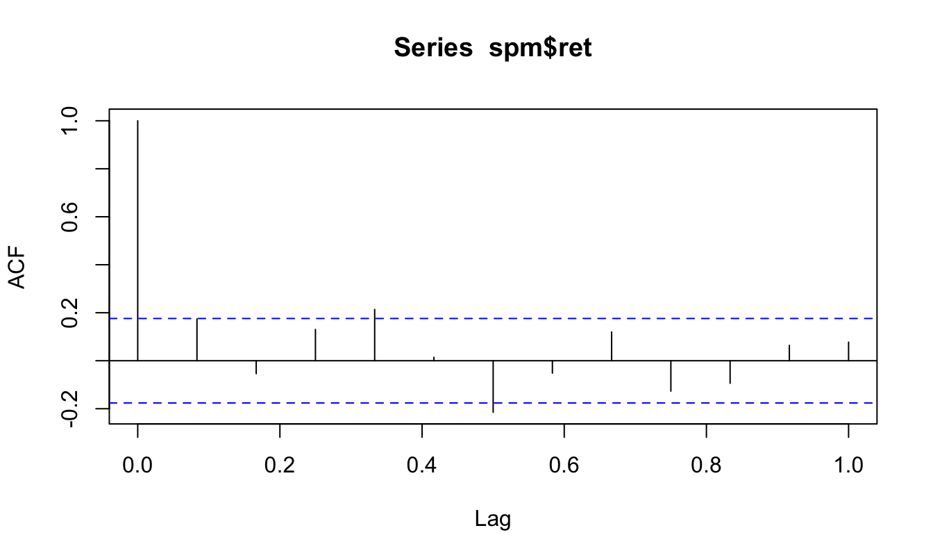
The function provides a graph with the horizontal axis representing the lag \(k\) (starting at 0 and expressed as a fraction of a year) and the vertical axis representing the value of \(\hat\rho_k\). The horizontal dashed lines are equal to \(\pm 1.96/\sqrt{T}\) and represent the confidence interval for the null hypothesis that the autocorrelation is equal to 0. If the auto-correlation at lag \(k\) is within the interval we conclude that we fail to reject the null that the auto-correlation coefficient is equal to zero (at 5% level). The plot produced by acf() uses the default R plotting function, although we might prefer a more customized and elegant graphical output using the ggplot2 package. This package does not provide a ready-made function to plot the ACF31, but we can easily solve this problem by creating a data frame that contains the lag \(k\) and the estimate of the auto-correlation \(\hat\rho_k\) and pass it to ggplot() function for plotting. The code below provides an example of how to produce a ggplot of the ACF.
Tm = length(spm$return)
spm.acf <- acf(spm$return, lag.max=12, plot=FALSE)
spm.acf <- data.frame(lag= 0:12, acf = spm.acf$acf)

library(ggplot2)
ggplot(spm.acf, aes(lag, acf)) +
  geom_bar(stat="identity", fill="orange") +
  geom_hline(yintercept =  1.96 * Tm^(-0.5), color="steelblue3", linetype="dashed") +
  geom_hline(yintercept = -1.96 * Tm^(-0.5), color="steelblue3", linetype="dashed") +
  theme_classic()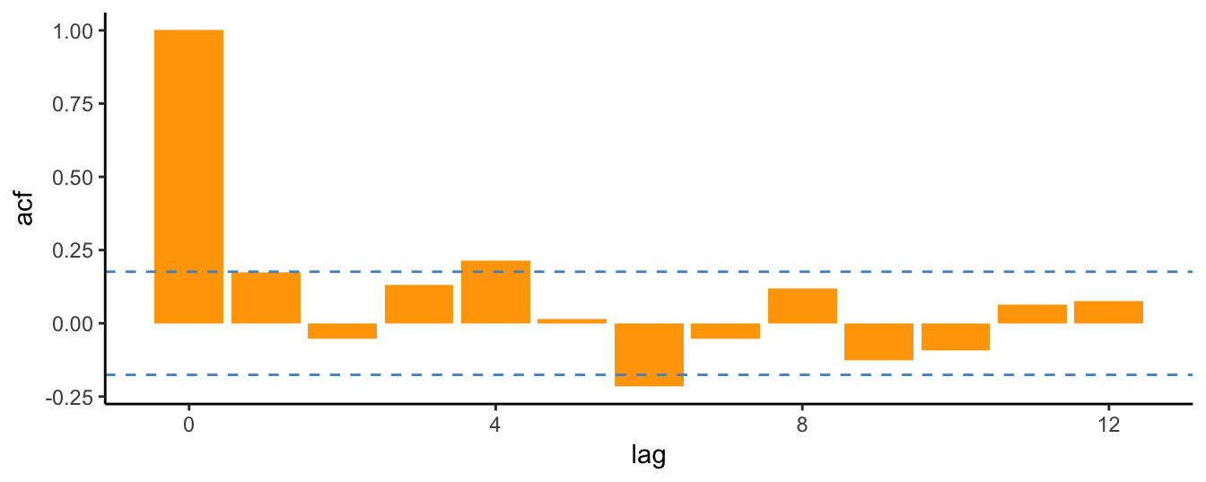
The analysis of monthly returns for the S&P 500 Index shows that the auto-correlations are quite small and only few of them are statistically different from zero at 5% (such as lags 4, 6). The ACF results indicate that there is very weak dependence in monthly returns so that lagged values might not be very useful in forecasting future returns. The conclusion is not very different when considering the daily frequency. The code below uses the dataset downloaded earlier to create a data frame spd with the adjusted closing price and the return at the daily frequency. In addition, we can exploit the flexibility of ggplot2 to write a function to perform the task. In the example below, the function ggacf is created that takes the following arguments:
- y is a numerical vector that represents a time series
- lag represents the maximum lag to calculate the ACF; if not specified, the default is 12
- plot.zero takes values yes/no if the user wants to plot the autocorrelation at lag 0 (which is always equal to 1); the default is no
- alpha the significance level for the confidence bands in the graph; default is 0.05
spd        <-merge(Ad(sp.data), 100*ClCl(sp.data))
names(spd) <- c("price","return")
spd        <- na.omit(spd)
#  a function to plot the ACF using ggplot2
ggacf <- function(y, lag = 12, plot.zero="no", alpha = 0.05)
{
  T    <- length(y)

  y.acf <- acf(y, lag.max=lag, plot=FALSE)
  if (plot.zero == "yes") y.acf <- data.frame(lag= 0:lag, acf = y.acf$acf)
  if (plot.zero == "no")  y.acf <- data.frame(lag= 1:lag, acf = y.acf$acf[-1])

  library(ggplot2)
  ggplot(y.acf, aes(lag, acf)) +
  geom_bar(stat="identity", fill="orange") +
  geom_hline(yintercept =  qnorm(1-alpha/2) * T^(-0.5), color="steelblue3", linetype="dashed") +
  geom_hline(yintercept =  qnorm(alpha/2) * T^(-0.5), color="steelblue3", linetype="dashed") +
  geom_hline(yintercept = 0, color="steelblue3") +
  theme_classic() + ylab("") + ggtitle("ACF")
}
# use the function
ggacf(spd$return, lag=25)
Figure 4.1: Auto-Correlation Function (ACF) for the daily returns of the SP 500.
There are 2606 daily returns in the sample so that the confidence band in Figure 4.1 is narrower around zero and several auto-correlations are significantly different from 0 (at 5% signficance level). Interestingly, the first order correlation is negative and significant suggesting that daily returns have a weak tendency to reverse the previous day change. A stylized fact is that daily returns are characterized by small auto-correlations, but large values of \(\hat\rho_k\) when the returns are in absolute value or squared. Figure 4.2 shows the ACF for the absolute and squared daily returns up to lag 100 days:
p1  <- ggacf(abs(spd$return), 100)
p2  <- ggacf(spd$ret^2, 100)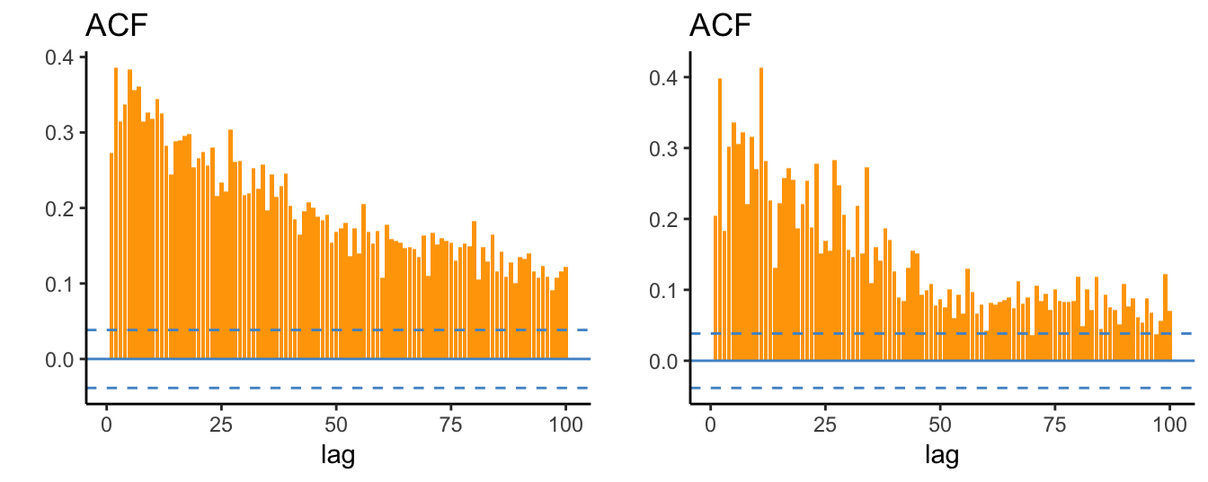
Figure 4.2: Auto-correlation function of absolute (left) and square (right) daily returns of the SP 500.
These plots make clear that the absolute and square returns are significantly and positively correlated and that the auto-correlations decay very slowly as the lag increases. This shows that large (small) absolute returns are likely to be followed by large (small) absolute returns since the magnitude of the returns is auto-correlated rather than their direction. This pattern is consistent with the evidence that returns display volatility clusters that represent periods of high volatility that can last several months, followed by long periods of lower volatility. This suggests that volatility (in the sense of absolute or squared returns) is persistent and strongly predictable, while returns are weakly predictable. We will discuss this topic and volatility models in the next Chapter.
4.2 The Auto-Regressive (AR) Model
The evidence in the ACF indicates that lagged values of the returns or absolute/square returns might be informative about the future value of the variable itself and we would like to incorporate this information in a regression model. The Auto-Regressive (AR) model is a regression model in which the independent variables are lagged values of the dependent variable \(Y_t\). If we include only one lag of the dependent variable, we denote the model by AR(1) which is given by \[Y_t = \beta_0 + \beta_1 Y_{t-1} + \epsilon_t\] where \(\beta_0\) and \(\beta_1\) are coefficients to be estimated and \(\epsilon_t\) is an error term with mean zero and variance \(\sigma^2_{\epsilon}\). More generally, the AR(p) model might include p lags of the dependent variable to account for the possibility that information relevant to predict \(Y_t\) is dispersed over several lags. The AR(p) model is given by \[Y_t = \beta_0 + \beta_1 Y_{t-1} + \beta_2 Y_{t-2} + \cdots + \beta_p Y_{t-p} + \epsilon_t\] The properties of the AR(p) model are:
- \(E(Y_t | Y_{t-1}, \cdots, Y_{t-p}) = \beta_0 + \beta_1 Y_{t-1} \cdots + \beta_p Y_{t-p}\): the expected value of \(Y_t\) conditional on the recent p realizations of the variable can be interpreted as a forecast since only past information is used to produce an expectation of the variable today.
- \(E(Y_t) = \beta_0 / (1-\beta_1 - \cdots - \beta_p)\): represents the unconditional expectation or the long-run mean of \(Y_t\) \[\begin{array}{rl}E(Y_t) =& \beta_0 + \beta_1 E(Y_{t-1})+\cdots+\beta_2 E(Y_{t-p}) + E(\epsilon_t)\\ = & \frac{\beta_0}{1-\sum_{j=1}^p \beta_j}\end{array}\] assuming that \(E(Y_t) = E(Y_{t-k})\) for all values of \(k\). If the sum of the slopes \(\beta_i\), for \(i=1\),\(\cdots\), \(p\), is equal to one the mean is not defined.
- \(Var(Y_t) = \sigma^2_{\epsilon} / (1-\beta_1^2 - \cdots - \beta_p^2)\) since \[\begin{array}{rl}var(Y_t) =& \beta_1^2 Var(Y_{t-1})+\cdots+\beta_2^2 Var(Y_{t-p}) + Var(\epsilon_t)\\ = & \left(\sum_{j=1}^p \beta_j^2\right)Var(Y_{t}) + \sigma^2_{\epsilon}\\= & \frac{\sigma^2_{\epsilon}}{1-\sum_{j=1}^p \beta^2_j}\end{array}\] where \(Var(Y_t) = Var(Y_{t-k})\) for all values of \(k\).
- The sum of the slopes \(\beta_i\) is interpreted as a measure of persistence of the time series; persistence measures the extent that past values above/below the mean are likely to persist above/below the mean in the current period.
The concept of persistence is also related to that of mean-reversion which measures the speed at which a time series reverts back to its long-run mean. The higher the persistence of a time series the longer it will take for deviations from the long-run mean to be absorbed. Persistence is associated with positive values of the sum of the betas, while negative values of the coefficients imply that the series fluctuates closely around the mean. This is because a value above the mean in the previous period is expected to be below the mean in the following period, and viceversa for negative values. In economics and finance we typically experience positive coefficients due to the persistent nature of economic shocks, although the daily returns considered above are a case of first-order negative auto-correlation.
4.2.1 Estimation
The AR model can be estimated using the OLS estimation method, but there are also alternative estimation methods, such as Maximum Likelihood (ML). Although both OLS and ML are consistent in large sample, estimating an AR model with these methods might provide slightly different results (see Tsay (2005) for a more extensive discussion of this topic). There are various functions available in R to estimate time series models and we will discuss three of them below. While the first consist of using the lm() function and thus uses OLS in estimation, the functions ar() and arima() are specifically targeted for time series models and have ML as the default estimation method. Let’s estimate an AR(12) model on the S&P 500 return at the monthly frequency.
lm()
The first approach is to use the lm() function discussed in the previous chapter together with the dyn package that gives lm() the capabilities to handle time series data and operations, such as the lag() and diff() operators. The estimation is implemented below32:
library(dyn)
fit <- dyn$lm(return ~ lag(return, 1:12), data = spm)
Estimate Std. Error t value Pr(>|t|)
(Intercept) 0.38768 0.422 0.9183 0.361
lag(return, 1:12)1 0.17071 0.099 1.7269 0.087
lag(return, 1:12)2 -0.03190 0.100 -0.3185 0.751
lag(return, 1:12)3 0.15708 0.100 1.5736 0.119
lag(return, 1:12)4 0.15012 0.100 1.5005 0.137
lag(return, 1:12)5 0.00093 0.100 0.0093 0.993
lag(return, 1:12)6 -0.21437 0.100 -2.1407 0.035
lag(return, 1:12)7 -0.07022 0.100 -0.7014 0.485
lag(return, 1:12)8 0.12011 0.100 1.1954 0.235
lag(return, 1:12)9 -0.11326 0.100 -1.1330 0.260
lag(return, 1:12)10 0.04731 0.100 0.4750 0.636
lag(return, 1:12)11 0.04440 0.100 0.4449 0.657
lag(return, 1:12)12 0.00451 0.098 0.0460 0.963The Table with the results is in the familiar format from the previous chapter. The estimate of the sum of the coefficients of the lagged values is 0.26 which is not very high. This suggests that the monthly returns have weak persistence and that it is difficult to predict the return next month by only knowing the return for the current month. In terms of significance, at 5% level the only lag that is significant is 6 (with a negative coefficient), while the third lag is significant at 10%. The lack of persistence in financial returns at high-frequencies (intra-daily or daily), but also at lower frequencies (weekly, monthly, quarterly), is well documented and it is one of the stylized facts of returns common across asset classes.
ar()
Another function that can be used to estimate AR models is the ar() from the tseries package. The inputs of the function are the series \(Y_t\), the maximum order or lag of the model, and the estimation method. An additional argument of the function is aic that can be TRUE/FALSE. This option refers to the Akaike Information Criterion (AIC) that is a method to select the optimal number of lags in the AR model and will be discussed in more detail below. The code below shows the estimation results for an AR(12) model when the option aic is set to FALSE33:
# estimation method "mle" for ML and "ols" or OLS
ar(spm$return, method="ols", aic=FALSE, order.max=12, demean = FALSE, intercept = TRUE)
Call:
ar(x = spm$return, aic = FALSE, order.max = 12, method = "ols",     demean = FALSE, intercept = TRUE)

Coefficients:
     1       2       3       4       5       6       7       8       9      10      11      12
 0.171  -0.032   0.157   0.150   0.001  -0.214  -0.070   0.120  -0.113   0.047   0.044   0.005

Intercept: 0.388 (0.397)

Order selected 12  sigma^2 estimated as  16.7
Since I opted for method="ols" the coefficient estimates are equal to the one obtained above with the lm() command. A problem with this function is that it does not provide the standard errors of the estimates. To evaluate their statistical significance we can obtain the standard errors of the estimates and calculate the t-statistics for the null hypothesis that the coefficients are equal to zero:
data.table <- data.frame(COEF = fit.ar$ar,
                         SE = fit.ar$asy.se.coef$ar,
                         TSTAT = fit.ar$ar /fit.ar$asy.se.coef$ar,
                         PVALUE = pnorm(-abs(fit.ar$ar /fit.ar$asy.se.coef$ar)))
COEF SE TSTAT PVALUE
1 0.171 0.093 1.837 0.033
2 -0.032 0.094 -0.339 0.367
3 0.157 0.094 1.674 0.047
4 0.150 0.094 1.596 0.055
5 0.001 0.094 0.010 0.496
6 -0.214 0.094 -2.277 0.011
7 -0.070 0.094 -0.746 0.228
8 0.120 0.094 1.271 0.102
9 -0.113 0.094 -1.205 0.114
10 0.047 0.094 0.505 0.307
11 0.044 0.094 0.473 0.318
12 0.005 0.092 0.049 0.480where we can see that only the third and sixth lags are significant at 5%. The standard errors are close but not equal to the values obtained for lm().
arima()
The third function that can be used to estimate AR model is arima(). The function is more general relative to the previous one since it is able to estimate time series models called Auto-Regressive Integrated Moving Average (ARIMA) models. In this Chapter we will not discuss MA processes, and postpone the presentation of the Integrated part to a later Section of the Chapter. We can use the arima() to estimate the AR(p) model and the results shown below are similar in magnitude to the those obtained earlier:
# default estimation method is "ML", for OLS set method="CSS"
arima(spm$return, order=c(12, 0, 0))
Call:
arima(x = spm$return, order = c(12, 0, 0))

Coefficients:
       ar1     ar2    ar3   ar4    ar5     ar6     ar7    ar8    ar9   ar10   ar11   ar12  intercept
      0.18  -0.040  0.128  0.15  0.016  -0.192  -0.065  0.099  -0.12  0.038  0.054  0.004       0.41
s.e.  0.09   0.091  0.091  0.09  0.091   0.091   0.090  0.091   0.09  0.090  0.090  0.090       0.48

sigma^2 estimated as 16.2:  log likelihood = -349,  aic = 726
The coefficient estimates in this case are slightly different from the previous results since the default estimation method in this case is ML instead of OLS.
4.2.2 Lag selection
The most important modeling question when using AR(p) models is the choice of the lag order \(p\). This choice is made by estimating the AR model for many values of \(p\), e.g. from 0 to \(p_{max}\), and then select the order that minimizes a criterion. A popular criterion is the Akaike Information Criterion (AIC) that is similar to the adjusted \(R^2\) calculated for LRM, but with a different penalization term for the number of parameters included in the model. The Akaike Information Criterion (AIC) is calculated as \[AIC(p) = \log(RSS/T) + 2* (1+p) /T\] where \(RSS\) is the Residual Sum of Squares of the model, \(T\) is the sample size, and \(p\) is the lag order of the AR model. The AIC is calculated for models with different \(p\) and the lag selected is the one that minimizes the criterion. This is done automatically by the function ar() when setting the argument aic=TRUE and the results are shown below for the monthly and daily returns:
ar(spm$return, aic=TRUE,  order.max=24, demean = FALSE, intercept = TRUE)
ar(spd$return, aic=TRUE,  order.max=24, demean = FALSE, intercept = TRUE)
Call:
ar(x = spm$return, aic = TRUE, order.max = 24, demean = FALSE,     intercept = TRUE)

Coefficients:
     1       2       3       4       5       6
 0.180  -0.053   0.157   0.152   0.007  -0.214

Order selected 6  sigma^2 estimated as  17.9

Call:
ar(x = spd$return, aic = TRUE, order.max = 24, demean = FALSE,     intercept = TRUE)

Coefficients:
     1       2       3       4       5       6       7       8       9      10      11      12      13      14      15
-0.106  -0.059   0.013  -0.037  -0.047   0.002  -0.030   0.021  -0.014   0.035  -0.016   0.033   0.002  -0.042  -0.047
    16      17      18      19      20      21
 0.047   0.012  -0.060   0.008   0.039  -0.030

Order selected 21  sigma^2 estimated as  1.63
The AIC has selected lag 6 for the monthly returns and 21 for the daily returns. However, a criticism against AIC is that it tends to select large models, that is, models with a large number of lags. In the case of the monthly returns, the ACF showed that they are hardly predictable based on the weak correlations and yet AIC suggests to use information up to 6 months earlier to predict next month returns. As for the daily returns, the order selected is 21 which seems large given the scarse predictability of the time series. An alternative criterion that can be used to select the optimal lag is the Bayesian Information Criterion (BIC) which is calculated as follows: \[BIC(p) = \log(RSS/T) + \log(T) * (1+p) /T\] The only difference with AIC is that the number of lags in the model is multiplied by \(\log(T)\) (instead of \(2\) for AIC). For time series with 8 or more observations the BIC penalization is larger relative to AIC and will lead to the selection of fewer lags. Unfortunately, the function ar() uses only the AIC and does not provide results for other selection criteria. The package FitAR provides the SelectModel() function that does the selection according to the criterion specified by the user, for example AIC or BIC. Below is the application to the monthly returns of the S&P 500 Index where the spm$ret is transformed to a ts object using as.ts() which is the time series type required by this function:
library(FitAR)
SelectModel(as.ts(spm$return), lag.max=24, Criterion="AIC")
SelectModel(as.ts(spm$return), lag.max=24, Criterion="BIC")
p AIC-Exact AIC-Approx
1 6 364 -2.1
2 7 366 -1.2
3 8 367 -0.9
p BIC-Exact BIC-Approx
1 0 372 5.8
2 1 373 9.7
3 2 377 11.2BIC indicates the optimal lag is 0 while AIC selects 6. This is expected since BIC requires a larger improvement in fit to justify including additional lags. Also when considering the top 3 models, AIC chooses larger models relative to BIC.
SelectModel(as.ts(spd$return), lag.max=24, Criterion="AIC")
SelectModel(as.ts(spd$return), lag.max=24, Criterion="BIC")
p AIC-Exact AIC-Approx
1 21 1299 -58
2 20 1300 -58
3 22 1300 -56
p BIC-Exact BIC-Approx
1 2 1339 -11.5
2 1 1344 -18.3
3 3 1346 -5.5At the daily frequency, the order selected by the two criteria is remarkably different: AIC suggests to include 21 lags of the dependent variable, while BIC only 2 days. In general, it is not always the case that more parsimonious models are preferable to larger models, although when forecasting time series it is preferable since they provide more stable forecasts. Adding the argument Best=1 to the SelectModel() function returns the optimal order.
4.3 Forecasting with AR models
One of the advantages of AR models is that they are very suitable to produce forecasts about the future value of the series. Let’s assume that the current time period is \(t\) and we observe the current observation. Assuming that we are using an AR(1) model, the forecast for the value of \(Y_{t+1}\) is given by \[\hat{E}(Y_{t+1}|Y_t) = \hat\beta_0 + \hat\beta_1 * Y_t\] where \(\hat\beta_0\) and \(\hat\beta_1\) are the estimates of the parameters. If we want to forecast the variable two steps ahead, then the forecast is given by
\[\hat{E}(Y_{t+2}|Y_t) = \hat\beta_0 + \hat\beta_1 * \hat{E}(Y_{t+1}|Y_t) = \hat\beta_0(1+\hat\beta_1) + \beta_1^2 * Y_t\] The formula can be generalized to forecasting \(k\) steps ahead which is given by \[\hat E(Y_{t+k} | Y_t) = \hat\beta_0 \left(\sum_{j=1}^k\hat\beta_1^{k-1}\right) + \hat\beta_1^k * Y_t\]
Let’s forecast the daily and monthly returns of the S&P 500 Index. We already discussed how to select and estimate an AR model so that we need only to discuss how to produce the forecasts \(Y_{t+k}\) with \(k\) representing the forecast horizon. The functions predict() and forecast() (from package forecast) calculate the forecast based on a estimation object and the forecast horizon \(k\). The code below shows how to perform these three steps and produce 6-step ahead forecast, in addition to print a table with the results.
bic.monthly      <- SelectModel(as.ts(spm$return), lag.max = 24, Criterion = "BIC", Best=1)
fit.monthly      <- arima(spm$return, order = c(bic.monthly, 0, 0))
forecast.monthly <- forecast::forecast(fit.monthly, h = 6) # h is the forecast horizon
knitr::kable(as.data.frame(forecast.monthly), digits=4, caption=paste("Point and interval forecast for the monthly
returns of the SP 500 Index starting in", end(spm)," and for 12 months ahead."))| Point Forecast | Lo 80 | Hi 80 | Lo 95 | Hi 95 | |
|---|---|---|---|---|---|
| May 11 | 0.41 | -5.2 | 6 | -8.2 | 9 |
| Jun 11 | 0.41 | -5.2 | 6 | -8.2 | 9 |
| Jul 11 | 0.41 | -5.2 | 6 | -8.2 | 9 |
| Aug 11 | 0.41 | -5.2 | 6 | -8.2 | 9 |
| Sep 11 | 0.41 | -5.2 | 6 | -8.2 | 9 |
| Oct 11 | 0.41 | -5.2 | 6 | -8.2 | 9 |
bic.daily      <- SelectModel(as.ts(spd$return), lag.max = 24, Criterion = "BIC", Best=1)
fit.daily      <- arima(spd$return, order = c(bic.daily, 0, 0))
forecast.daily <- forecast::forecast(fit.daily, h = 6, level=c(50,90))
knitr::kable(as.data.frame(forecast.daily), digits=4, caption=paste("Point and interval forecast for the daily
returns of the SP 500 Index starting in", end(spd)," and for 12 days ahead."))| Point Forecast | Lo 50 | Hi 50 | Lo 90 | Hi 90 | |
|---|---|---|---|---|---|
| 2607 | 0.028 | -0.84 | 0.9 | -2.1 | 2.1 |
| 2608 | 0.023 | -0.85 | 0.9 | -2.1 | 2.2 |
| 2609 | 0.029 | -0.85 | 0.9 | -2.1 | 2.2 |
| 2610 | 0.029 | -0.85 | 0.9 | -2.1 | 2.2 |
| 2611 | 0.029 | -0.85 | 0.9 | -2.1 | 2.2 |
| 2612 | 0.029 | -0.85 | 0.9 | -2.1 | 2.2 |
The Table of the S&P 500 forecasts at the monthly frequency shows that they are equal at all horizons. This is due to the fact that BIC selected order 0 and in this case the forecast is given by \(\hat E(Y_{t+k} | Y_t) = \hat\beta_0 = \hat\mu_Y\), where \(\hat\mu_Y\) represents the sample average of the monthly returns. However, at the daily frequency the order selected is 2, and the forecasts start from a different value but rapidly converge toward the sample average of the daily returns. Visualizing the forecasts and the uncertainty around the forecast is a useful tool to understand the strength and the weakness of the forecasts. Figure 4.3 shows the forecast, the forecast intervals around the forecast, and the time series that is being forecast34.
library(ggfortify)
plot.monthly <- autoplot(forecast.monthly)
plot.daily <- autoplot(forecast.daily, include=50) + theme_classic() +
              geom_hline(yintercept = 0, color="hotpink3",alpha = 0.5)
grid.arrange(plot.monthly, plot.daily, ncol=2)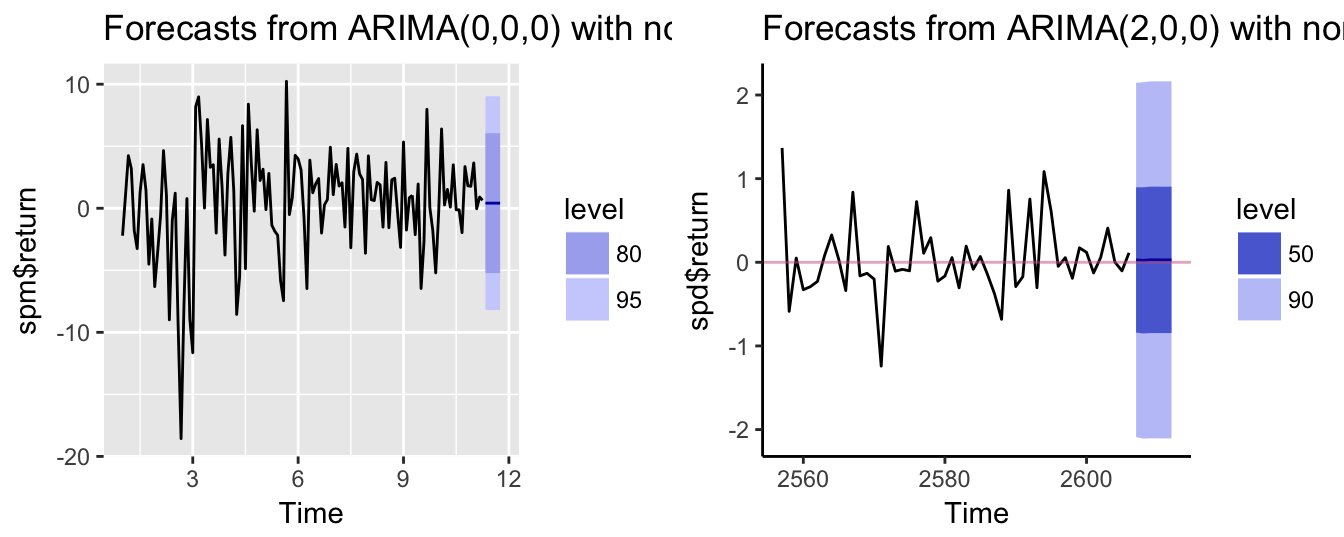
Figure 4.3: Point and interval forecasts for the monthly (left) and daily (right) returns of the SP 500 Index
Let’s consider a different example. Assume that we want to produce a forecast of the growth rate of real GDP for the coming quarters using time series models. This can be done as follows:
- download from
FREDthe time series of real GDP with tickerGDPC1 - transform the series to percentage growth rate
- select the order \(p^*\) using BIC
- estimate the AR(\(p^*\)) model
- produce the forecasts
As an example, assume that we are interested in forecasting the growth rate of GDP in the following quarter. Figure 4.4 shows the most recent 100 quarter of the real GDP growth rate until January 2017 together with 4 quarters of point and interval forecasts. The model forecasts that the GDP growth will moderately increase in the future quarters and that there is approximately 25% probability that output growth becomes negative.
gdp.level  <- getSymbols("GDPC1", src="FRED", auto.assign=FALSE)
gdp.growth <- 100 * diff(log(gdp.level)) %>% na.omit
gdp.p <- SelectModel(as.ts(gdp.growth), lag.max=12, Criterion="BIC", Best=1)
gdp.fit <- arima(gdp.growth, order=c(gdp.p, 0,0))
gdp.forecast <- forecast::forecast(gdp.fit, h=4, level=c(50,75,90))
autoplot(gdp.forecast, include=50) + theme_classic() + geom_hline(yintercept = 0, color="hotpink3")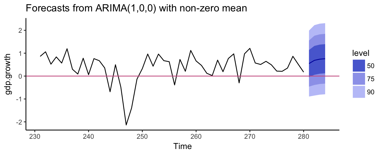
Figure 4.4: The growth rate of real GDP at the quarterly frequency.
4.4 Seasonality
Seasonality in a time series represents a regular pattern of higher/lower realizations of the variable in certain periods of the year. A seasonal pattern for daily data is represented by the 7 days of the week, for monthly data by the 12 months in a year, and for quarterly data by the 4 quarters in a year. For example, electricity consumption spikes during the summer months while being lower in the rest of the year. Of course there are many other factors that determine the consumption of electricity which might change over time, but seasonality captures the characteristic of systematically higher/lower values at certain times of the year. As an example, let’s assume that we want to investigate if there is seasonality in the S&P 500 returns at the monthly frequency. To capture the seasonal pattern we use dummy variables that take value 1 in a certain month and zero in all other months. For example, we define the dummy variable \(JAN_t\) to be equal to 1 if month \(t\) is January and 0 otherwise, \(FEB_t\) takes value 1 every February and it is 0 otherwise, and similarly for the remaining months. We can then include the dummy variables in a regression model, for example, \[Y_t = \beta_0 + \beta_1 X_t + \gamma_2 FEB_t + \gamma_3 MAR_t +\gamma_4 APR_t +\gamma_5 MAY_t+\] \[ \gamma_6 JUN_t +\gamma_7 JUL_t +\gamma_8 AUG_t +\gamma_9 SEP_t + \gamma_{10} OCT_t +\gamma_{11} NOV_t +\gamma_{12} DEC_t + \epsilon_t\] where \(X_t\) can be lagged values of \(Y_t\) and/or some other relevant independent variable. Notice that in this regression we excluded one dummy variable (in this case \(JAN_t\)) to avoid perfect collinearity among the regressors (dummy variable trap). The coefficients of the other dummy variables should then be interpreted as the expected value of \(Y\) in a certain month relative to the expectation in January, once we control for the independent variable \(X_t\). There is an alternative way to specify this regression which consists of including all 12 dummy variables and excluding the intercept: \[Y_t = \beta_1 X_t + \gamma_1 JAN_t + \gamma_2 FEB_t + \gamma_3 MAR_t +\gamma_4 APR_t +\gamma_5 MAY_t +\] \[ \gamma_6 JUN_t +\gamma_7 JUL_t +\gamma_8 AUG_t +\gamma_9 SEP_t + \gamma_{10} OCT_t +\gamma_{11} NOV_t +\gamma_{12} DEC_t + \epsilon_t\] The first regression is typically preferred because a test of the significance of the coefficients of the 11 monthly dummy variables provides evidence in favor or against seasonality. The same hypothesis could be evaluated in the second specification by testing that the 12 parameters of the dummy variables are equal to each other.
We can create the seasonal dummy variables by first defining a variable sp.month using the month() function from package lubridate which identifies the month for each observation in a time series object either with a number from 1 to 12 or with the month name. For example, for the monthly S&P 500 returns we have:
sp.month <- lubridate::month(spm$return, label=TRUE)
head(sp.month, 12)
[1] Feb Mar Apr May Jun Jul Aug Sep Oct Nov Dec Jan
Levels: Jan < Feb < Mar < Apr < May < Jun < Jul < Aug < Sep < Oct < Nov < DecWe can then use the model.matrix() function that simply converts the qualitative variable sp.month to a matrix of dummy variables with one column for each month and value 1 when the date of the observation is in each of the months. The code below shows how to convert the sp.month variable to the matrix of dummy variables sp.month.mat:
sp.month.mat          <- model.matrix(~ -1 + sp.month)
colnames(sp.month.mat) <- levels(sp.month)
head(sp.month.mat, 8)
Jan Feb Mar Apr May Jun Jul Aug Sep Oct Nov Dec
1 0 1 0 0 0 0 0 0 0 0 0 0
2 0 0 1 0 0 0 0 0 0 0 0 0
3 0 0 0 1 0 0 0 0 0 0 0 0
4 0 0 0 0 1 0 0 0 0 0 0 0
5 0 0 0 0 0 1 0 0 0 0 0 0
6 0 0 0 0 0 0 1 0 0 0 0 0
7 0 0 0 0 0 0 0 1 0 0 0 0
8 0 0 0 0 0 0 0 0 1 0 0 0To illustrate the use of seasonal dummy variables we consider a simple example in which the monthly return of the S&P 500 is regressed on the 12 monthly dummy variables. As discussed before, to avoid the dummy variable trap the regression models does not include the intercept in favor of including the 12 dummy variables. The model is implemented as follows:
fit <- lm(spm$return ~ -1 + sp.month.mat) Estimate Std. Error t value Pr(>|t|)
sp.month.matJan -1.782 1.4 -1.278 0.204
sp.month.matFeb 0.586 1.3 0.441 0.660
sp.month.matMar 2.373 1.3 1.785 0.077
sp.month.matApr 2.347 1.3 1.765 0.080
sp.month.matMay 0.036 1.3 0.027 0.978
sp.month.matJun -1.592 1.4 -1.142 0.256
sp.month.matJul 1.741 1.4 1.248 0.215
sp.month.matAug -0.903 1.4 -0.647 0.519
sp.month.matSep -0.059 1.4 -0.042 0.967
sp.month.matOct 0.543 1.4 0.389 0.698
sp.month.matNov 0.144 1.4 0.103 0.918
sp.month.matDec 1.150 1.4 0.824 0.412The results indicate that, in most months, the expected return is not significantly different from zero, except for March and April. In both cases the coefficient is positive which indicates that in those months it is expected that returns are higher relative to the other months. To develop a more intuitive understanding of the role of the seasonal dummies, the graph below shows the fitted or predicted returns from the model above. In particular, the expected return of the S&P 500 in January is -1.78%, that is, \(E(R_t | JAN_t = 1) =\) -1.78, while in February the expected return is \(E(R_t | FEB_t = 1) =\) 0.59% and so on. These coefficients are plotted in the graph below and create a regular pattern that is expected to repeat every year:
Returns seems to be positive in the first part of the year and then go into negative territory during the summer months only to return positive toward the end of the year. However, keep in mind that only March and November are significant at 10%. We can also add the lag of the S&P 500 return to the model above to see if the significance of the monthly dummy variables changes and to evaluate if the goodness of the regression increases:
fit <- dyn$lm(return ~ -1 + lag(return, 1) + sp.month.mat, data = spm) Estimate Std. Error t value Pr(>|t|)
lag(return, 1) 0.201 0.093 2.157 0.033
sp.month.mat1 -2.013 1.380 -1.459 0.148
sp.month.mat2 1.224 1.386 0.883 0.379
sp.month.mat3 2.256 1.313 1.718 0.089
sp.month.mat4 1.870 1.330 1.405 0.163
sp.month.mat5 -0.435 1.330 -0.327 0.744
sp.month.mat6 -1.588 1.376 -1.154 0.251
sp.month.mat7 2.061 1.384 1.489 0.139
sp.month.mat8 -1.253 1.385 -0.904 0.368
sp.month.mat9 0.123 1.378 0.089 0.929
sp.month.mat10 0.555 1.376 0.403 0.688
sp.month.mat11 0.035 1.377 0.025 0.980
sp.month.mat12 1.121 1.376 0.815 0.417The -1 in the lm() formula is introduced when we want to exclude the intercept from the model.
Seasonality is a common characteristics of macroeconomic variables. Typically, we analyze these variables on a seasonally-adjusted basis, which means that the statistical agencies have already removed the seasonal component from the variable. However, they also provide the variables before the adjustment as in the case of the Department Stores Retail Trade series (FRED ticker RSDSELDN) at the monthly frequency. The time series graph for this variable from January 1992 is shown below.
library(quantmod)
deptstores <- getSymbols("RSDSELDN", src="FRED", auto.assign = FALSE)
qplot(time(deptstores), deptstores, geom="line") +
  labs(x=NULL, y=NULL, title="Retail Trade: Department Stores", caption="Source: FRED") + theme_bw()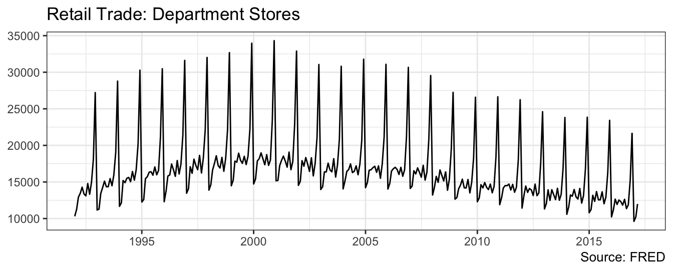
 [1] Jan Feb Mar Apr May Jun Jul Aug Sep Oct Nov Dec Jan
Levels: Jan Feb Mar Apr May Jun Jul Aug Sep Oct Nov Dec
The seasonal pattern is quite clear in the data and it seems to happen toward the end of the year. We can conjecture that the spike in sales is probably associate with the holiday season in December, but we can test this hypothesis by estimating a linear regression model in which we include monthly dummy variables as explanatory variables to account for this pattern. The regression model for the sales in $ of department stores, denoted by \(Y_t\), is
\[Y_t = \beta_0 + \beta_1 Y_{t-1} + \gamma_2 FEB_t + \gamma_3 MAR_t +\gamma_4 APR_t +\gamma_5 MAY_t+\] \[ \gamma_6 JUN_t +\gamma_7 JUL_t +\gamma_8 AUG_t +\gamma_9 SEP_t + \gamma_{10} OCT_t +\gamma_{11} NOV_t +\gamma_{12} DEC_t + \epsilon_t\]
where, in addition to the monthly dummy variables, we have the first order lag of the variable. The regression results are shown below:
dept.month.mat <- model.matrix(~ -1 + dept.month)
colnames(dept.month.mat) <- levels(dept.month)
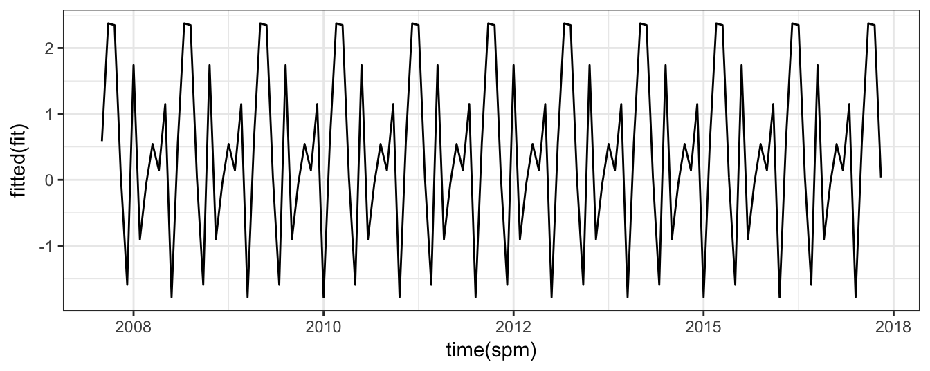
fit <- arima(deptstores, order=c(1,0,0), xreg = dept.month.mat[,-1])
Call:
arima(x = deptstores, order = c(1, 0, 0), xreg = dept.month.mat[, -1])

Coefficients:
        ar1  intercept      Feb       Mar       Apr       May       Jun      Jul       Aug       Sep       Oct
      0.912  12512.667  711.110  2676.430  2585.476  3494.866  2848.780  2356.04  3704.680  2036.551  3245.653
s.e.  0.024    552.364  162.592   218.792   255.383   278.441   291.423   295.80   292.016   279.712   257.551
           Nov        Dec
      7110.664  16216.001
s.e.   222.354    165.536

sigma^2 estimated as 689002:  log likelihood = -2467.45,  aic = 4962.89
The results indicate the retail sales at department stores are highly persistent with an AR(1) coefficient of 0.912. To interpret the estimate of the seasonal coefficients, notice that the dummy for the month of January was left out so that all other seasonal dummies should be interpreted as the difference in sales relative to the first month of the year. The results indicate that all coefficients are positive and thus retail sales are higher than January. From the low levels of January, sales seems to increase and remain relative stable during the summer months, and then increase significantly in November and December. Figure 4.5 of the variable and the model fit (springgreen4 dashed line).
ggplot() + geom_line(aes(time(deptstores), deptstores),color="gray60", size=0.8) +
           geom_line(aes(time(deptstores), fitted(fit)), color="springgreen4", linetype=2) +
          theme_classic() + labs(x=NULL, y=NULL, title="Retail Trade: Department Stores", caption="Source: FRED")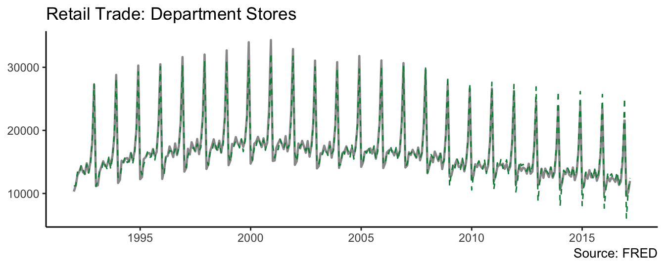
Figure 4.5: Retail trade and fitted value from the time series model.
So far we estimated the model and compared the realization of the variable with the prediction or fitted value of the model. In practice, it is useful to perform an out-of-sample exercise which consist of estimating the model up to a certain date and forecast the future even though we observe the realization for the out-of-sample period. This simulates the situation of a forecaster that in real-time observes only the past and is interested to forecast the future. Figure 4.6 shows the results of an out-of-sample exercise in which an AR(4) model with seasonal dummies is estimated with data up to December 2014 and forecasts are produced from that date onward. The blue line shows the forecast, the shaded areas the 80% and 95% forecast intervals, and the red line represents the realization of the variable. In the first part of the out-of-sample period, the forecasts underpredicted the realization of sales, but underpredicted the peak of sales at the end of the year. In the second year, the forecasts during the year were closer to the realization, but again the model overpredicted end-of-year sales.
library(forecast)
index = sum(time(deptstores) < "2014-12-31")
dept.insample   <- window(deptstores, end = "2014-12-31")
month.insample  <- dept.month.mat[1:index,]
dept.outsample  <- window(deptstores, start = "2014-12-31")
month.outsample <- dept.month.mat[(index+1):length(dept.month),]

fit <- arima(dept.insample, order = c(4,0,0), xreg = month.insample[,-1])
autoplot(forecast(fit, h = length(dept.outsample), xreg = month.outsample[,-1]), include=50) +
  theme_classic() +
  geom_line(aes((index+1):(index+length(dept.outsample)), dept.outsample), color="red")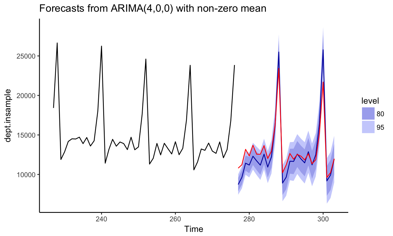
Figure 4.6: Out-of-sample forecast of Retail Trade starting in December 2014 and for forecast horizons 1 to 27 .
4.5 Trends in time series
A trend is defined as the tendency of an economic or financial time series to grow over time. Examples are provided in Figure 4.7 that shows the real Gross Domestic Product (FRED ticker: GDPC1) and the S&P 500 index (YAHOO ticker: ^GSPC) at the quarterly frequency.
gdp.level        <- getSymbols("GDPC1", src="FRED", auto.assign=FALSE)
sp.level         <- getSymbols("^GSPC", src="yahoo", auto.assign=FALSE, from="1947-01-01")
macrodata        <- merge(gdp.level, Ad(to.monthly(sp.level)))
names(macrodata) <- c("GDP","SP500")
macrodata.q      <- to.quarterly(macrodata, OHLC = FALSE)
p1 <- ggplot(macrodata.q) + geom_line(aes(time(macrodata.q), GDP), alpha=0.4) + theme_classic() +
      labs(x=NULL, y=NULL, title="GDP", caption="Source: FRED")
p2 <- ggplot(macrodata.q) + geom_line(aes(time(macrodata.q), SP500), alpha=0.4) + theme_classic() +
      labs(x=NULL, y=NULL, title="SP 500", caption="Source: Yahoo")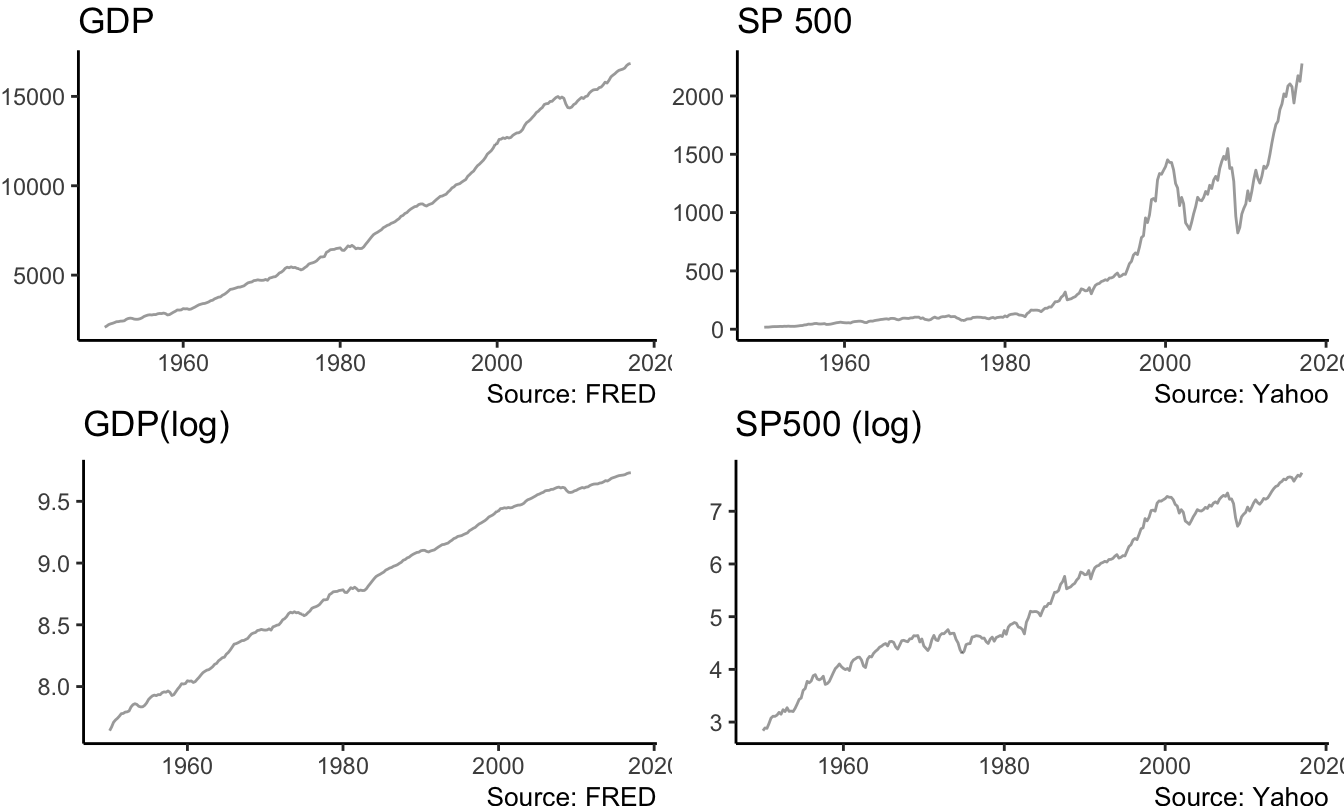
Figure 4.7: Real GDP (FRED: GDPC1) and the Standard and Poors 500 Index at the quarterly frequency starting in January 1947. Bottom graphs are in logarithmic scale.
The series have in common the feature of growing over time with no tendency to revert back to the mean. Actually, the trending behavior of the variables implies that the mean of the series is also increasing over time rather than being approximately constant. For example, if we were to estimate the mean of GDP and the S&P 500 in 1985 it would not have been a good predictor of the future value of the mean because the variables kept growing over time. This type of series are called non-stationary since some features of the distribution (e.g., the mean and/or the variance) change over time instead of being constant as it is the case for stationary processes. For the variables in the Figure, we can thus conclude that they are clearly non-stationary. In addition, very often in economics and finance we prefer to take the natural logarithm of the variables which makes exponential growth approximately linear. The same variables discussed above are plotted in natural logarithm in Figure 4.7. Taking the log of the variables is particularly relevant for the S&P 500 Index which shows a considerable exponential behavior, at least until the end of the 1990s.
4.5.1 Deterministic Trend
A simple approach to model the non-stationarity of these time series is to assume that they follow a deterministic trend, which we can assume that it is linear as a starting point. We thus assume that the series \(Y_t\) evolves according to the model \[Y_t = \beta_0 + \beta_1 * t + d_t\] where the deviation \(d_t\) is a zero mean stationary random variable (e.g., an AR(1) process). The independent variable, denoted \(t\), represents the time trend and takes value 1 for the first observation, value 2 for the second observation and value \(T\) for the last observation35. This model decomposes the series \(Y_t\) in two components:
- a permanent (non-stationary) component represented by \(\beta_0 + \beta_1 * t\) that captures the long-run growth of the series
- a transitory (stationary) component \(d_t\) that captures the deviations from the long-run trend (e.g., business cycle fluctuations)
This type of trend is called deterministic since it makes the prediction that every time period the series \(Y_t\) is expected to increase by \(\beta_1\) units. It is often referred as the trend-stationary model after the two components that constitute the model. The model can be estimated by OLS using the lm() function:
macrodata.q$trend <- 1:nrow(macrodata.q) # creates the trend variable
fit.gdp <- lm(log(GDP) ~ trend, data=macrodata.q)| (Intercept) | trend | |
|---|---|---|
| GDP | 7.77606 | 0.007839 |
| SP500 | 3.08990 | 0.017248 |
where the estimate of \(\beta_1\) is 0.0078 and indicates that real GDP is expected to grow 0.78% every quarter. For the S&P 500 \(\hat\beta_1\) = 0.0172 and represents a quarterly growth of 1.72%. The application of the linear trend model to the series shown above gives as a result the dashed trend line shown in Figure 4.8:
fit.gdp   <- lm(log(GDP) ~ trend, data=macrodata.q)
fit.sp500 <- dyn$lm(log(SP500) ~ trend, data=macrodata.q)

p1 <- ggplot(macrodata.q) + geom_line(aes(time(macrodata.q), log(GDP)), alpha=0.4) +
            geom_line(aes(time(macrodata.q), fitted(fit.gdp)), color="red", linetype="dashed")
p2 <- ggplot(macrodata.q) + geom_line(aes(time(macrodata.q), log(SP500)), alpha=0.4) +
            geom_line(aes(time(macrodata.q), fitted(fit.sp500)), color="red", linetype="dashed")
p1 <- p1 + theme_classic() + labs(x=NULL,y=NULL, title="GDP", caption="Source: FRED")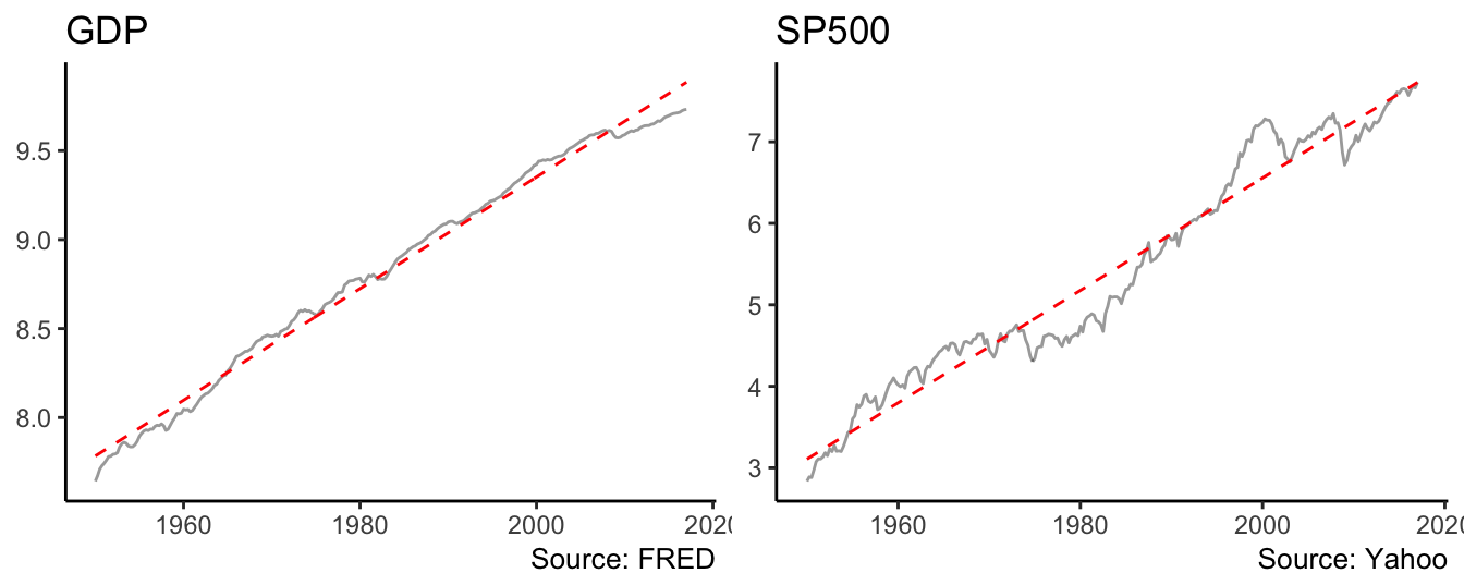
Figure 4.8: Linear trend model for the real GDP and the SP500.
The deviation of the series from the fitted trend line are small for GDP, but for the S&P 500 index they are persistent and last for long periods of time (i.e., 10 years or even longer). Such persistent deviations might be due to the inadequacy of the linear trend model and the need to consider a nonlinear trend. This can be accommodated by adding a quadratic and/or cubic term to the linear trend model which becomes: \[ Y_t = \beta_0 + \beta_1 * t + \beta_2 * t^2 + \beta_3 * t^3 + d_t\] where \(t^2\) and \(t^3\) represent the square and cube of the trend variable. The implementation in R requires the only additional step of including the square and cube of trend in the lm() formula:
fitsq   <- lm(log(GDP) ~ trend + I(trend^2), data=macrodata.q)
fitcb   <- lm(log(GDP) ~ trend + I(trend^2) + I(trend^3), data=macrodata.q)
Estimate Std. Error t value Pr(>|t|)
(Intercept) 7.6611 0.0064 1196.5683 0
trend 0.0104 0.0001 94.8250 0
I(trend^2) 0.0000 0.0000 -23.9916 0
Estimate Std. Error t value Pr(>|t|)
(Intercept) 7.6932 0.0081 951.1638 0.0000
trend 0.0090 0.0003 34.6535 0.0000
I(trend^2) 0.0000 0.0000 1.6210 0.1062
I(trend^3) 0.0000 0.0000 -5.9360 0.0000The linear (dashed line) and cubic (dot-dash line) deterministic trends are shown in Figure 4.9. For the case of GDP the differences between the two lines is not visually large, although the quadratic and/or cubic regression coefficients might be statistically significant at conventional levels. In terms of fitness, the AIC of the linear model is -731.34 and -1039.18 and -1070.76 for the quadratic and cubic models, respectively. Hence, in this case we would select the cubic model which does slightly better relative to the quadratic, and significantly better relative to the linear trend model36. However, it could be argued that the deterministic trend model might not represent well the behavior of the S&P 500 index since there are significant departures of the series from the trend models for long periods of time.
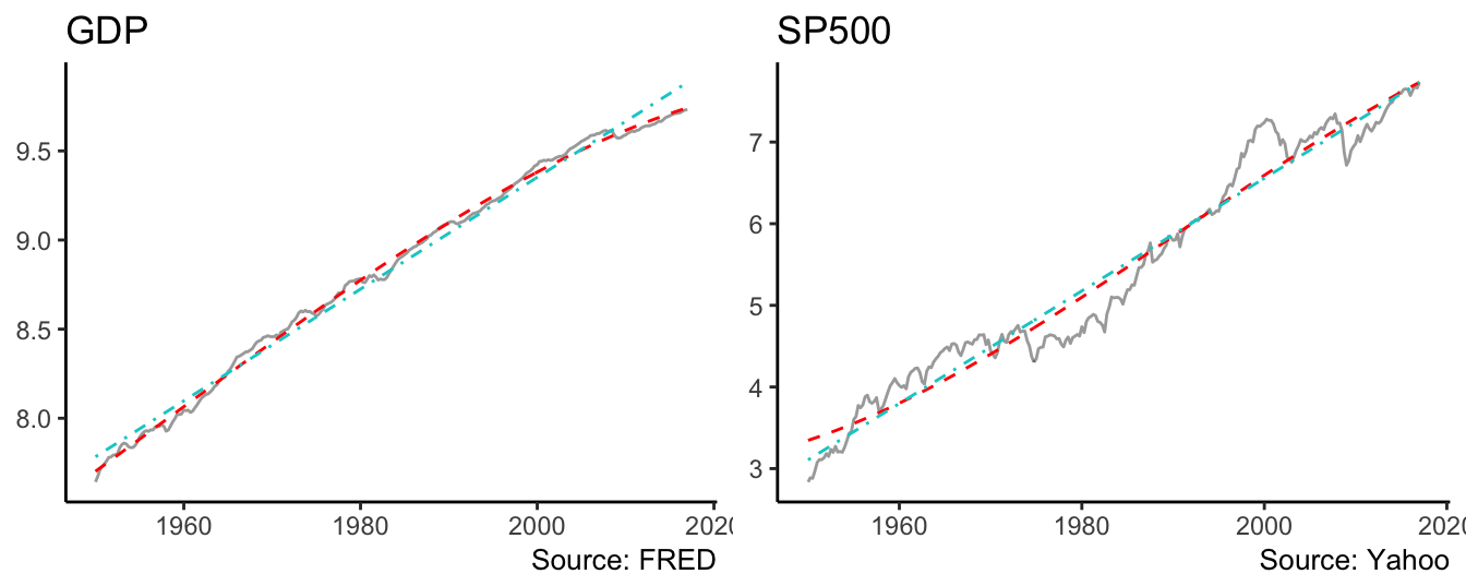
Figure 4.9: Linear and cubic trend model for the real GDP and the SP500.
Another way to visualize the ability of the trend-stationary model to explain these series is to plot the residuals or deviation from the cubic trend, \(d_t\). Figure 4.10 shows the time series graph of the \(d_t\) for the linear and cubic models and the ACF functions with lag up to 50 (quarters for GDP and months for S&P 500):
p1 <- qplot(time(macrodata.q), residuals(fitcb.gdp), data=macrodata.q, geom="line", color="Cubic") +
           geom_line(aes(time(macrodata.q), residuals(fit.gdp), color="Linear"), linetype="dashed") +
           geom_hline(yintercept = 0, color="orchid4") + labs(title="GDP") +
           scale_colour_manual("", breaks=c("Cubic","Linear"), values=c("steelblue2","darkorange4"))
p2 <- qplot(time(macrodata.q), residuals(fitcb.sp500), data=macrodata.q, geom="line", color="Cubic") +
           geom_line(aes(time(macrodata.q), residuals(fit.sp500), color="Linear"), linetype="dashed") +
           geom_hline(yintercept = 0, color="orchid4") +  labs(title="SP500") +
           scale_colour_manual("", breaks=c("Cubic","Linear"), values=c("steelblue2","darkorange4"))
p3 <- ggacf(residuals(fitcb.gdp), 50) + labs(title="GDP", subtitle="Cubic")
p4 <- ggacf(residuals(fit.gdp), 50)+ labs(title="GDP", subtitle="Linear")
p5 <- ggacf(residuals(fitcb.sp500), 50) + labs(title="SP500", subtitle="Cubic")
p6 <- ggacf(residuals(fit.sp500), 50) + labs(title="SP500", subtitle="Linear")
mylayout <- rbind(c(1,1,2,2),
                  c(3,4,5,6))
grid.arrange(p1, p2, p3, p4,p5, p6, layout_matrix=mylayout)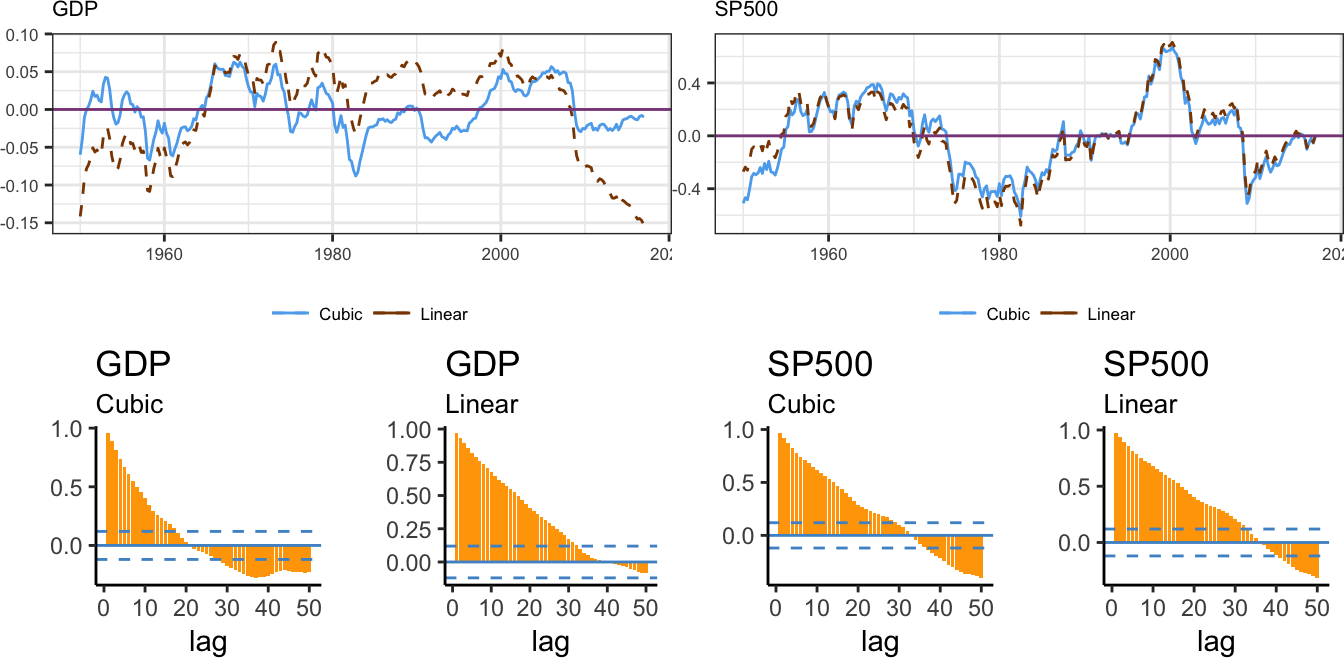
Figure 4.10: Deviation of the logarithm of real GDP and SP 500 from the linear and cubic trend model and its ACF up to lag 50.
The ACF shows clearly that the deviation of the log GDP from the cubic trend is persistent but with rapidly decaying values relative to the residuals of the linear trend model. On the other hand, for the S&P 500 it seems that the serial correlation decays at a slower rate, that might be an indication of a non-stationary time series. Even when we account for the trend in a variable, the deviation from the trend \(d_t\) might still be non-stationary and we will discuss later how to formally test this hypothesis.
4.5.2 Stochastic Trend
An alternative model that is often used in asset and option pricing is the random walk with drift model. The model takes the following form: \[ Y_t = \mu + Y_{t-1} + \epsilon_t\] where \(\mu\) is a constant and \(\epsilon_t\) is an error term with mean zero and variance \(\sigma^2\). The random walk model assumes that the expected value of \(Y_t\) is equal to the previous value of the series (\(Y_{t-1}\)) plus a constant term \(\mu\) (which can be positive or negative), that is, \(E(Y_t | Y_{t-1}) = \mu + Y_{t-1}\). The model can also be reformulated by substituting backward the value of \(Y_{t-1}\), that is, \(\mu + Y_{t-2} + \epsilon_{t-1}\) and we obtain \(Y_t = 2*\mu + Y_{t-2} + \epsilon_t + \epsilon_{t-1}\). We can then continue by substituting \(Y_{t-2}\), \(Y_{t-3}\), and so on until we reach the initial value \(Y_0\) and the model can be written as \[\begin{eqnarray*} Y_t &=& \mu + Y_{t-1} + \epsilon_t \\ &=& \mu + (\mu + Y_{t-2} + \epsilon_{t-1}) + \epsilon_t \\ & = & \mu + \mu + (\mu + Y_{t-3} + \epsilon_{t-2}) + \epsilon_{t-1} + \epsilon_t \\ & = & \cdots \\ & = & Y_0 + \mu t + \sum_{j=1}^{t}\epsilon_{t-j+1}\\ \end{eqnarray*}\]This shows that a random walk with drift model can be expressed as the sum of two components (in addition to the starting value \(Y_0\)):
- deterministic trend (\(\mu t\))
- the sum of all past errors/shocks to the series
In case the drift term \(\mu\) is set equal to zero, the model reduces to \(Y_t = Y_{t-1} + \epsilon_t = Y_0 + \sum_{j=1}^{t}\epsilon_{t-j+1}\) which is called the random walk model (without drift since \(\mu\) is equal to zero). Hence, another way to think of the random walk model with drift is as the sum of a deterministic linear trend and a random walk process.
The relationship between the trend-stationary and the random walk with drift models becomes clear if we assume that the deviation from the trend \(d_t\) follow an AR(1) process, that is, \(d_t = \phi d_{t-1} + \epsilon_t\), where \(\phi\) is the coefficient of the first lag which is assumed to be smaller than 1 in absolute value and \(\epsilon_t\) is a mean zero random variable. We can do backward substitution of the AR term in the trend-stationary model, that is, \[\begin{eqnarray*} Y_t = \beta_0 + \beta_1 t & + & d_t \\ & + & \phi d_{t-1} + \epsilon_{t}\\ & + & \phi^2 d_{t-2}+ \phi * \epsilon_{t-1} + \epsilon_{t} \\ & + & ...\\ & + & \epsilon_t + \phi * \epsilon_{t-1} + \phi^2 * \epsilon_{t-2} + \cdots + \phi^{t-1} \epsilon_1\\ & + & \sum_{j=1}^{t} \phi^{j-1} \epsilon_{t-j+1} \end{eqnarray*}\]Comparing this equation with the one obtained for the random walk with drift model we find that the former is a special case of the latter for \(\phi = 1\). Hence, the only difference between these models consists of the assumption on the persistence of the deviation from the trend. If the coefficient \(\phi\) is less than 1 the deviation is stationary and thus the trend-stationary model can be used to de-trend the series and then conduct the analysis on the deviation. However, when \(\phi = 1\) the deviation from the trend as well is non-stationary (i.e., random walk) and the approach just described is not valid. We will discuss later what to do in this case. A more practical way to understand the issue of the (non-)stationarity of the deviation from the trend is to think in terms of the speed at which the series is likely to revert back to the trend-line. Series that oscillate around the trend are stationary while persistent deviations from the trend (slow reversion) are an indication of non-stationarity. How do we know if a series (e.g., the deviation from the trend) is stationary or not? In the following section we will discuss a test that evaluates this hypothesis and provides guidance as to what modeling approach to take.
The previous analysis of real GDP shows that the deviations of GDP from its trend seem to revert to the mean faster relative to the other two series: this can be seen both in the time series plot and also from the quickly decaying ACF. The estimate of the trend-stationary model shows that we expect GDP to grow around 0.773% per quarter (approximately 3.092% annualized), although GDP alternates periods above trend (expansions) and periods below trend (recessions). Alternating between expansions and recessions captures the mean-reverting nature of the GDP deviations from the long-run trend. We can evaluate the ability of the trend-stationary model to capture the expansion-recession feature of the business cycle by comparing the periods of positive and negative deviations with the peak and trough dates of the business cycle decided by the NBER dating committee. In the graph below we plot the deviation from the cubic trend estimated earlier together with the shaded areas that indicate the period of recessions.
# dates from the NBER business cycle dating committee
xleft  = c(1953.25, 1957.5, 1960.25, 1969.75, 1973.75, 1980,
           1981.5, 1990.5, 2001, 2007.917) # beginning
xright = c(1954.25, 1958.25, 1961, 1970.75, 1975, 1980.5, 1982.75,
           1991, 2001.75, 2009.417) # end

#fitgdp is the lm() object for the cubic trend model
ggplot() + geom_rect(aes(xmin=xleft, xmax=xright, ymin=rep(-0.10,10), ymax=rep(0.10, 10)),fill="lightcyan3") +
  geom_hline(yintercept = 0, color="grey35", linetype="dashed") +
  geom_line(aes(time(macrodata.q), residuals(fitcb.gdp))) +
theme_classic() + labs(x=NULL, y=NULL) 
Figure 4.11: Deviation of the log real GDP from a cubic trend. The shaded areas represent the NBER recession periods.
Overall, there is a tendency for the deviation to sharply decline during recessions (shaded areas), and then increase during the recovery period and the expansion, which seems to have last longer since the mid-1980s.
Earlier we discussed that the distribution of a non-stationary variable changes over time. We can verify the stationarity properties of the trend-stationary model and the random walk with drift model by deriving the mean and variance of \(Y_t\). Under the trend-stationary model the dynamics follows \(Y_t = \beta_0 + \beta_1 t + d_t\) and we can make the simplifying assumption that \(d_t = \phi d_{t-1} + \epsilon_t\) with \(\epsilon_t\) a mean zero and variance \(\sigma^2_{\epsilon}\) error term. Based on these assumptions, we obtain that \(E(d_t) = 0\) and \(Var(d_t) = \sigma^2_{\epsilon}/ (1-\phi^2)\) so that:
- \(E_t(Y_t) = \beta_0 + \beta_1 t\)
- \(Var_t(Y_t) = Var(d_t) = \sigma^2_{\epsilon}/(1-\phi^2)\)
This demonstrates that the mean of a trend-stationary variable is a function of time and not constant, while the variance is constant. On the other hand for the random walk with drift model we have that:
- \(E_t(Y_t) = E_t\left( Y_0 + \mu t + \sum_{j=1}^{t} \epsilon_{t-j+1} \right) = Y_0 + \mu t\)
- \(Var_t(Y_t) = t\sigma^2_{\epsilon}\)
From these results we see that for the random walk with drift model both the mean and the variance are time varying, while for the trend-stationary model only the mean varies with time.
The main difference between the trend-stationary and random walk with drift models thus consists in the non-stationarity properties of the deviations from the deterministic trend. For the trend-stationary model the deviations are considered stationary and they can be analysed using regression models estimated by OLS. However, for the random walk with drift the deviations are non-stationary and its time series cannot be considered in regression models because of several statistical issues that will be discussed in the next Section, followed by a discussion of an approach to statistically test if a series is non-stationary and non-stationary around a (deterministic) trend.
4.5.3 Why non-stationarity is a problem for OLS?
The estimation of time series models can be conducted by standard OLS techniques, as long as the series is stationary. If this is the case, the OLS estimator is consistent and \(t\)-statistics are distributed according to the Student \(t\) distribution. However, these properties fail to hold when the series is non-stationary and three problems arise:
- the OLS estimate of the AR coefficients is biased in small samples
- the \(t\) statistic is not normally distributed (even in large samples)
- the regression of a non-stationary variables on a non-stationary variable leads to spurious results of dependence between the two series
We will discuss and illustrate these problems in the context of a simulation study using R. To show the first fact we follow the steps:
- simulate B time series from a random walk with drift model \(Y_t = \mu + Y_{t-1} + \epsilon_t\) for \(t=1,\cdots,T\)
- estimate an AR(1) model \(Y_t = \beta_0 + \beta_1 * Y_{t-1} + \epsilon_t\)
- store the B OLS estimates of \(\beta_1\)
We perform this simulation for a short and a long time series (\(T = 25\) and \(T = 500\), respectively) and compare the mean, median, and histogram of the \(\hat{\beta}_1\) across the B simulations. Below is the code for \(T = 25\) and the histogram of the simulated values for \(T=25\) and \(500\) is provided in Figure 4.12:
set.seed(1234)

T      = 25              # length of the time series
B      = 1000            # number of simulation
mu     = 0.1             # value of the drift term
sigma  = 1               # standard deviation of the error
beta25 = numeric(B)      # object to store the DF test stat

for (b in 1:B)
{
  Y        <- as.xts(arima.sim(n=T, list(order=c(0,1,0)), mean=mu, sd=sigma))
  fit      <- dyn$lm(Y ~ lag(Y,1))               # OLS estimation of DF regression
  beta25[b] <- summary(fit)$coef[2,1]                   # stores the results
}

# plotting
p1 <- ggplot() + geom_histogram(aes(beta25),color="grey35", fill="grey90", bins=40) + theme_bw() + labs(x=NULL,y=NULL) +
  geom_vline(xintercept = 1, color="cadetblue", size=1.2, linetype="dashed")

T        = 500         # length of the time series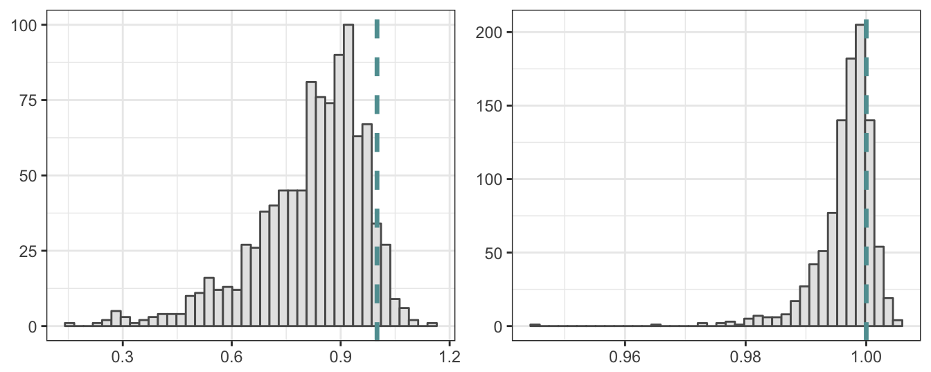
Figure 4.12: Simulated distribution of the OLS estimate of the AR(1) coefficient when the true generating process is a random walk with drift. Sample size is 25 for the left plot and 500 for the right plot.
The histogram when the sample size is 25 shows that the \(\hat\beta_1\) over 1000 simulations ranges between 0.5 and 0.5 with a mean of 0.5 and median of 0.5. Both the mean and the median are significantly smaller relative to the true value of 1. This demonstrates the bias in the OLS estimates in small samples when the variable is non-stationary. However, this bias has a tendency to decline for larger sample sizes as shown in the right histogram of Figure 4.12 where the sample size is set to \(500\). In this case the min/max estimates are 0.5 and 0.5 with a mean and median of 0.5 and 0.5, respectively. For the larger sample of 500 periods, even though the series is non-stationary, the coefficient estimates of \(\beta_1\) are close to the theoretical value of 1 and thus there is no bias.
The second fact that arises when estimating AR by OLS when variables are non-stationary is that the t statistic does not follow the normal distribution even when samples are large. This can be seen clearly in Figure 4.13 for the statistic of the null hypothesis that \(\beta_1 = 1\) and for T=500. The histogram below shows that the distribution of \(t\) statistic is shifted to the left relative to the standard normal distribution.
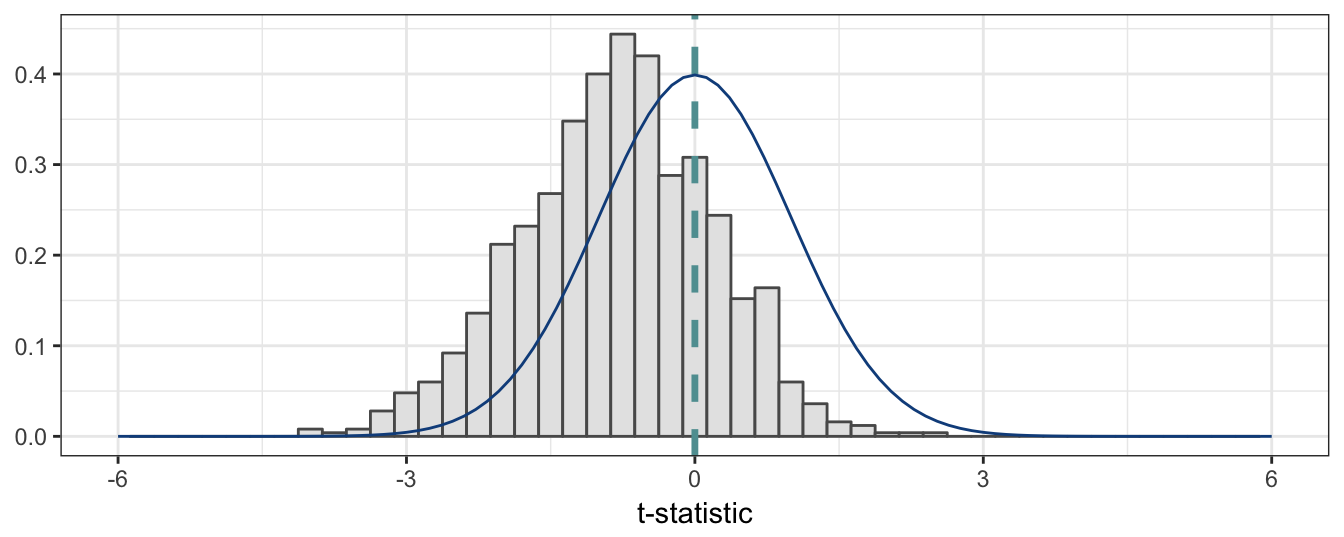
Figure 4.13: Simulated distribution of t-statistic of the OLS estimate of the AR(1) coefficient when the true generating process is a random walk with drift. Sample size is 500.
The third problem with non-stationary variables occurs when the interest is to model is the relationship between \(X\) and \(Y\) and both variables are non-stationary. This could lead to spurious results of statistical evidence of a relationship between the two series when indeed they are independent of each other. An intuitive explanation for this result can be provided when considering, e.g., two independent random walk with drift: estimating a LRM finds co-movement between the series due to the existence of a trend in both variables that makes the series move in the same or opposite direction. The simulation below shows more intuitively this results for two independent processes \(X\) and \(Y\) with the same drift parameter \(\mu\), but independent of each other (i.e., \(Y\) is not a function of \(X\)). The histogram of the t statistics for the significance of \(\beta_1\) in \(Y_t = \beta_0 + \beta_1 X_t + \epsilon_t\) is shown in the left plot of Figure 4.14, while the R\(^2\) of the regression is shown on the right. The distribution of the \(t\) test statistic has a significant positive mean and would lead to an extremely large number of rejections of the hypothesis that \(\beta_1 = 0\), when its true value is equal to zero. In addition, the distribution of the R\(^2\) shows that in the vast majority of these 1000 simulations we would find a moderate to large goodness-of-fit measure which would suggest a significant relationship between the two variables, although the truth is that there is no relationship.
T     = 500         # length of the time series
B     = 1000         # number of simulation
mu    = 0.1         # value of the drift term
sigma = 1           # standard deviation of the error
tstat  = numeric(B) # object to store the DF test stat
R2     = numeric(B)
for (b in 1:B)
{
  Y       <- as.xts(arima.sim(n=T, list(order=c(0,1,0)), mean=mu, sd=sigma))   # simulates the Y series
  X       <- as.xts(arima.sim(n=T, list(order=c(0,1,0)), mean=mu, sd=sigma))   # simulates the X series

  fit      <- lm(Y ~ X)               # OLS estimation of DF regression
  fit.tab  <- summary(fit)$coefficients
  tstat[b] <- fit.tab[2,3]  # stores the results
  R2[b]    <- summary(fit)$r.square
}

p1 <- ggplot() + geom_histogram(aes(tstat),color="grey35", fill="grey90", binwidth=5) +
  theme_bw() + labs(x="t-statistic",y=NULL) +
  geom_vline(xintercept = 0, color="cadetblue", size=1.2, linetype="dashed")
p2 <- ggplot() + geom_histogram(aes(R2),color="grey35", fill="grey90", binwidth=0.05) +
  xlim(c(-0.2, 1.2)) + theme_bw() + labs(x="R squared",y=NULL)
grid.arrange(p1, p2, ncol=2)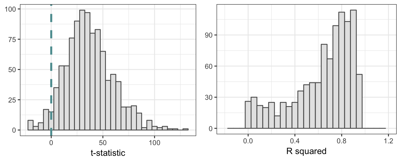
Figure 4.14: Simulated distribution of the t-statistic and R square for the regression of two independent non-stationary variables. Sample size is 500.
4.5.4 Testing for non-stationarity
The first task when analyzing economic and financial time series is to evaluate if the variable can be considered stationary or not, since non-stationarity leads to several inferential problems that can be problematic for our analysis. Once we conclude that a time series is non-stationary we need to decide whether it is consistent with a trend-stationary model or rather with a random walk model (with or without drift). So, what we are really asking are two questions: is the time series stationary or non-stationary? and if it non-stationary, which of the two models discussed earlier is more likely to be consistent with the data?
The approach that we follow is to combine the trend-stationary and random walk models and test hypothesis about the coefficients of the combined model that provide answers to the previous questions. The trend-stationary model with an AR(1) process for the deviation is defined as \[\begin{array}{rl}Y_t =& \beta_0 + \beta_1 t + d_t\\ d_t =& \phi d_{t-1} + \epsilon_t\end{array}\] from the first Equation we obtain that \(d_{t-1} = Y_{t-1} - \beta_0 - \beta_1 (t-1)\) so that we can replace \(d_t\) in the first Equation and formulate the model in terms of \(t\) and \(Y_{t-1}\), that is: \[\begin{array}{rl}Y_t =& \beta_0 + \beta_1 t + \phi d_{t-1} + \epsilon_t\\ =& \beta_0 + \beta_1 t + \phi \left[Y_{t-1} - \beta_0 - \beta_1 (t-1)\right] + \epsilon_t\\ = & \beta_0(1-\phi) + \phi\beta_1 + \beta_1 (1-\phi) t +\phi Y_{t-1} + \epsilon_t \end{array} \] if we set \(\gamma_0 = \beta_0(1-\phi) + \phi\beta_1\) and \(\gamma_1 = \beta_1 (1-\phi)\) then the model becomes \[Y_{t} = \gamma_0 + \gamma_1 t + \phi Y_{t-1} + \epsilon_t\] and the null hypothesis that we want to test is that \(\phi = 1\) against the alternative that \(\phi < 1\). Notice that if \(\phi_1 = 1\) then \(\gamma_1 = 0\) and the model becomes \(Y_t = \beta_1 + Y_{t-1} + \epsilon_t\), which is the random walk with drift model. Testing the hypothesis can lead to the two following outcomes:
- Failing to reject the null hypothesis that \(\phi = 1\) (and \(\gamma_1=0\)) indicates that \(Y_t\) follows the random walk with drift model
- Rejecting the null hypothesis in favor of the alternative that \(\phi < 1\) supports the trend-stationary model
If the time series \(Y_t\) does not show a clear pattern of growing over time, we can assume that \(\beta_1 = 0\) which simplifies the model to \(Y_t = \gamma_0 + \phi Y_{t-1} + \epsilon_t\) with \(\gamma_0 = \beta_0(1-\phi)\). Testing the hypothesis that \(\phi = 1\) in this case provides the following results:
- Failing to reject \(H_0\) implies that the model is \(Y_t = Y_{t-1} + \epsilon_t\) that represents the random walk without drift model
- Rejecting the null hypothesis suggests that \(Y_t\) should be modeled as a stationary AR process
The important choice to make is whether to include a trend (i.e., \(\beta_1\)) or not in the testing Equation. While for the real GDP and the S&P 500 in Figure 4.7 it is clear that a trend is necessary, in other situations (e.g., the unemployment rate or interest rates) a trend might not be warranted. To test \(H_0: \phi = 1\) (non-stationarity) against the alternative \(H_1 : \phi < 1\) (stationarity) the model is reformulated by subtracting \(Y_{t-1}\) to both the left and right hand-side of the Equation: \[\begin{array}{rl}Y_{t} - Y_{t-1} = & \gamma_0 + \gamma_1 t + \phi Y_{t-1} - Y_{t-1} + \epsilon_t\\ \Delta Y_t =& \gamma_0 + \gamma_1 t + \delta Y_{t-1} + \epsilon_t\end{array} \] with \(\delta = \phi - 1\). Testing the null that \(\phi = 1\) is equivalent to testing \(\delta = 0\) in this model against the alternative that \(\delta < 0\). This model is estimated by OLS and the test statistic for what is called the Dickey-Fuller (DF) test is given by the t-statistic of \(\hat\delta\), that is, \[DF = \frac{\hat{\delta}}{\hat\sigma_{\delta}} \] where \(\hat\sigma_{\delta}\) represents the standard error of \(\hat\delta\) assuming homoskedasticity. Even though subtracting \(Y_{t-1}\) makes the LHS of the Equation stationary, under the null hypothesis the regressor \(Y_{t-1}\) is non-stationary and leads to the distribution of the \(DF\) not being t distributed. Instead, it follows a different distribution with critical values that are tabulated and are provided below.
The non-standard distribution of the DF test statistic can be investigated via a simulation study using R. The code below performs a simulation in which:
- random walk time series (with drift) are generated
- the DF regression equation is estimated
- the \(t\)-statistic of \(Y_{t-1}\) is stored
These steps are repeated B times and Figure 4.15 shows the histogram of the DF statistic together with the Student \(t\) distribution with T-1 degree-of-freedom (T represents the length of the time series set in the code).
T     = 100         # length of the time series
B     = 1000         # number of simulation
mu    = 0.1         # value of the drift term
sigma = 1           # standard deviation of the error

DF = numeric(B) # object to store the DF test stat
for (b in 1:B)
{
  Y     <- as.xts(arima.sim(n=T, list(order=c(0,1,0)), mean=mu, sd=sigma))
  fit   <- dyn$lm(diff(Y) ~ lag(Y,1))               # OLS estimation of DF regression
  DF[b] <-  summary(fit)$coef[2,3]                   # stores the results
}
# plotting
ggplot(data=data.frame(DF), aes(x=DF)) +
  geom_histogram(aes(y=..density..), bins=50, fill="grey90", color="steelblue1") +
  stat_function(fun = dt, colour = "dodgerblue4", args = list(df = (T-1))) +
  theme_classic()  + xlim(-6,6)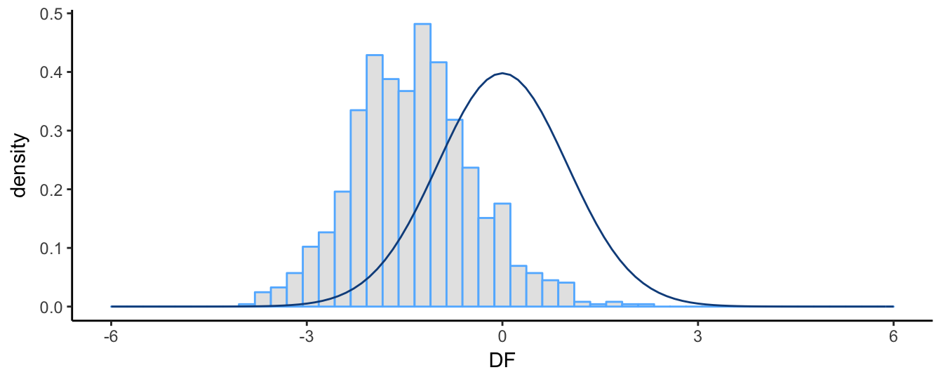
Figure 4.15: Simulated distribution of the DF test statistic and the t distribution. Sample size 100.
The graph shows clearly that the distribution of the DF statistic does not follow the \(t\) distribution: it has a negative mean and median (instead of 0), it is slightly skewed to the right (positive skewness) rather than being symmetric, and its empirical 5% quantile is -2.851 instead of the theoretical value of -1.66. Since we are performing a one-sided test against the alternative hypothesis \(H_1: \delta < 0\), using the one-sided 5% critical value from the \(t\) distribution would lead to reject the null hypothesis of non-stationarity too often relative to the appropriate critical values of the DF statistic. For the simulation exercise above, the (asymptotic) critical value for the null of a random walk with drift is -2.86 at 5% significance level. The percentage of simulations for which we reject the null based on this critical value and that from the \(t\) distribution are
c(DF = sum(DF < -2.86) / B, T = sum(DF < -1.67) / B) DF T
0.049 0.390 This shows that using the critical value from the \(t\)-distribution would lead to reject too often (39% of the times) relative to the expected level of 5%. Instead, using the correct critical value the null is rejected 4.9% which is quite close to the 5% significance level.
In practice, it is advisable to include lags of \(\Delta Y_{t}\) to control for serial correlation in the time series \(Y_t\) and its changes. This is called the Augmented Dickey Fuller (ADF) and requires to estimate the following regression model (for the case with a constant): \[\Delta Y_t = \gamma_0 + \gamma_1 t + \delta Y_{t-1} + \sum_{j=1}^{p} \omega_j \Delta Y_{t-j} + \epsilon_t\] which is simply adding lags of \(\Delta Y_t\) on the RHS of the previous Equation. The \(ADF\) test statistic is calculated as before by taking the \(t\)-statistic of the coefficient estimate of \(Y_{t-1}\), that is, \(ADF = \hat{\delta}/\hat\sigma_{\delta}\). The decision to reject the null hypothesis that \(\delta = 0\) against the alternative that \(\delta < 0\) relies on comparing the \(DF\) or \(ADF\) test statistic with the appropriate critical values. As discussed earlier, the DF statistic has a special distribution and critical values have been tabulated for the case with/without a constant and with/without a trend and for various sample sizes. Below you can find the critical values obtained for various sample sizes for a model with constant and with or without trend and the null is rejected if the test statistic is smaller relative to the critical value:
| Sample Size | Without | Trend | With | Trend |
|---|---|---|---|---|
| 1% | 5% | 1% | 5% | |
| T = 25 | -3.75 | -3.00 | -4.38 | -3.60 |
| T = 50 | -3.58 | -2.93 | -4.15 | -3.50 |
| T = 100 | -3.51 | -2.89 | -4.04 | -3.45 |
| T = 250 | -3.46 | -2.88 | -3.99 | -3.43 |
| T = 500 | -3.44 | -2.87 | -3.98 | -3.42 |
| T = \(\infty\) | -3.43 | -2.86 | -3.96 | -3.41 |
There are several packages that provide functions that perform the ADF test on a time series. The package tseries provides the adf.test() function that assumes a model with constant and trend and the user is only required to specify the time series and the lags of \(\Delta Y_{t}\). The application to the logarithm of real GDP discussed above gives the following results37:
library(tseries)
adf.test(log(macrodata.q$GDP), k=4)
    Augmented Dickey-Fuller Test

data:  log(macrodata.q$GDP)
Dickey-Fuller = -0.935, Lag order = 4, p-value = 0.948
alternative hypothesis: stationary
The ADF test statistic is equal to -0.935 with a p-value of 0.948 which is larger than 5% and we thus conclude that we do not reject the hypothesis that \(\delta = 0\) or, equilevantly, \(\phi = 1\). Hence, the logarithm of GDP is not stationary even when including a trend in the analysis and a random walk with drift is the most appropriate modeling choice. The code below shows the application of the ADF test to the logarithm of the S&P 500 and the returns at the monthly and daily frequency:
adf.sp <- rbind(`Price monthly`  = adf.test(log(spm$price))[c("statistic", "p.value")],
                `Return monthly` = adf.test(spm$return)[c("statistic", "p.value")],
                `Price daily`    = adf.test(log(spd$price))[c("statistic", "p.value")],
`Price daily` = adf.test(spd$return)[c("statistic", "p.value")])| statistic | p.value | |
|---|---|---|
| Price monthly | -3.18738 | 0.0932597 |
| Return monthly | -4.02599 | 0.0103085 |
| Price daily | -2.20653 | 0.490885 |
| Price daily | -14.1847 | 0.01 |
The results show that at the 5% level the null of non-stationarity is not rejected for the monthly and daily price, but they are strongly rejected for the returns. This is expected since the returns are the growth rate of the price variable and they exhibit very small auto-correlation and a constant long-run mean. A problem with the adf.test() function is that it does not allow to change the type of test, in case we are interested to run the test without the trend variable. In this case we can use the ur.df() function from the urca package. Below is an application to the logarithm of the real GDP:
library(urca)
adf <- ur.df(log(macrodata.q$GDP), type="trend", lags=4) # type: "none", "drift", "trend"
summary(adf)
###############################################
# Augmented Dickey-Fuller Test Unit Root Test #
###############################################

Test regression trend


Call:
lm(formula = z.diff ~ z.lag.1 + 1 + tt + z.diff.lag)

Residuals:
     Min       1Q   Median       3Q      Max
-0.03073 -0.00417  0.00040  0.00485  0.03369

Coefficients:
              Estimate Std. Error t value Pr(>|t|)
(Intercept)  0.0715265  0.0688867    1.04     0.30
z.lag.1     -0.0083048  0.0088822   -0.93     0.35
tt           0.0000513  0.0000703    0.73     0.47
z.diff.lag1  0.3246072  0.0623695    5.20    4e-07 ***
z.diff.lag2  0.0974953  0.0654656    1.49     0.14
z.diff.lag3 -0.0440104  0.0648115   -0.68     0.50
z.diff.lag4 -0.0482718  0.0614166   -0.79     0.43
---
Signif. codes:  0 '***' 0.001 '**' 0.01 '*' 0.05 '.' 0.1 ' ' 1

Residual standard error: 0.00834 on 257 degrees of freedom
Multiple R-squared:  0.155, Adjusted R-squared:  0.136
F-statistic: 7.88 on 6 and 257 DF,  p-value: 8.45e-08


Value of test-statistic is: -0.935 12.8384 2.442

Critical values for test statistics:
      1pct  5pct 10pct
tau3 -3.98 -3.42 -3.13
phi2  6.15  4.71  4.05
phi3  8.34  6.30  5.36
In this case the ADF test statistic is -0.935 which should be compared to the critical value at 5% -3.42 and we fail to reject the null hypothesis that the series is non-stationary so that we concluded that it follows a random walk with drift model.
4.5.5 What to do when a time series is non-stationary
If the ADF test leads to the conclusion that a series is non-stationary then we need to understand if the nature of the non-stationarity is a trend-stationary model or a random walk model (with or without a drift). In the first case, the non-stationarity is solved by de-trending the series, which means that the series is regressed on a time trend and the residuals of the regression are then interpreted as the deviation from the long-run trend and modeled using time series techniques (e.g., AR). This approach is often used for the logarithm of GDP and the deviation is interpreted as the output gap. However, in our results the log of GDP is non-stationary even when including a trend which indicates that the deviation might also be non-stationary. On the other hand, in case we find that the series follows a random walk model then the solution to the non-stationarity is differencing the series and modeling \(\Delta Y_t = Y_t - Y_{t-1}\). The reason for this is that differencing the series removes the trend and this can be seen in the random walk with drift model \(Y_t = \mu + Y_{t-1} + \epsilon_t\) where by taking \(Y_{t-1}\) to the left-hand side results in \(\Delta Y_t = \mu + \epsilon_t\). When we consider returns of an asset prices we are differencing the price which, from a statistical perspective, is justified in order to induce stationarity in the price series.
4.6 Structural breaks in time series
Another issue that we need to keep in mind when analyzing time series is that there could have been a shift (or structural change) in its mean or its persistence over time. The economy is an evolving system changing over time which makes the past less relevant, to some extent, to understand the future. It is important to be able to recognize structural change because it can be easily mistaken for non-stationarity when indeed it is not.
Let’s assume that at time \(t^*\) the intercept of a time series shifts so that we can write the AR(1) model as \[ Y_t = \beta_{00} + \beta_{01} * I(t > t^*) + \beta_1 * Y_{t-1} + \epsilon_t \] where \(\beta_{00}\) represents the intercept of the AR(1) model until time \(t^*\), \(\beta_{00}+\beta_{01}\) after time \(t^*\), and \(I(A)\) denotes the indicator function that takes value 1 if A is true and 0 otherwise. In the above example we assume that the dependence of the time series, measured by \(\beta_1\), is constant, although it might as well change over time as we discuss later.
Let’s simulate a time series from this model with a shift in the intercept at observation 200 on a total sample of length 400. To show the effect of an intercept shift we simulate a time series with a shift of the intercept from \(\beta_{00}\)=0 to \(\beta_{0,1}\)=1, while the AR(1) parameters is constant and equal to 0.8. The resulting time series is shown in Figure 4.16, with the horizontal line representing the unconditional means before/after the break at the values \(\beta_{00}/(1-\beta_1)\) and \(\beta_{01}/(1-\beta_1)\), respectively. For this choice of parameters it is clear that there was a shift at observation 200 when the unconditional mean of the time series shifts from 0 to 5.
set.seed(1234)
T         = 400;   Tbreak    <- round(T/2)
beta00    = 0;     beta01    = 1
beta1     = 0.8;   sigma.eps = 0.8
eps       = sigma.eps * rnorm(T)
Y         = as.xts(ts(numeric(T)))
for (t in 2:T) Y[t] = beta00 + beta01 * (t > Tbreak) + beta1 * Y[t-1] + eps[t]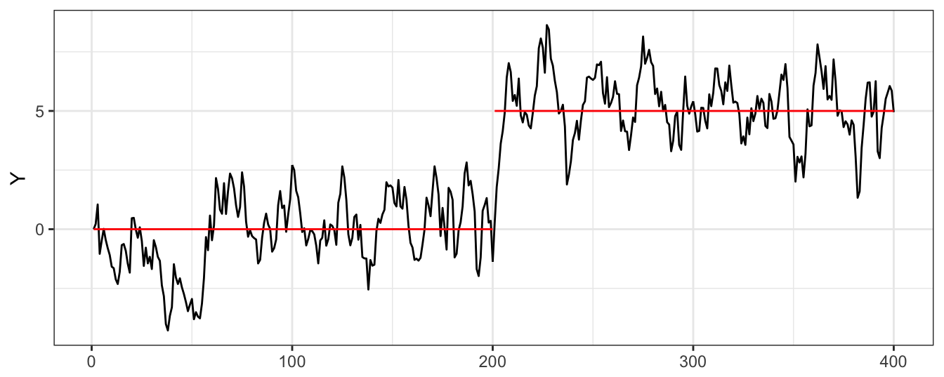
Figure 4.16: Simulated AR(1) time series with a structural break in the intercept.
A time series with structural change can be easily mistaken for non-stationarity. As it is clear from Figure 4.17, from the perspective of a linear trend model the simulate time series seems a good candidate for such non-stationary behavior. Obviously, the trend model is misspecified and particularly irrelevant if the interest is to build a model for forecasting since the trend model predicts that \(Y\) should increase by 0.02104 units per time period. However, there is no underlying drift in the model and in the future the series will keep oscillating around its mean of 5 if not other break occurs.
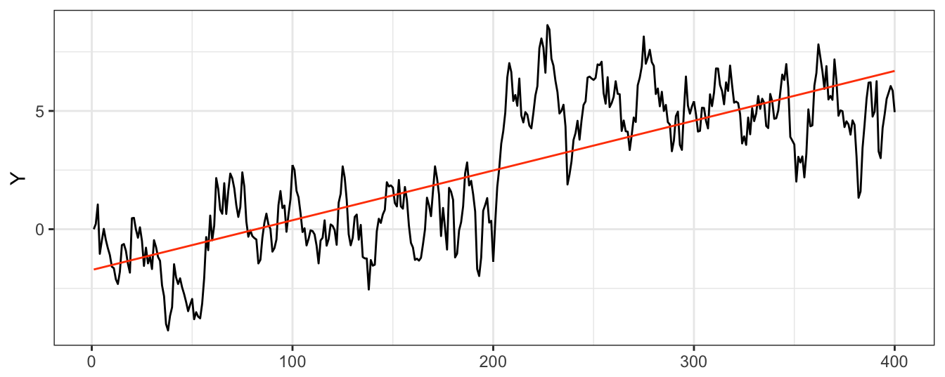
Figure 4.17: A linear trend model estimated on the simulated AR(1) time series with a structural break in the intercept.
4.6.1 Break at a know date
If the visual analysis of the time series shows the possibility of a break we can use that information and incorporate it in the model. An example is the break in the simulated series in Figure 4.16 that shows a level shift half-way through the sample. We can estimate an AR(1) model with an intercept shift at observation 200 as follows:
fit <- dyn$lm(Y ~ I(trend > Tbreak) + lag(Y, 1), data=merge(Y,trend)) Estimate Std. Error t value Pr(>|t|)
(Intercept) -0.039 0.058 -0.681 0.496
I(trend > Tbreak)TRUE 1.030 0.166 6.220 0.000
lag(Y, 1) 0.813 0.027 29.928 0.000The regression results show that the OLS estimate of \(\hat\beta_{00}\) is equal to -0.039 which is not statistically different from the true value 0, while \(\hat\beta_{0,1} =\) 1.03 that is also close to its true value of 1. Hence, by incorporating in the model the occurrence of a break we are able to recover parameter estimates that are close to the true value. In addition, if we did include a time trend in this regression it would turn out to be insignificant at standard levels as shown in the code below:
fit <- dyn$lm(Y ~ I(trend > Tbreak) + lag(Y, 1) + trend, data=merge(Y,trend)) Estimate Std. Error t value Pr(>|t|)
(Intercept) -0.068 0.093 -0.730 0.466
I(trend > Tbreak)TRUE 0.984 0.203 4.847 0.000
lag(Y, 1) 0.811 0.028 29.353 0.000
trend 0.000 0.001 0.393 0.6944.6.2 Break at an unknown date
In most cases, we might suspect that there was a break in the series but a simple visual analysis might not be enough to decide when it happened and if it was a break in the intercept, slope, or both. In this case, an approach is to scan through all possible break dates and compare the goodness of fit of the model with and without break. We then perform and F test of the null hypothesis that the model parameters did not change. If we fix the AR order to equal \(p=1\), the approach is as follows:
- Estimate the AR(p) model on the full sample: \[Y_t = \beta_0 + \beta_1 Y_{t-1} + \epsilon_t\] for \(t = 1, \cdots, T\) and denote by \(RSS_R\) its Residual Sum of Squares
- For each \(t^*\) between \(t_{min}\) and \(t_{max}\) (e.g., \(t_{min} = 0.15*T\) and \(t_{max} = 0.85*T\)), we estimate the model: \[Y_t = \beta_{0,0} * I(t \le t^*) + \beta_{01}*I(t > t^*) + \beta_{1,0}*I(t\le t^*)*Y_{t-1} + \beta_{1,1}*I(t > t^*) * Y_{t-1}+ u_t\] where \(RSS_u\) represents the Residual Sum of Squares of the model in 2 (unrestricted) and \(RSS_{\epsilon}\) for the model in 1 (restricted)
- Calculate the F statistic for the null joint hypothesis that \(\beta_{00} = \beta_{01}\) and \(\beta_{10}=\beta_{11}\) at each \(\tau\) which is given by \[F(\tau) = \frac{RSS_u - RSS_R}{RSS_u/(T-2*(p+1))}\]
- The \(supF = \sup_{\tau} F(\tau)\) test statistic is the largest value of \(F(\tau)\)
While the \(F\) statistic follows the \(F\) distribution with \(p+1\) degrees-of-freedom in the numerator and \(T-2*(p+1)\) in the denominator, the \(supF\) statistic has a non-standard distribution with the critical values provided in the Table below.
| p | 10% | 5% | 1% |
|---|---|---|---|
| 1 | 7.12 | 8.68 | 12.16 |
| 2 | 5.00 | 5.86 | 7.78 |
| 3 | 4.09 | 4.71 | 6.02 |
| 4 | 3.59 | 4.09 | 5.12 |
| 5 | 3.26 | 3.66 | 4.53 |
| 6 | 3.02 | 3.37 | 4.12 |
| 7 | 2.84 | 3.15 | 3.82 |
| 8 | 2.69 | 2.98 | 3.57 |
| 9 | 2.58 | 2.84 | 3.38 |
| 10 | 2.48 | 2.71 | 3.23 |
The test for structural change can be easily implemented using the Fstats function in the strucchange package. The application to the simulated series is as follows:
library(strucchange)
fit <- dyn$lm(Y ~ lag(Y, 1))
test <- Fstats(fit, from=0.15, to=0.85, data=as.ts(Y))
plot(test, xlab="")
abline(v=0.5, col="blue", ltype=2)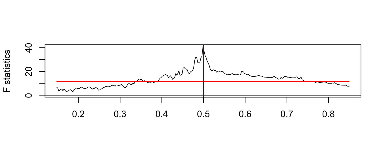
Figure 4.18: F-statistic for structural change at an unkown date.
The time series plot of \(F(\tau)\) shows a clear peak which corresponds to 0.5 times the sample size that indeed corresponds to the break date. Once we find the break date, we can proceed as discussed earlier for the case of a known break dates, that is, estimate the model separately on the sub-periods. In practice, it is not necessarily the case that a time series experiences only one break but there could be several. In case there are two intercept shifts corresponding to one third (intercept shift from 0 to 1) and two third (from 1 to 2) of the sample, the time series and the \(F(\tau)\) test are as follows.
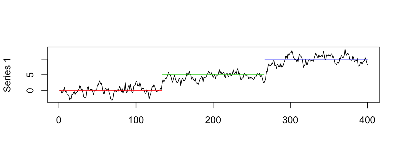
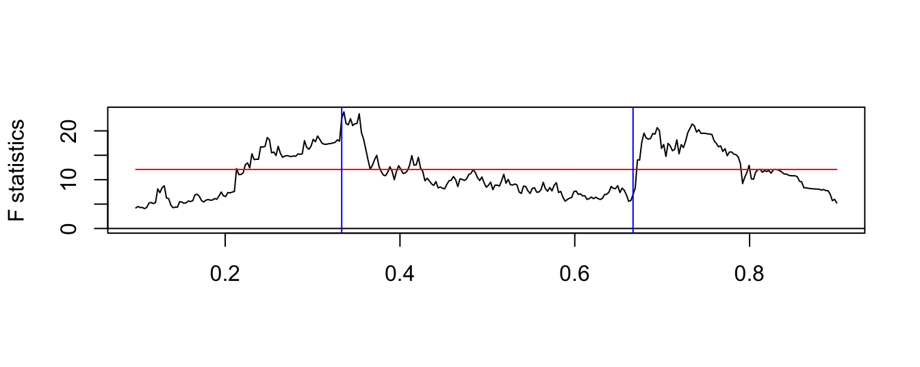
Figure 4.19: Simulated time series with three breaks in the mean and the F-statistic for the test of structural change at an unkown date.
The \(F(\tau)\) plot shows clearly two peaks that are statistically significant and are very close to the break dates set in simulating the data. So far we only discussed shift of the intercept, but there could be as well changes in the persistence of the time series. Below we show a simulated time series from the following model:\[Y_t = \beta_0 + \beta_{10} Y_{t-1} I(t \le t^*) + \beta_{11} Y_{t-1} I(t > t^*) + \epsilon_t \] where \(t^*\) denotes the break date. In the simulation we set the parameters to \(\beta_0\)=0.2, \(\beta_{10}\)=0.5, \(\beta_{11}\)=0.8, and the break date \(t^*\) is set equal to 200.
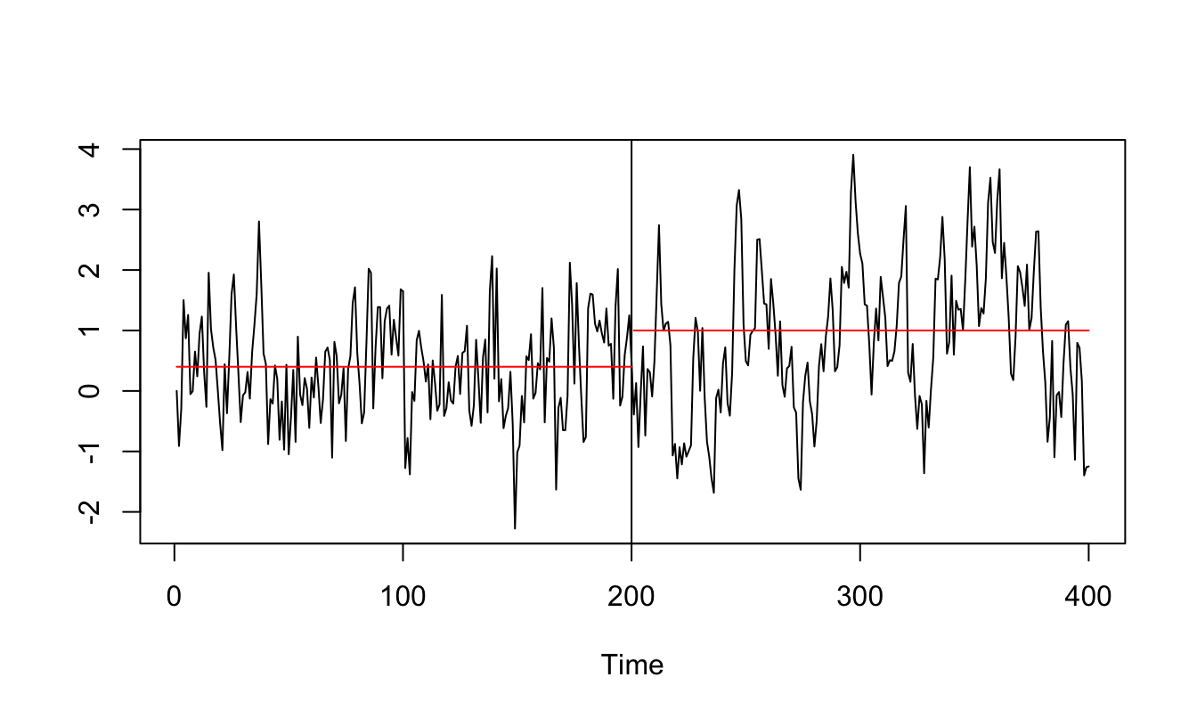
Figure 4.20: Simulated AR(1) time series with three structural breaks in the mean.
The \(F(\tau)\) statistic for this time series is shown below. Also in this case the maximum value of \(F(\tau)\) occurs close to 0.5 that represents halfway through the sample. Once the break date has been identified we can then proceed by estimating the model that accounts for the change in parameters and use this model for further analysis or forecasting.
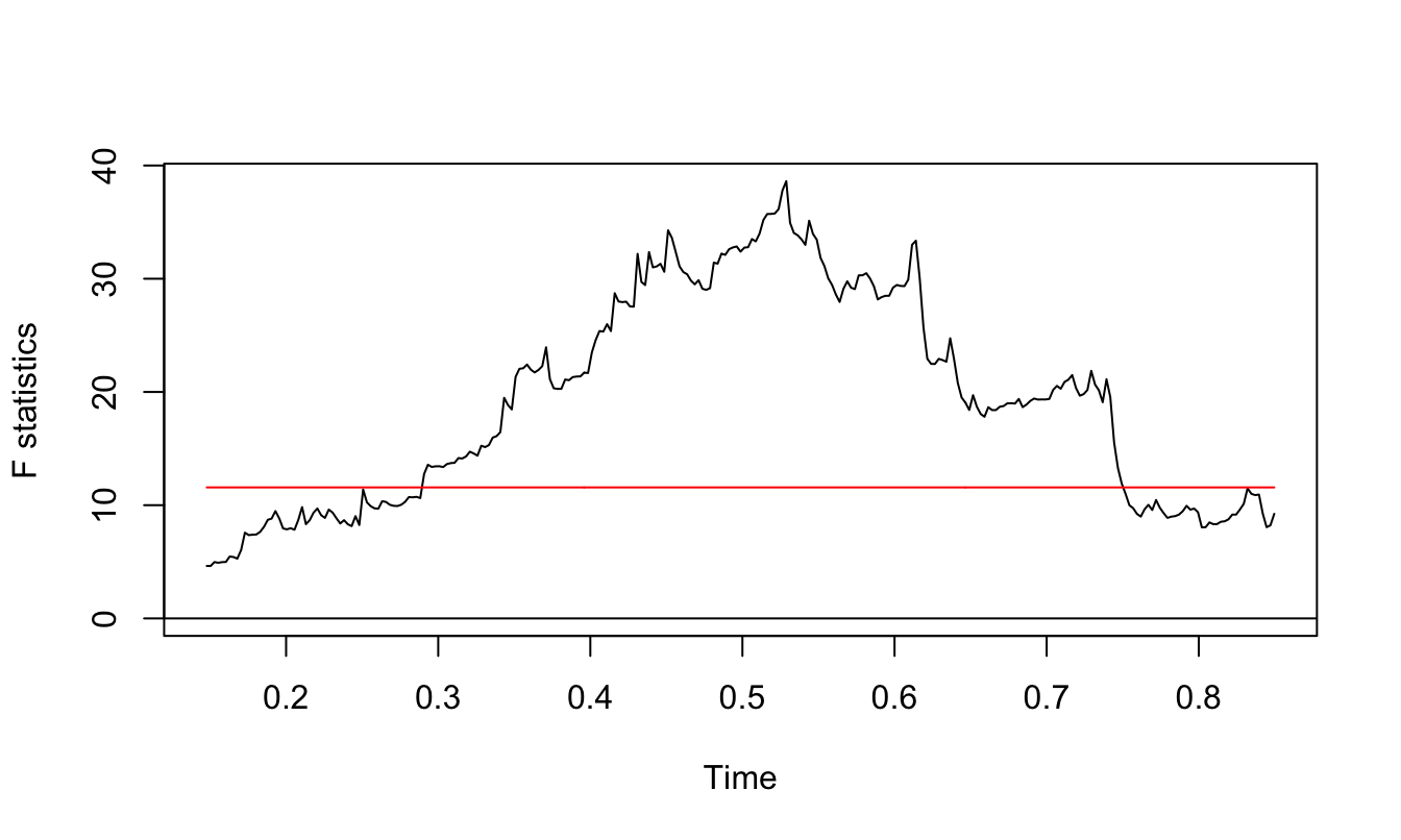
Figure 4.21: F statistic for the structural break test.
4.7 Forecasting Revenue and Earnings-Per-Share (EPS)
... this section is still work in progress ...
An interesting application of time series methods is forecasting revenue and EPS of listed companies. Analysts at investment banks provide their forecast about the future prospects of companies which are then used by their clients as inputs in the investment process. Although analysts use a much wider information set than just the history of revenue and EPS of a company, it is still interesting to calculate a purely time series forecast of these variables as a benchmark forecast.
Below we show the revenue and EPS time series for Walmart (ticker: WMT) from 1990 Q1 until the as.yearqtr(max(data$datadate)). The dashed line represents a linear deterministic trend estimated over the full sample. These series share some common features:
- they grow over time, although a linear trend over the full sample might not be the best model to explain the series
- an evident seasonal component in both series
- possible structural breaks in the level and/or dynamics of the series
For the EPS series it is evidence that there were two breaks in the 1990s in which the variable dropped and continued growing afterwards. On the other hand, the Revenue series seems to have a slightly exponential behavior which could be taken into account by modeling the logarithm of the variable. These series seem good to apply the test for non-stationarity and structural break that we discussed earlier. We will start by modeling the time series of Revenue.
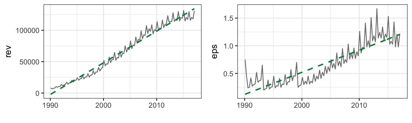
4.7.1 Modeling Revenue
Let’s first test for non-stationarity of WMT revenue. Unfortunately, we cannot use the ur.df() function from the urca package since there is a clear seasonal pattern in the time series which cannot be added in that function. Hence, we estimate the DF regression as follows:
## dyn$lm(drev ~ lag(rev, 1) + lag(drev, 1:4) + trend + Q2 + Q3 + Q4, data=mydata)
## dyn$lm(drev ~ lag(rev, 1) + lag(drev, 1:4) + trend + trendsq + Q2 + Q3 + Q4, data=mydata)
adf.tab
Rev + trend Rev + quad trend Log Rev + trend Log Rev + quad trend
-1.250 -0.752 -1.349 -0.752 where drev denotes the first difference of the revenue, trend is the trend variable and trendsq its square, and Q2, Q3, and Q4 represent the quarterly dummy variables that take value 1 in quarter 2, 3, and 4 and are zero otherwise. The ADF test statistic is the \(t\)-statistic of the lagged value of the revenue or the log revenue and the critical value at 5% when \(T=93\) is -3.45. The ADF test statistic is -1.25 for the linear trend and -0.752 for the quadratic trend. In both cases we do not reject the null hypothesis which suggests that the most appropriate model is a random walk with drift rather than a linear or quadratic trend model with seasonal dummy variables. When considering the logarithm of revenue, the ADF statistic is -1.349 and -4.542, respectively, so that for the quadratic trend model we reject the null hypothesis and thus conclude it is a valid model for log revenue since the deviations from the trend are stationary. Hence, in this case we find that the modeling implications of the test for non-stationarity rely on the decision to take the logarithm of the variable or not. For the purpose of illustrating the modeling process and the decisions involved, we continue by discussing the specification of the linear and quadratic trend models and later discuss the modeling of the changes of revenue and log revenue.
The first issue that we need to resolve is whether we should use Revenue in million of $ or transform the variable to logarithm. Below is a graph of the two series together with a deterministic trend. In the graph below the time series of WMT revenue is shown in million of $ or logarithm and for linear or quadratic trend.
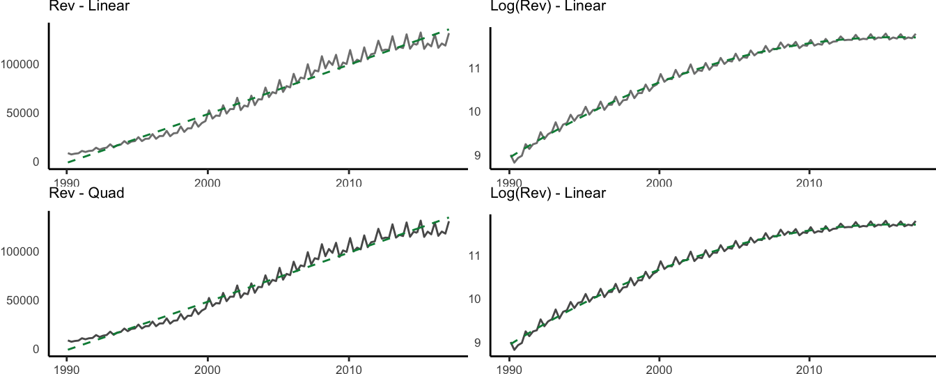
Figure 4.22: Time series plot of the revenue and logarithm of revenue together with the predicted value from the linear and quadratic trend models.
The graph for Revenue shows that the series seems to be increasingly volatile over time, in the sense that revenue are more (less) variable when their level is high (low). This type of heteroskedasticity can be solved by making the changes in revenue a percentage of the level, which is achieved by taking the logarithm of the variable. The graphs show that the variability of the series appears more homogeneous over time when revenue is log-transformed. The linear trend doesn’t seem useful here because the time series is off the trend line in particular at the beginning and at the end of the sample. On the other hand, the quadratic trend appears as a better fit in both cases. Overall, the quadratic model for log Revenue provides a good starting point to model the series and use it as a building block to which we sequentially add features such as seasonality and AR terms. The estimation results for the quadratic model are provided below:
Call:
arima(x = mydata$lrev, order = c(0, 0, 0), xreg = mydata[, c("trend", "trendsq")])

Coefficients:
      intercept  trend  trendsq
          8.898  0.054        0
s.e.      0.023  0.001        0

sigma^2 estimated as 0.00598:  log likelihood = 124.36,  aic = -240.72
The interpretation of the results for the quadratic trend model is that revenue is expected to grow by \(100*(\beta_1 + 2 * \beta_2 * trend)*\Delta trend\)% every quarter. In 2017 Q1 the value of the trend is 10938 and the forecast for revenue growth in 2017 Q2 based on the coefficient estimates is 0.361%.
An additional characteristic of the time series is its seasonal pattern which is quite clear from the plots. To account for this pattern we can include quarterly dummy variables in the regression as discussed earlier. The dummy variables for the quarters can be created using the quarter() function from package lubridate which provides value 1,2,3, and 4 based on the date. To avoid the dummy variable trap we can include in the regression the intercept and drop one of the seasonal variables, for example Q1. The estimation results for the quadratic trend model with seasonal dummy variables are as follows:
Call:
arima(x = mydata$lrev, order = c(0, 0, 0), xreg = mydata[, c("Q2", "Q3", "Q4",
    "trend", "trendsq")])

Coefficients:
      intercept      Q2      Q3      Q4  trend  trendsq
          9.001  -0.174  -0.119  -0.142  0.054        0
s.e.      0.013   0.011   0.011   0.011  0.000        0

sigma^2 estimated as 0.00158:  log likelihood = 196.87,  aic = -379.74
where the seasonal pattern is clear: WMT’s revenue are -17.4% higher in Q2 relative to Q1, -11.9% higher in Q3 relative to Q1, and -14.2% in Q4. This pattern is not surprising for a retailer since the last quarter of the year is associated with the holiday shopping. The fitted line in Figure 4.22 is very close to the realized time series and it is difficult to visually investigate the success of the model in modeling revenues. However, it becomes clearer when plotting the residuals of the regression since most of the residuals are within a \(\pm\) 5% range and alternating periods of positive residuals (estimate underpredicted the realization) and negative residuals (estimate overpredicted the realization). It is clear that the residuals are stationary since they mean-revert relatively quickly, and this can be better assessed by looking at the ACF of the residuals.
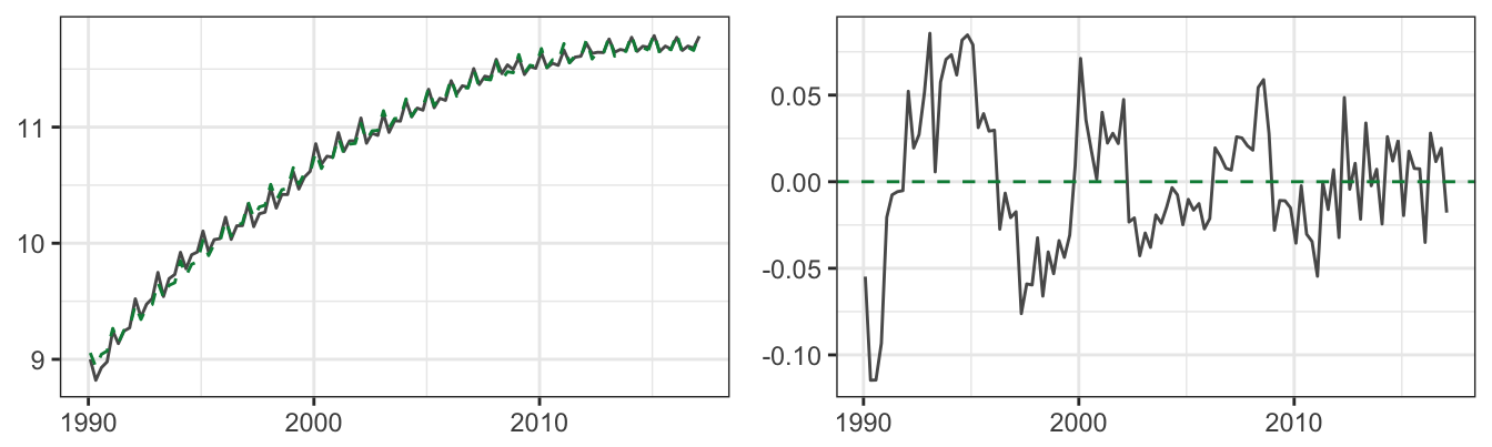
Figure 4.23: The fitted value from the quadratic trend model for the logarithm of revenue (left) and the residuals of the model (right).
The ACF of the residuals shows that there is significant correlation in the residuals that starts around 0.7 at lag 1 and then at lag 5 and then again at lag 9 to 12. The existence of such dependence means that the deviations of revenue from the quadratic trend model have a systematic component which should be included in the model to improve its goodness-of-fit and its forecasting power. This could be done by adding an AR component to the model to account for these systematic deviations of revenue from the quadratic trend model with quarterly dummy variables.
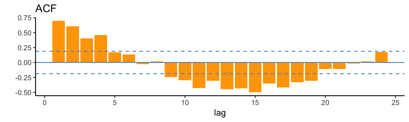
We thus add 12 lags of log(Revenue) to the regression model and find that only lags 1 to 4 are significant after we sequentially eliminate the irrelevant lags. However, adding these lags makes the Q4 dummy variable irrelevant and we thus drop it from the regression and the final model is:
Call:
arima(x = mydata$lrev, order = c(4, 0, 0), xreg = mydata[, c("Q2", "Q3", "Q4",
    "trend", "trendsq")])

Coefficients:
       ar1    ar2     ar3    ar4  intercept      Q2      Q3      Q4  trend  trendsq
      0.58  0.228  -0.309  0.374      8.954  -0.175  -0.120  -0.144  0.056        0
s.e.  0.09  0.102   0.103  0.090      0.039   0.008   0.006   0.008  0.001        0

sigma^2 estimated as 0.000623:  log likelihood = 246.79,  aic = -471.57
The coefficient of Q4 has significantly reduced from the earlier model without lags due to the effect of lag 4 and 5 in (partly) capturing the seasonal pattern in the data. Checking the residuals of this model shows that there are still some lags that are statistically significant at 5%, such as at the 1 year horizon and for lags over two years, but the model seems to be overall well-specified.
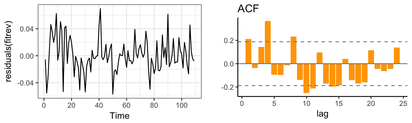
Based on this model, the 1 to \(h\) steps ahead forecasts based on the information available in 2017 Q1 are shown in Figure 4.24. However, we are modeling the logarithm of revenue so that the forecasted value is also in logarithm and the scale of the plot in Figure 4.24 is thus logarithmic. The intuitive approach of taking the exponential of the forecasts from the log-revenue model provides however an approximate solution, since the \(exp(E(ln(X)) \not= E(X)\). In practice, the error in doing this is quite small that can be considered as a good approximation.
h = 8 # forecast horizon
forecast.dates   <- seq(max(time(mydata)), by = "quarter", length.out = h)
forecast.quarter <- lubridate::quarter(forecast.dates)
forecast.xreg    <- cbind(Q2 = forecast.quarter == 2,
                          Q3 = forecast.quarter == 3,
                          Q4 = forecast.quarter == 4,
                          trend   = max(mydata$trend) + 1:h,
                          trendsq = (max(mydata$trend) + 1:h)^2)
library(forecast)
p1 <- forecast(fitrev, h, xreg=forecast.xreg, level=c(50,90))
autoplot(p1, include=24, is.date=TRUE) + theme_bw() +
  scale_fill_gradientn(colours = c("plum1","plum3"), breaks=p1$level, guide="legend")
knitr::kable(exp(data.frame(p1)), caption="The point and interval forecasts from the previous model; taking the exponential of the forecasts of the logarithm of the variable provides an approximate forecast of the level of the variable.")| Point.Forecast | Lo.50 | Hi.50 | Lo.90 | Hi.90 | |
|---|---|---|---|---|---|
| 110 | 132631 | 130417 | 134883 | 127296 | 138190 |
| 111 | 110002 | 107882 | 112164 | 104903 | 115349 |
| 112 | 117339 | 114826 | 119908 | 111303 | 123703 |
| 113 | 112513 | 110086 | 114993 | 106687 | 118658 |
| 114 | 129676 | 126744 | 132677 | 122641 | 137115 |
| 115 | 107295 | 104805 | 109844 | 101324 | 113617 |
| 116 | 113231 | 110477 | 116054 | 106632 | 120238 |
| 117 | 109228 | 106531 | 111993 | 102768 | 116094 |
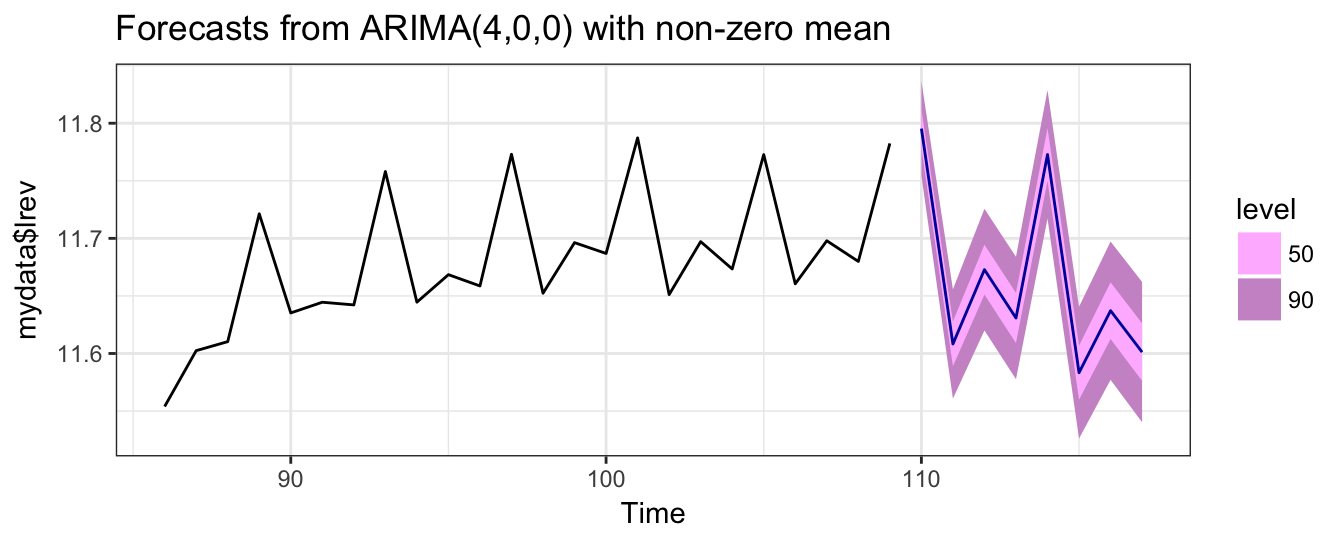
Figure 4.24: h step ahead forecasts for the logarithm of revenue based on the AR(4) model with seasonal dummies and quadratic trend.
The application of the ADF test to revenue shows that the series can be considered non-stationary, although in the case of the logarithm we reject the null hypothesis when the quadratic trend is included in the model. We thus consider also the case of taking differences of revenue and log revenue by creating the variable drev = diff(rev) and dlrev = diff(log(rev)). Below we show a time series plot of these two variables.
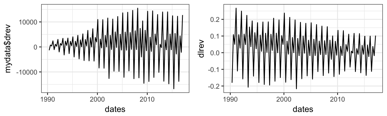
The time series plot of drev on the left shows that the variable seems to have increasing dispersion as time progresses. This might be problematic in estimating the parameters of the model since the recent observations will have a larger weight in estimation relative to older observations. This problem can be easily solved, as discussed earlier, by taking the logarithm of revenue as shown on the right plot. Changes become relative to the level in the previous period and thus more homogeneous (technically, homoskedastic), although it seems that in the last years of the sample the dispersion has somewhat decreased.
4.7.2 Earnings-Per-Share (EPS)
As we saw earlier, the EPS series is not well-explained by a linear trend, and one of the reasons is the occurence of two breaks in the 1990s. The first step in modeling the EPS series is to identify the break dates to try to account for these events. The first break occured in 1993Q1 when EPS jumped to $0.20 from $0.65 for 1992Q4, while the second break occured in 1999Q1 when EPS dropped to $0.20 from $0.70 in the previous quarter. We can account for these breaks by fitting different trend lines to the time period before 1993Q1, between 1993Q1 and 1999Q1, and after 1999Q1. This can be done by creating a constant and trend variables for each of these three subperiods. For example, the constant for the period between 1993Q1 and 1998Q1 can be created as (time >= 1993) * (time <= 1998.75), where time = time(trend). The trend can be similarly created by trend * ((time >= 1993) * (time <= 1998.75)). The fitted line for the piece-wise linear trend model is shown below, and it is clear that the model improves significantly over a linear trend model with no break (earlier graph). The graph on the right shows the ACF of the residuals that shows a clear seasonal pattern which we did not account yet in the model.
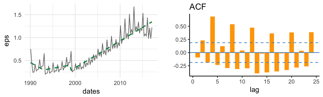
Splitting the full sample in sub-periods results in the same coefficient estimates that would be obtained by estimating the regression in each sub-period. In other words, the observations in each sub-period contribute to estimate the parameters in that period but not in others. This is important if our goal is to model or forecast the time series: in case our only goal is actually to forecast EPS, then we might as well consider EPS since the first quarter of 1999 and neglect the rest of the sample since it is uninformative about the current regime. However, it might also be the case that, once accounted for the shift in the trend line, we might want to estimate the seasonality and AR parameters on the full sample of observations, instead of the sub-period.
For the case of Revenue we considered a quadratic trend model and it is instructive to see how it would perform for EPS. In this case we might not consider the two jumps as breaks, but fluctuations around a quadratic trend. The fitted line shown below starts relatively flat until approximately 2000 when it starts an upward movement. In terms of goodness-of-fit, the previous model dominates the quadratic trend model even after accounting for the different number of parameters of the two models. In what follows, we examine the two models to evaluate the effect of adding features, such as seasonality and AR terms, on the model performance.
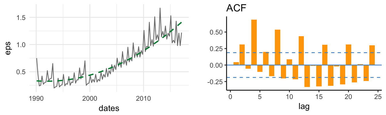
The next step in modeling the EPS series is to account for the seasonality in the EPS series by adding quarterly dummy variables to the regression. The results are shown below for the piece-wise linear trend and the quadratic trend models. It is clear that the fit improves in both cases since the fitted line is closer to the EPS time series.
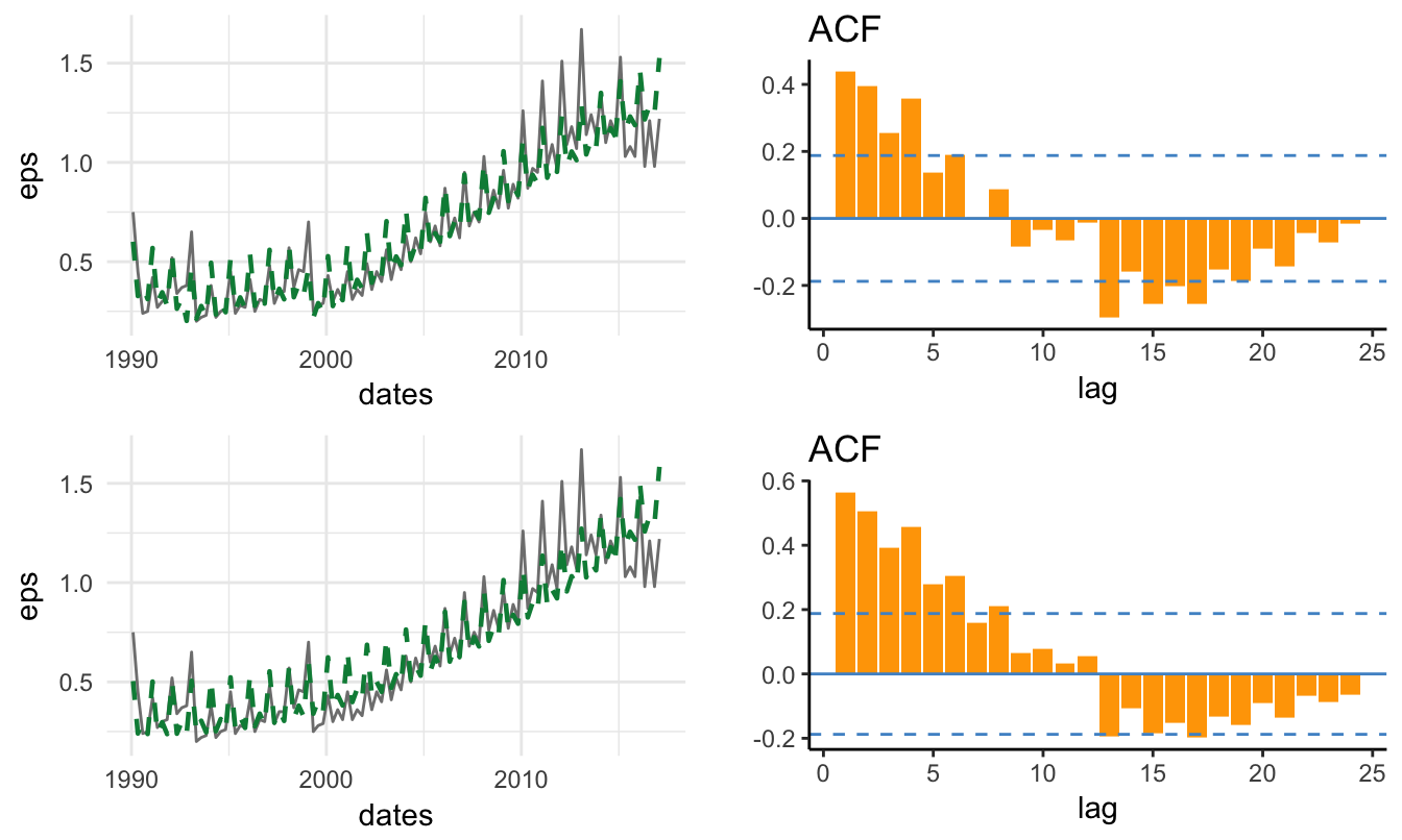
The two breaks that are unaccounted by the quadratic model imply large errors which could be dummied-out by adding in the regression two dummy variables that are equal to one in the quarters in which the break occurred. Neutralizing the effect of these large observations has the benefit of providing unbiased estimates of the parameters which helps also in producing more accurate forecasts of the future.
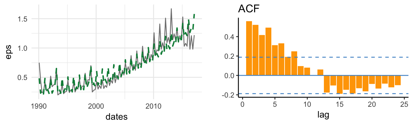
Finally, the residuals still display some auto-correlation which suggests including AR terms in the regression. We add 12 lags and found that lag 1, 4, 5 and 8 are significant and remain so even after we exclude the insignificant lags. The fitted lines for the two models when including the AR component and the ACF of the residuals are shown below. In both cases the overall fit of the model is quite good and the residuals ACF is mostly insignificant.
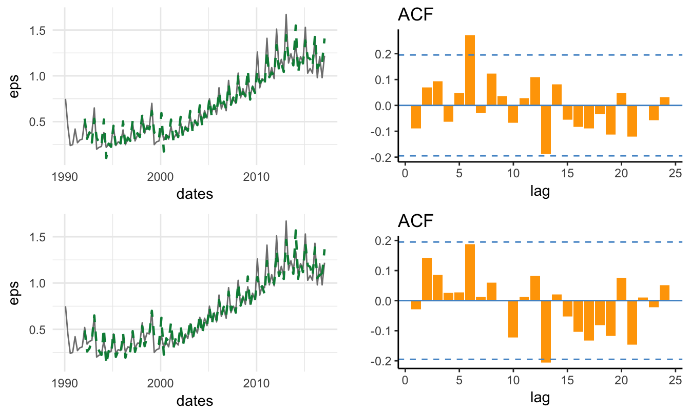
To compare the goodness-of-fit of these models we report below the Adjusted R\(^2\) of the different specifications considered so far. The best model is specification (E) which consists of the linear trend model with breaks, in addition to seasonality and AR terms. Specification (F) has a performance which is very close and is characterized of the quadratic trend model with dummy variables for the break dates, as well as seasonality and AR terms. Both the seasonal dummy variables and the AR terms are essential in improving the performance of the models. However, the difference in adjusted R\(^2\) are very small and a more powerful test might be to evaluate the performance of the models out-of-sample.
| Model | Adj. R\(^2\) |
|---|---|
| (A) Linear Trend & Break | 0.9592 |
| (B) Quadratic Trend + Dummies | 0.805 |
| (C) = (A) + Seasonality | 0.9184 |
| (D) = (B) + Seasonality | 0.8942 |
| (E) = (C) + AR | 0.9892 |
| (F) = (E) + AR | 0.9898 |
4.8 Automatic time series modeling
Coming soon … or later …
#library(forecast)
#library(prophet)
R commands
| FUNCTIONS | PACKAGES |
|---|---|
| acf() | dyn |
| adf.test() | FitAR |
| ar() | forecast |
| arima() | ggfortify |
| autoplot() | strucchange |
| Fstats() | tseries |
| model.matrix() | urca |
| SelectModel() | |
| ur.df() |
Exercises
- Exercise 1
- Exercise 2
References
Tsay, Ruey S. 2005. Analysis of Financial Time Series. Vol. 543. John Wiley & Sons.
However, the
autoplot()function of packageggfortifybuilds on theggplot2functionalities to provide an ACF plot.↩Since time series models explicitly account for time series dependence the errors of a well-specified model are likely to have no serial correlation. This suggests that the need to correct the standard errors is less compelling, although it is the case that heteroskedasticity might still play a role. In this Chapter the errors are obtained under the assumption of homoskedasticity which is the default output of
summary().↩The option
demeanmeans that by default thear()function subtracts the mean from the series before estimating the regression. In this case, thear()function estimates the model \(Y_t - \bar{Y} = \beta_1 * (Y_{t-1} - \bar{Y}) + \epsilon_t\) without an intercept. If we denote the expected value of \(Y_t\) by \(\mu\), then using the previous equation we can express the intercept as \(\beta_0 = (1-\beta_1)\mu\). By replacing this value for \(\beta_0\) in the AR(1) model we obtain \(Y_t = (1-\beta_1)\mu + \beta_1 Y_{t-1} + \epsilon_{t}\) that can be rearranged as \(Y_t - \mu = \beta_1 (Y_{t-1}-\mu) + \epsilon_t\). So, estimating the AR model or the AR model in deviation from the mean leads to the same estimate of \(\beta_1\).↩The number of past observations that are plotted can be changed by setting the option
include=to the number of observations that the user intends to show.↩Any sequence of numbers can constitute a trend as long as the difference between consecutive values is 1.↩
The best model is the one that minimizes AIC and BIC.↩
If the lag is not specified the function default is to use \(k = trunc((length(x)-1)^(1/3))\), where \(x\) denotes the time series object.↩
The sample period starts in 1990 Q1 and ends in 2017 Q1 for a total of 109 observations.↩